Use Cases & Category Recommendations
Category overview
Categories below are ordered by the model’s category Elo. Each rating describes relative performance within that category; the 1–10 averages are included only as diagnostics.
| Category |
Elo |
Mean image score |
Recommended interpretation |
| Hands & Anatomy |
1161 |
7.0/10 |
Strongest relative option; inspect crowded finger contacts |
| Complex Scenes |
1126 |
6.4/10 |
Useful for clearly staged activities; weaker at distinct simultaneous tasks |
| Surreal & Creative Prompts |
1075 |
6.2/10 |
Good material and atmosphere studies; check conceptual integration |
| Architecture & Interiors |
1051 |
6.1/10 |
Suitable for visual concepts, not dependable technical documentation |
| Ultra Hard |
1021 |
5.5/10 |
Uneven; straightforward signs fare better than unusual relationships |
| Graphic Design |
972 |
6.0/10 |
Selective decorative successes; weak default for minimalist assets |
| Anime & Cartoon Style |
964 |
6.5/10 |
Appealing characters; complex action construction needs review |
| Text in Images |
918 |
5.9/10 |
Often readable primary wording, less reliable integration and hierarchy |
| Ghibli style |
910 |
6.0/10 |
Better for loose storybook reinterpretation than exact matching |
| Photorealistic People & Portraits |
862 |
5.9/10 |
Prefer dramatic stylization over subtle documentary realism |
1. Anatomy, sports, and object interaction: a selective strength
Use for: athletic poses, readable whole-body movement, and uncomplicated hand–object interactions.
The runner mid-stride combines 9/10 overall with 10/10 coherence. Opposing arm movement, hip extension, and ankle articulation work together rather than merely producing a dynamic silhouette.
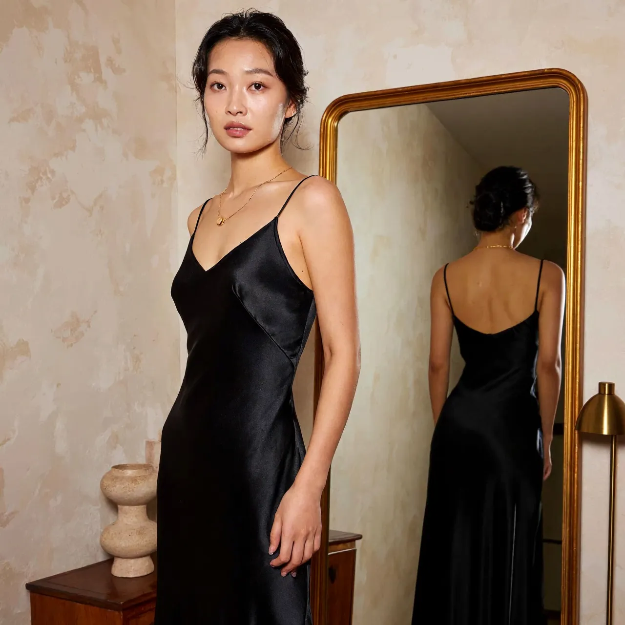
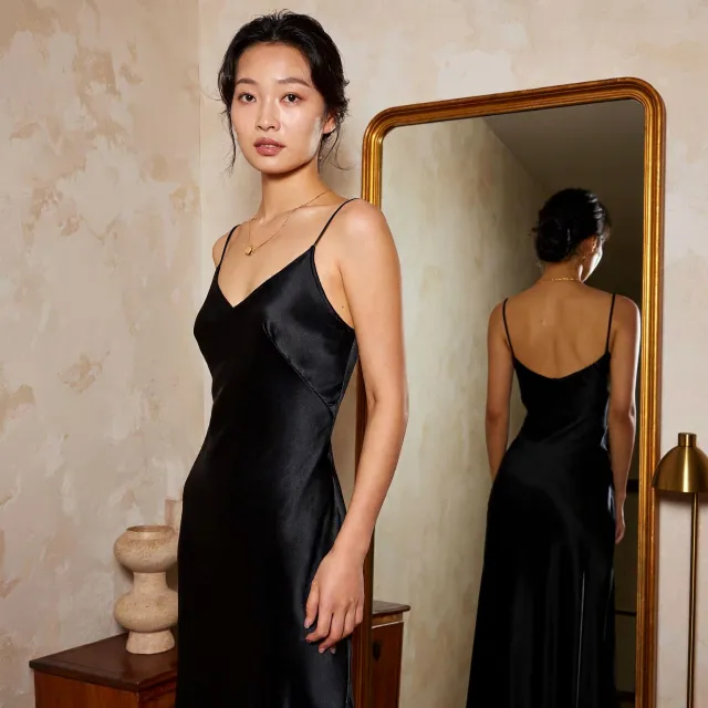
The mirror portrait also scores 9/10, preserving garment straps, hairstyle, and arm correspondence across views. The sports high-five and hand drawing with a pencil both score 8/10.
Avoid assuming that hands are solved. The hand holding an apple scores only 5/10 because the digits are crowded and not clearly separable. The handshake similarly struggles to demonstrate the requested anatomy clearly.
Recommendation: choose compositions with clear silhouettes and inspect joints, occlusion, grip, and contact—not just skin texture.
2. Portrait photography: favor editorial drama, not subtle naturalism
Use for: stylized character portraits where strong contrast and polished presentation are acceptable.
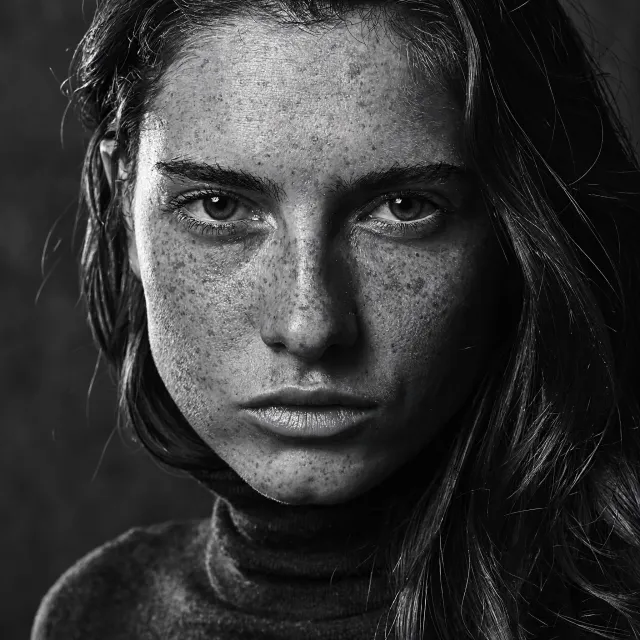
The monochrome freckled portrait is the clear positive example. Its lighting and texture treatment align with the brief.
Avoid as a first choice for: natural toddler photography, delicate emotional moments, and believable aging detail. The toddler, joyful bride, and weathered fisherman all score 5/10, for different combinations of synthetic surfaces, artificial emotion, and unclear anatomy.
Recommendation: request restrained local contrast and natural material variation, but treat this as a prompting strategy to test—not a demonstrated fix.
3. Character illustration and fantasy: useful when interpretation is flexible
Use for: charming character-led adventures, tactile fantasy objects, and warm illustrated scenes.
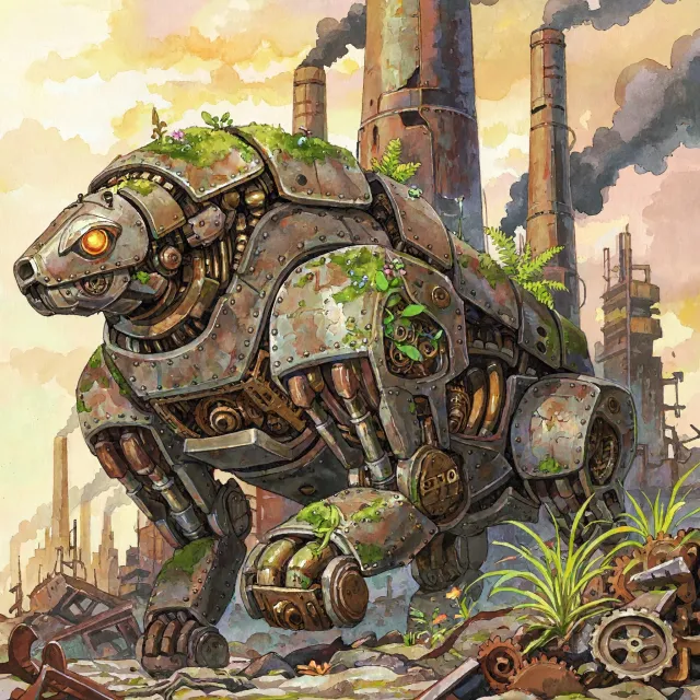
The cat-and-dog adventure scores 8/10, with explorer accessories supporting the story. The sleeping chibi dragon also scores 8/10, with particularly rich treasure detail. In surreal work, the steampunk robot in ancient Rome earns 8/10, supported by an expressive pose and coherent historical setting.
The avocado armchair is another useful concept-development example: its tactile materials score 9/10 for detail, even though the fruit silhouette is less fully resolved.
Avoid when: exact source identity, mechanical action, or organic integration is essential. The android Mona Lisa loses too much of the original identity and composition. The retro anime space battle has unclear beam paths and cause-and-effect staging.
For Ghibli-related requests, choose MiniMax only if a general hand-painted storybook interpretation is acceptable. The flying witch and enchanted bathhouse demonstrate that subject coverage does not ensure the requested visual language or setting.
4. Crowds and architecture: good atmosphere, weaker functional explanation
Use for: editorial scenes with a few legible principal activities and architectural mood studies.
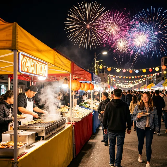
The city intersection with musicians scores 8/10 overall, with 9/10 for both coherence and technical quality. The night festival food stalls also scores 8/10, supported by readable cooking activity and controlled spatial staging.
These results suggest that clearly differentiated foreground actions are a better fit than instructions requiring every person to do something different.
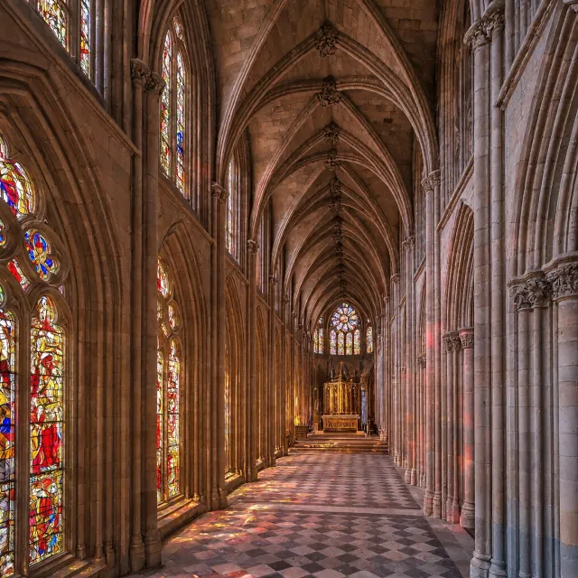
For architecture, the Scandinavian living room and Gothic cathedral each score 7/10. They are useful visual studies, although composition and the requested lighting effects remain incomplete.
Avoid for: construction references, circulation planning, historical reconstruction, or engineering validation. The underground bunker lacks visible inter-level circulation and connected ventilation routing. The Chinese temple master plan introduces inconsistent markers and scale information.
Recommendation: separate architectural atmosphere from technical correctness. Have a qualified reviewer verify any functional or historical claims.
5. Typography and graphic assets: choose decorative display work over tiny minimalism
Use for: short, prominent wording and expressive botanical typography.
The plant-formed GROWTH wordmark is the strongest design example, scoring 9/10 throughout. Its detail serves the concept rather than competing with it.
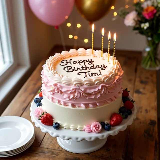
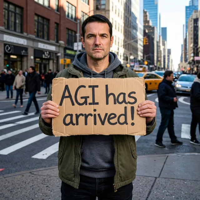
The Happy Birthday Tim cake and AGI has arrived cardboard sign both score 8/10 overall, demonstrating useful primary-text readability in physical scenes.
Avoid as a default for: compact app icons, clean infographic elements, restrained logos, and print-ready repeats. The weather app icon scores 4/10 after adding unnecessary cloud layers, outlines, and a label. The water-conservation droplet adds multiple motifs that weaken the main symbol.
The Art Deco pattern also needs geometric and tiling checks before production. A detailed-looking square image is not evidence of a seamless or print-ready texture.
Recommendation: specify one deliverable, limit supporting elements explicitly, and finish production typography or vector geometry in dedicated design software.
6. Educational and instruction-critical imagery: require specialist verification
Avoid relying on the first output for sign language, mathematical explanations, historically precise hardware, or unusual role assignments.
The ASL thank-you portrait has 9/10 technical quality and detail, but only 4/10 adherence because the sign is not unmistakable. A still image also cannot establish the gesture’s full motion.
The vintage Apple II setup contains readable requested text, yet the hardware architecture is substantially incorrect. Together with the robot self-portrait and horse–astronaut reversal, this shows how convincingly finished imagery can communicate the wrong thing.
Practical workflow
- Check the essential instruction first: who does what, to whom, with which object, and in which style?
- Choose a focused composition: fewer overlapping contacts and clearly separated activity zones are easier to validate.
- Review at delivery scale: small icons, secondary text, and crowded diagrams can fail despite a clean full-size impression.
- Use specialist finishing and review: typesetting, technical annotations, historical details, and instructional gestures need independent checking.
Bottom line: MiniMax-H3-Image is worth testing for expressive anatomy, character illustration, and staged scenes. Use it selectively—not as an automatic choice for naturalistic portraits, minimalist production assets, or precision-dependent communication.