Summary for Grok Imagine
Grok Imagine establishes itself as a highly capable, upper-mid-tier competitor with an Overall Elo rating of 1094, placing it 14th out of 37 models on the leaderboard. While it trails the absolute bleeding-edge models, it routinely produces polished, usable, and visually striking imagery across a wide variety of prompts.
Key Discoveries
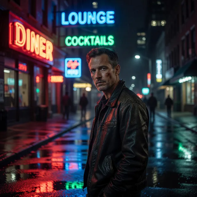
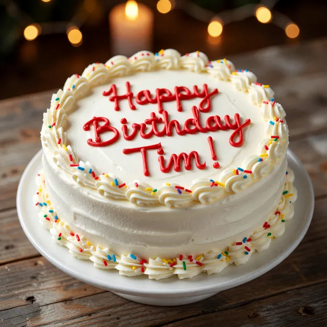
- Text Rendering is a Superpower: Grok Imagine boasts remarkable accuracy with typography, seamlessly integrating text into environments like cakes and neon signs.
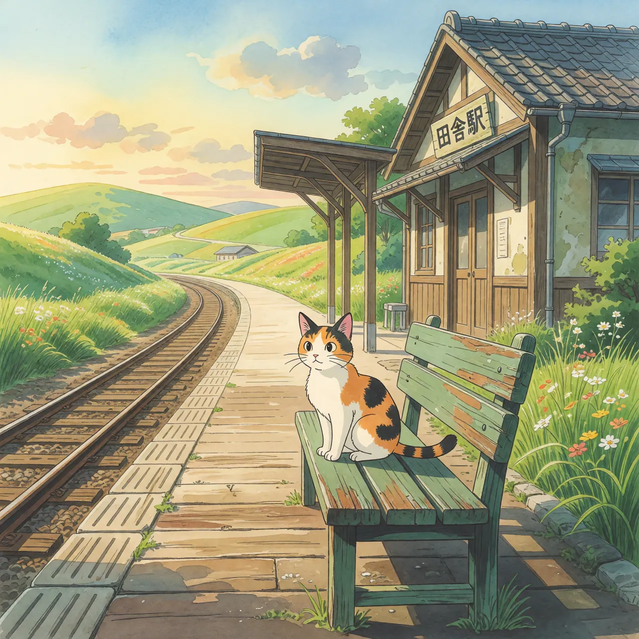
- Stylized Art & Animation Excel: The model shines when generating cartoon, anime, and Ghibli-inspired art, scoring highly for aesthetic appeal and prompt adherence.
- Spatial Logic Struggles: It occasionally stumbles on complex spatial inversions (e.g., an astronaut ridden by a horse) and prone to severe anatomical hallucinations in complex full-body poses.
Quick Reference Conclusions
- Use it for: Graphic design, stylized animation, environmental text, and standard portraiture.
- Avoid it for: Highly complex physical interactions, crowded scenes with overlapping limbs, and surreal logical inversions.
Comparative Strengths & Weaknesses
Grok Imagine demonstrates a highly polished default aesthetic that balances vibrant colors with clean composition. When it succeeds, it produces images that are immediately striking and usable.
Key Strengths:
- Typographical Integration: The model excels at embedding text naturally into scenes. For example, the Open 24/7 neon sign and the Birthday cake Tim both scored an impressive 9/10, showing near-flawless spelling and realistic material integration.
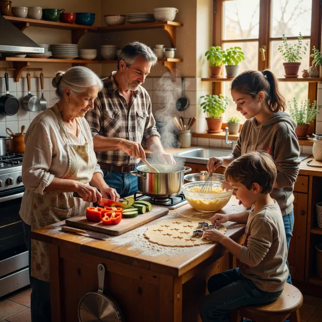
- Lighting and Environmental Atmosphere: Grok Imagine handles complex lighting beautifully. The Nighttime portrait and Family cooking showcase excellent handling of neon reflections and warm, moody interiors.
- Stylized Coherence: In non-photorealistic realms, the model maintains excellent stylistic discipline, delivering rich, vibrant scenes without overcomplicating the requested aesthetic.
Common Failure Modes:
- Anatomical Breakdowns in Complex Poses: While standard close-ups look great, complex full-body interactions can cause severe failures. The most notable example is the Yoga practitioner, which scored a 3/10 due to generating a horrifying extra leg and third foot.
- Difficulty with Spatial Reversals: The model struggles to override its training priors. When asked for an Astronaut ridden by horse, it simply placed the astronaut hovering above the horse, failing the logical inversion test entirely (scoring 4/10).
- Crowd Coherence: In dense environments like the Busy city intersection and the African savanna watering hole, the model resorts to repetitive silhouettes, overlapping structural errors, and logical inconsistencies (like simultaneous red and green traffic lights).
Best Model Analysis by Use Case
Grok Imagine exhibits varying levels of proficiency depending on the category. Here is a breakdown of where it thrives and where users should exercise caution.
Stylized Art & Animation (Highly Recommended)
- Ghibli style (1130 Elo): The model is exceptional at capturing the serene, nostalgic magic of Studio Ghibli. The Cat at train station scored a brilliant 9/10, showcasing authentic hand-drawn qualities and gorgeous environmental storytelling.
- Anime & Cartoon Style (1130 Elo): It handles classic cartoon tropes beautifully. The Clever rabbit tricking hunter perfectly captured animated physical comedy and movement.
Typography & Graphic Design (Highly Recommended)
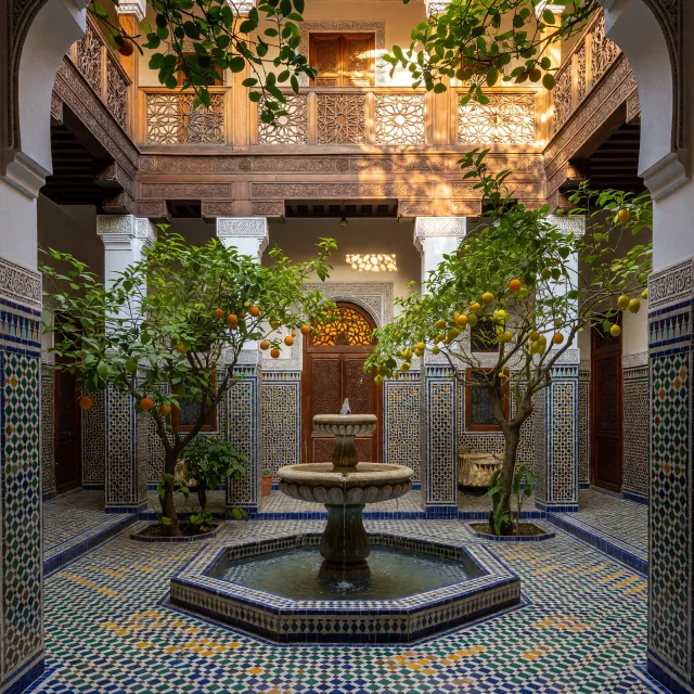
Architecture & Interiors (Recommended)
Photorealism & Anatomy (Proceed with Caution)