- Prompt adherence 9
- Technical quality 9
- Artistic merit 9
- Detail execution 9
- Realism & coherence 9
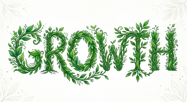
Expressive uppercase GROWTH lettering built from illustrated green vines, leaves, buds, and rootlike branches, with pale botanical corner ornaments on a white background.
Ranked 1st of 12, this offers the best combination of readable vine-built typography, stylistic distinction, and controlled execution. Slightly congested stem intersections prevent a flawless score.
- Prompt adherence 10
- Technical quality 9
- Artistic merit 8
- Detail execution 8
- Realism & coherence 9
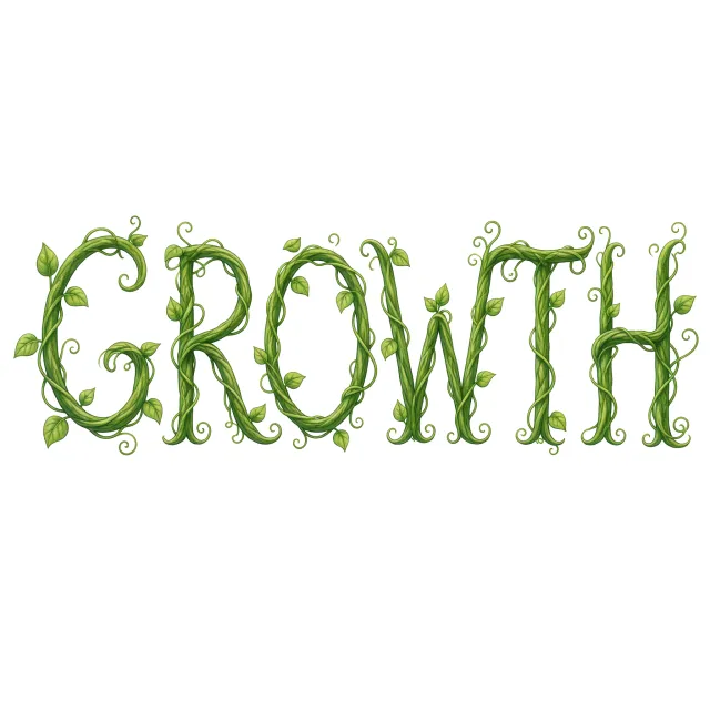
GROWTH is written in elegant olive-green braided vines, accented by veined leaves and numerous fine spiral tendrils on a plain white background.
This is the runner-up, offering exceptionally clear typography and faithful vine-based construction. Its slightly repetitive embellishment places it behind the more expressive strongest image.

- Prompt adherence 10
- Technical quality 9
- Artistic merit 9
- Detail execution 9
- Realism & coherence 9
The uppercase word GROWTH formed from intertwined green vines, small leaves, and curling tendrils on a near-white background.
Rank 1 of 13: the strongest combination of readable typography, genuine vine construction, and polished graphic execution. Minor ornamental crowding is the principal limitation.
- Prompt adherence 10
- Technical quality 9
- Artistic merit 9
- Detail execution 9
- Realism & coherence 9
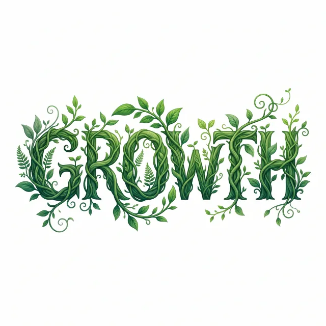
GROWTH is spelled in richly braided dark-green vines, surrounded by varied leaves, delicate fern sprigs, and expressive curling shoots on white.
This is the strongest image, balancing legibility, botanical construction, and artistic character exceptionally well. Minor dense intersections keep it short of a flawless score.
- Prompt adherence 10
- Technical quality 8
- Artistic merit 9
- Detail execution 9
- Realism & coherence 9
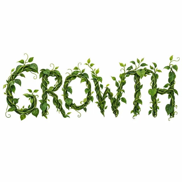
GROWTH formed from substantial braided green vines, realistic shaded leaves, and small curling tendrils against white.
Ranked 2nd of 13 for its highly convincing vine construction and rich botanical rendering. It trails the winner primarily in spacing refinement and control of foliage density.
- Prompt adherence 10
- Technical quality 9
- Artistic merit 9
- Detail execution 9
- Realism & coherence 9
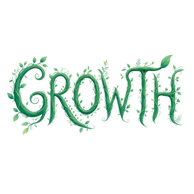
Elegant green vine lettering spelling GROWTH, with delicate leaves, curling tendrils, and sweeping extensions on a white background.
Ranked 1st of 13 for its combination of exact conceptual adherence, legibility, and refined composition. Only small weaknesses in the finest stem details keep it below a flawless score.

- Prompt adherence 10
- Technical quality 9
- Artistic merit 9
- Detail execution 9
- Realism & coherence 8
GROWTH formed from thick braided green vines, surrounded by curling shoots, realistic leaves, and small yellow flowers on white.
Ranked 2nd of 12, this is an excellent realization of plants genuinely forming typography. Its bulkier junctions and greater ornamental density are slightly less controlled than the winner.
- Prompt adherence 9
- Technical quality 7
- Artistic merit 8
- Detail execution 8
- Realism & coherence 8
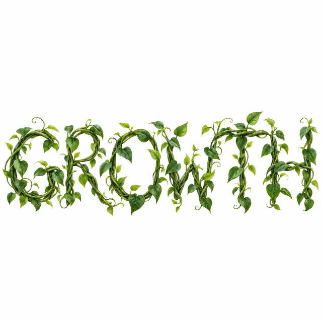
GROWTH is formed from loosely braided green vines carrying abundant heart-shaped leaves and curled tendrils on white.
This is a strong, botanically convincing interpretation with excellent thematic integration. Tight framing and dense foliage prevent it from matching the clarity and control of the best entries.
- Prompt adherence 10
- Technical quality 8
- Artistic merit 8
- Detail execution 8
- Realism & coherence 9
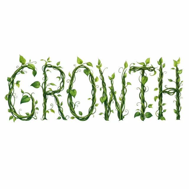
Tall, slender letters spell GROWTH through braided green vines, with naturalistic leaves and delicate tendrils against white.
This is one of the strongest results, combining clear typography with convincing vine construction. Minor spacing and intersection issues keep it just below the two leading designs.

- Prompt adherence 9
- Technical quality 8
- Artistic merit 8
- Detail execution 9
- Realism & coherence 8
Uppercase GROWTH made from intertwined olive-green vines with varied leaves, fern fronds, berries, and small botanical clusters on white.
Ranked 3rd of 12, this combines faithful vine construction with impressive botanical detail. Slight clutter and less decisive visual contrast keep it below the two leaders.

- Prompt adherence 10
- Technical quality 9
- Artistic merit 8
- Detail execution 8
- Realism & coherence 9
Bright green braided-vine lettering spells GRO above WTH, with large leaves and dark illustrated outlines on white.
Rank 2 of 13: an especially clear and faithful interpretation with strong illustrative craftsmanship. Slight layout imbalance and a familiar cartoon vocabulary keep it below the leading image.

- Prompt adherence 9
- Technical quality 8
- Artistic merit 8
- Detail execution 9
- Realism & coherence 8
Ornate illustrated GROWTH lettering made from green stems, abundant pointed leaves, curled shoots, buds, and small flowers.
Ranked 5th of 13 for rich, coherent botanical illustration and strong prompt fulfillment. Excess ornament and compressed letter spacing keep it below the more legible leading entries.
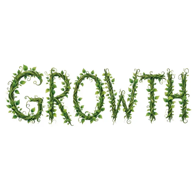
- Prompt adherence 10
- Technical quality 8
- Artistic merit 8
- Detail execution 8
- Realism & coherence 9
Readable uppercase GROWTH built from braided leafy vines, with small curls and dangling tendrils on white.
Ranked 3rd of 13 for exceptionally clear conceptual execution and balanced lettering. Slightly uneven letter weight and softer finishing prevent it from matching the leaders' polish.
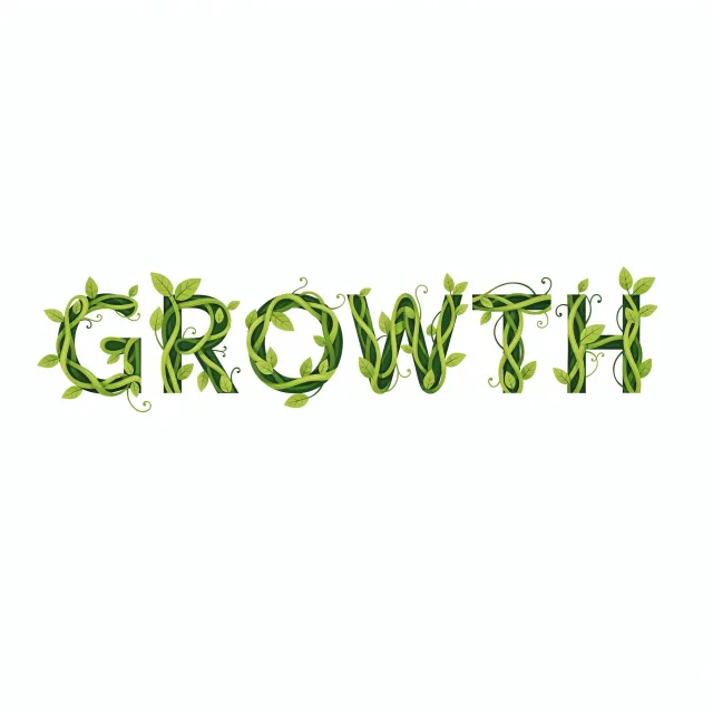
- Prompt adherence 8
- Technical quality 9
- Artistic merit 8
- Detail execution 8
- Realism & coherence 8
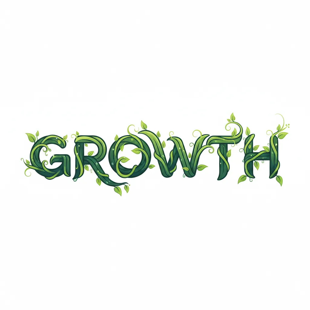
Clean flat-vector GROWTH lettering with dark green structural strokes wrapped in lime-green vines, pointed leaves, and curling tendrils on white.
Ranked 4th of 12, this is one of the most usable and technically polished graphic designs. Its visible conventional letter scaffolding makes the conceptual synthesis less complete than the higher-ranked examples.

- Prompt adherence 9
- Technical quality 7
- Artistic merit 8
- Detail execution 7
- Realism & coherence 7
Flowing uppercase GROWTH lettering composed of glossy green vine strands, scattered leaves, and numerous curling tendrils.
Ranked 6th of 13 for an expressive and largely faithful interpretation. Crowded crossings and less controlled finishing separate it from the excellent entries.

- Prompt adherence 9
- Technical quality 8
- Artistic merit 7
- Detail execution 7
- Realism & coherence 7
GROWTH is spelled in bright green intertwined vine strokes, decorated with simple leaves and curled terminals on a plain white background.
This is a successful, readable interpretation with strong prompt fidelity. It falls below the leaders mainly because of its comparatively generic finish and simplified botanical detail.

- Prompt adherence 7
- Technical quality 8
- Artistic merit 8
- Detail execution 8
- Realism & coherence 7
An ornate botanical GROWTH illustration with varied foliage, a wreath-like O, cross-braced final letters, and a small descriptive caption below.
Ranked 6th of 12, this has strong botanical craftsmanship and considerable aesthetic appeal. Its mixed approach to letter construction makes it less conceptually consistent than the image immediately above it.

- Prompt adherence 9
- Technical quality 8
- Artistic merit 7
- Detail execution 7
- Realism & coherence 7
Bold uppercase GROWTH composed of dark-outlined bundles of green vines with small leaves and numerous spiral tendrils on white.
Ranked 5th of 12, this succeeds through strong legibility and direct vine-based construction. Mechanical bundling and repetitive detailing prevent it from reaching the polish or inventiveness of the leading group.

- Prompt adherence 8
- Technical quality 8
- Artistic merit 7
- Detail execution 7
- Realism & coherence 7
Tall uppercase GROWTH lettering densely covered in green ivy-like leaves, with scattered peripheral foliage on white.
Rank 6 of 13: readable, attractive, and substantially faithful to the prompt. Repetitive foliage and obscured vine construction keep it below the more thoughtfully integrated designs.

- Prompt adherence 8
- Technical quality 7
- Artistic merit 7
- Detail execution 7
- Realism & coherence 7
GROWTH is spelled in thick bundles of pointed green leaves, with leafy shoots extending above and below the letters and soft shadows on white.
This is a strong, readable middle-tier result with an effective botanical message. Greater variation and clearer vine structure would bring it closer to the leading designs.

- Prompt adherence 8
- Technical quality 6
- Artistic merit 7
- Detail execution 7
- Realism & coherence 6
Large decorative GROWTH lettering made from dark green vine-like strokes, pale foliage, sweeping curls, and offset gray shadows.
Ranked 9th of 13 for a recognizable but overcomplicated interpretation. Inconsistent stroke endings, crowded ornamentation, and weak visual hierarchy outweigh its decorative richness.

- Prompt adherence 6
- Technical quality 8
- Artistic merit 6
- Detail execution 7
- Realism & coherence 8
Bold dark-green GROWTH lettering wrapped with lime-green vines and scattered leaves on a spacious white background.
Rank 9 of 13: technically clean and readable, but only partially successful at the prompt's central conceptual challenge. Decorative wrapping cannot fully substitute for letters constructed from vines.
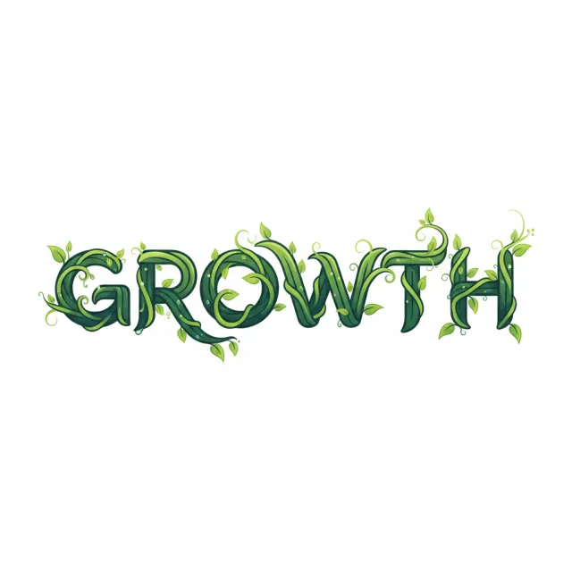
- Prompt adherence 8
- Technical quality 7
- Artistic merit 6
- Detail execution 6
- Realism & coherence 6
The word GROWTH appears in dark-outlined green ribbon-like plant lettering, with scattered leaves and curled shoots on white.
This is a competent and readable interpretation with a clear graphic identity. Its somewhat mechanical ribbon construction and uneven fine-detail finish keep it below the more convincing vine-based designs.
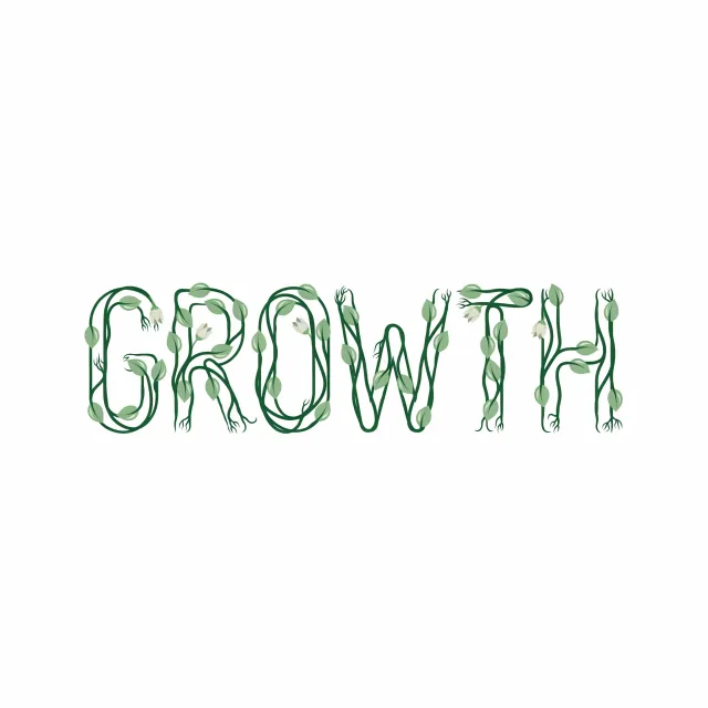
- Prompt adherence 9
- Technical quality 7
- Artistic merit 6
- Detail execution 6
- Realism & coherence 6
Thin green vine outlines spell GROWTH, accompanied by pale leaves, small cream flowers, and forked stem tips on white.
Rank 7 of 13: conceptually successful, but comparatively modest in visual presence and finishing. Simplified botanical details and inconsistent stem continuity limit its overall quality.
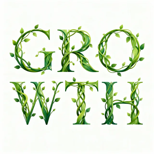
- Prompt adherence 7
- Technical quality 7
- Artistic merit 6
- Detail execution 7
- Realism & coherence 7
Green serif letters spell GRO above WTH, with winding vines and scattered leaves integrated into the strokes on a white background.
This is technically competent and correctly spelled, but the concept is less fully integrated than in the strongest images. The conventional letter skeleton and split layout reduce its effectiveness as a cohesive vine-grown wordmark.

- Prompt adherence 5
- Technical quality 9
- Artistic merit 7
- Detail execution 7
- Realism & coherence 8
Tall serif GROWTH typography with a lime-to-dark-green gradient, thin curling vines, and a softly green-tinted background.
Rank 10 of 13: polished conventional typography with attractive plant decoration. Missing the key requirement that vines form the letters substantially reduces its otherwise strong technical standing.

- Prompt adherence 8
- Technical quality 7
- Artistic merit 6
- Detail execution 6
- Realism & coherence 7
Thin outlined vine letters spelling GROWTH, with oversized pointed terminal leaves and small circular buds in muted greens on white.
Ranked 9th of 12, this is a readable and distinctive interpretation with competent rendering. Uneven visual weight and awkward terminal treatments keep it from feeling fully resolved as typography.

- Prompt adherence 9
- Technical quality 7
- Artistic merit 6
- Detail execution 6
- Realism & coherence 6
GROWTH arranged from green leafy letter forms wrapped in pale curling stems, with soft shadows on an off-white surface.
Ranked 8th of 13 for strong conceptual adherence but average execution. Simplified surfaces, uneven letter construction, and unresolved stem junctions limit its professional finish.

- Prompt adherence 6
- Technical quality 8
- Artistic merit 8
- Detail execution 7
- Realism & coherence 7
Lowercase growth is formed from broad, shaded green ribbons with small leaves and pale flowers against a softly tinted cream-green background.
The image is polished and aesthetically appealing but only partially realizes the requested construction. Its ribbon-based lettering and nonwhite backdrop are meaningful disadvantages in this comparison.
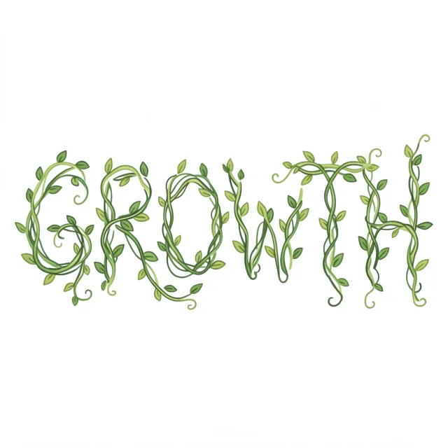
- Prompt adherence 9
- Technical quality 6
- Artistic merit 5
- Detail execution 5
- Realism & coherence 7
Thin intertwined light-green vines with simple leaves spelling GROWTH across a large white field.
Ranked 10th of 13 because it fulfills the concept but offers limited typographic and illustrative polish. Its weaknesses are refinement and visual impact, not missing subject matter.
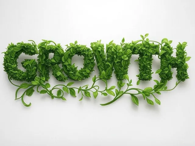
- Prompt adherence 8
- Technical quality 6
- Artistic merit 7
- Detail execution 6
- Realism & coherence 6
Thick leafy GROWTH lettering with curling green vines extending beneath it, presented on a softly shaded white surface.
Rank 8 of 13: a recognizable and appealing interpretation with useful decorative movement. Soft foliage rendering and heavy letter masses prevent a more polished result.
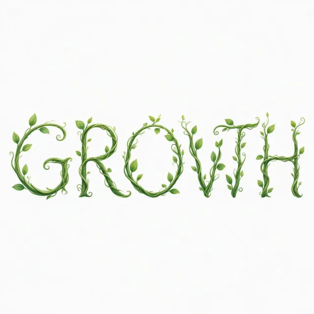
- Prompt adherence 4
- Technical quality 7
- Artistic merit 6
- Detail execution 6
- Realism & coherence 7
Thin green vine lettering with sparse leaves and curls sits on white; the fourth character resembles a V more than a clear W.
This is visually clean but weakened by a consequential letterform problem. The ambiguous W prevents its otherwise appropriate styling from becoming a fully successful response.
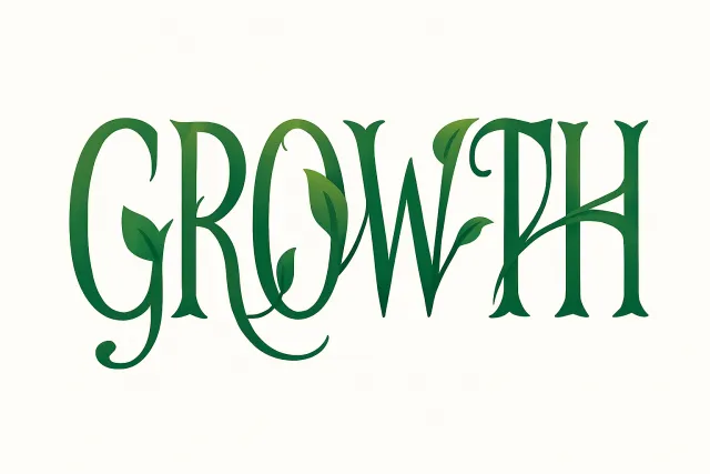
- Prompt adherence 5
- Technical quality 9
- Artistic merit 7
- Detail execution 6
- Realism & coherence 8
Tall dark-green decorative serif lettering spelling GROWTH, with a few integrated leaves and curved extensions on warm white.
Ranked 11th of 13 because the central conceptual requirement is substantially underdeveloped. Excellent contour rendering cannot compensate for presenting decorated typography instead of vine-built letters.

- Prompt adherence 4
- Technical quality 8
- Artistic merit 6
- Detail execution 8
- Realism & coherence 8
Bold moss-covered GROWTH lettering surrounded by loose leafy vines in a photographic-style arrangement on white.
Ranked 12th of 13 because it misses the prompt's defining creative requirement despite competent rendering. The vines surround the word instead of becoming its letters.

- Prompt adherence 8
- Technical quality 5
- Artistic merit 5
- Detail execution 5
- Realism & coherence 6
Thin lime-green cartoon vines and small leaves form uppercase GROWTH, centered within a large white field.
Ranked 11th of 12, this fulfills the literal concept but has one of the least finished executions. Uneven joins, stray marks, and rudimentary foliage outweigh its successful spelling and relevant imagery.

- Prompt adherence 5
- Technical quality 6
- Artistic merit 5
- Detail execution 5
- Realism & coherence 6
Lowercase growth rendered as angular dark-green sculpted frames wrapped in thin vines and sparse oval leaves, with soft shadows on white.
Rank 12 of 13: readable and reasonably coherent, but weak at the central vine-forming-typography requirement. The heavy geometric framework feels more like a decorated object than organic lettering.

- Prompt adherence 5
- Technical quality 7
- Artistic merit 6
- Detail execution 7
- Realism & coherence 6
Glossy dark-green dimensional Growth lettering decorated with realistic leaves and looping vines, casting soft shadows on white.
Ranked 10th of 12, this is reasonably polished but misses the prompt's main conceptual challenge. Decorative foliage around an existing font is materially weaker than plants constructing the typography.
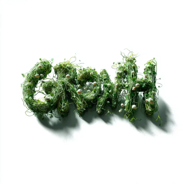
- Prompt adherence 6
- Technical quality 5
- Artistic merit 6
- Detail execution 5
- Realism & coherence 5
A three-dimensional GROWTH-like vine sculpture made from tangled green strands, small leaves, and pale bulbous growths, casting strong shadows on white.
Rank 11 of 13: an inventive attempt at genuinely plant-built lettering. Reduced legibility and unresolved tangling outweigh its sculptural interest.

- Prompt adherence 5
- Technical quality 7
- Artistic merit 6
- Detail execution 8
- Realism & coherence 6
Leafy plants trained into GROWTH stand on thin vertical stakes above a dense garden foreground, with a pale white background.
This is an interesting botanical scene but a substantially off-brief graphic-design solution. Its environmental realism does not compensate for the departure from stylized vines on a clean white field.

- Prompt adherence 3
- Technical quality 8
- Artistic merit 8
- Detail execution 8
- Realism & coherence 7
Deeply extruded, leaf-covered letterforms recede diagonally across a pale textured surface, surrounded by long curling green tendrils.
This is an impressive decorative rendering but a weak solution to the typography task. Unreliable recognition of the requested word outweighs its substantial visual polish.

- Prompt adherence 3
- Technical quality 7
- Artistic merit 5
- Detail execution 7
- Realism & coherence 6
Two rows of mossy green block lettering with curling vines; the upper row reads GOWTH and the lower row reads GRWTH.
Rank 13 of 13: the repeated spelling failures defeat the image's primary purpose. Competent plant rendering cannot compensate for never producing the requested word.

- Prompt adherence 2
- Technical quality 6
- Artistic merit 4
- Detail execution 5
- Realism & coherence 5
Dense masses of small green leaves form a large G and several ambiguous letter-like shapes, with detached botanical sprigs on a pale background.
This is the weakest result because it fails to present the requested word coherently. Its partial botanical realism cannot compensate for the missing typographic structure.