- Prompt adherence 9
- Technical quality 9
- Artistic merit 9
- Detail execution 8
- Realism & coherence 9
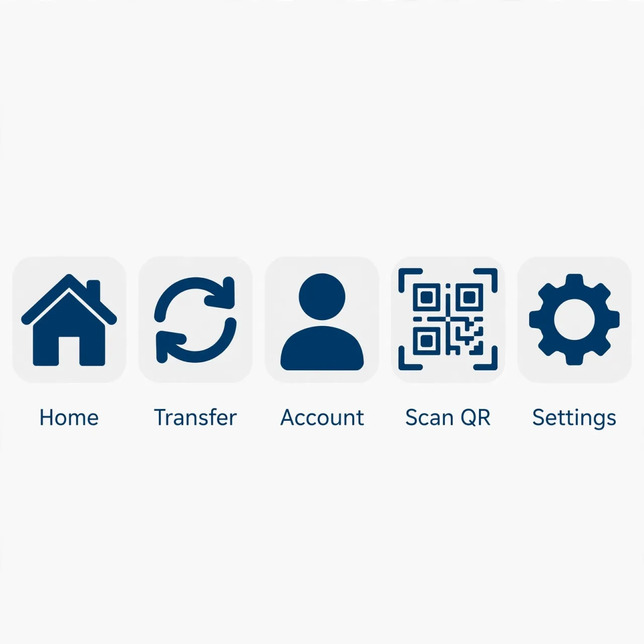
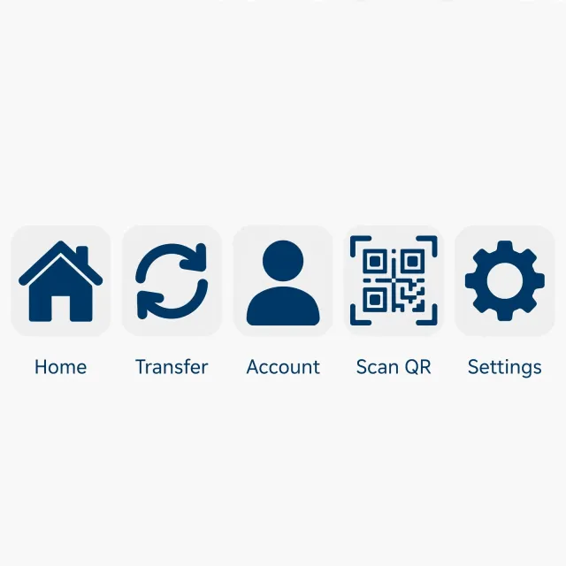
Five dark-blue icons on pale rounded-square tiles, labeled Home, Transfer, Account, Scan QR, and Settings, using bold silhouettes and a detailed QR motif.
Ranks 2nd of 12 as the strongest filled-icon family and a highly polished interface-ready result. Slightly generic transfer imagery and a busier QR interior leave the leading outline set with the advantage.

- Prompt adherence 10
- Technical quality 9
- Artistic merit 9
- Detail execution 9
- Realism & coherence 9
Five labeled dark-blue outline icons in one row: a house, opposing horizontal arrows, a user profile, QR finder squares within scan brackets, and a gear.
Ranks 1st of 12 for the clearest concept mapping and most consistent execution. A small optical-size adjustment across the house, avatar, and gear would bring this already professional set closer to flawless.

- Prompt adherence 10
- Technical quality 9
- Artistic merit 9
- Detail execution 9
- Realism & coherence 10
Five clean dark-blue outline icons in a horizontal row on white, with correctly labeled Home, Transfer, Account, Scan QR, and Settings symbols.
Rank 1 of 13: the strongest combination of prompt fidelity, semantic clarity, and polished stylistic consistency. Minor optical refinements are possible, but there are no substantial defects in the delivered five-icon set.

- Prompt adherence 9
- Technical quality 9
- Artistic merit 8
- Detail execution 9
- Realism & coherence 9
Five evenly spaced navy outline icons on an off-white background, showing a house, opposing arrows, user, detailed QR scanner, and gear with matching labels.
Rank 2 of 13: an excellent and nearly production-ready match to the prompt. It narrowly trails the best image through slightly heavier QR detailing and less refined optical balance.
- Prompt adherence 9
- Technical quality 9
- Artistic merit 9
- Detail execution 9
- Realism & coherence 9
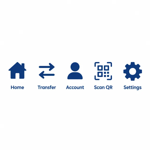
Five labeled dark-blue icons—a house, bidirectional arrows, user silhouette, QR scanner, and gear—are evenly arranged on white.
This offers the strongest overall balance of clear semantics, consistency, and near-professional execution. Only subtle fill variation keeps it from a flawless score.

- Prompt adherence 9
- Technical quality 9
- Artistic merit 9
- Detail execution 8
- Realism & coherence 9
Five labeled dark-blue outline icons show a house, transfer arrows, user, simplified QR scanner, and gear on a very pale blue background.
This joins the leading result through exceptional stylistic cohesion and clean flat execution. Its only meaningful limitation is the highly simplified QR interior, which remains recognizable at icon scale.
- Prompt adherence 9
- Technical quality 9
- Artistic merit 8
- Detail execution 8
- Realism & coherence 9
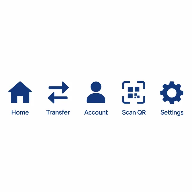
A labeled row of five solid blue navigation icons includes a house, opposing arrows, person, simplified block-based QR scanner, and gear.
This is an excellent clean set that closely approaches the leading image. Less-specific QR detailing and small optical-weight differences keep it one tier lower.
- Prompt adherence 8
- Technical quality 8
- Artistic merit 7
- Detail execution 8
- Realism & coherence 9
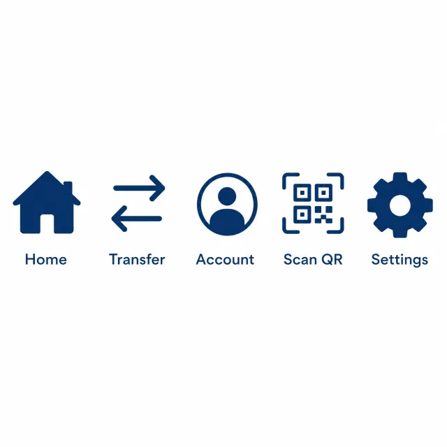
A horizontal row of five labeled navy icons: a filled house, opposing transfer arrows, a user inside a circle, a bracketed QR pattern, and a filled gear.
Rank 5 of 13: a strong, complete set with excellent semantic clarity and practical organization. Minor tonal and weight inconsistencies prevent it from matching the most cohesive outline designs.

- Prompt adherence 9
- Technical quality 9
- Artistic merit 8
- Detail execution 8
- Realism & coherence 9
Five labeled dark-blue icons arranged three above two on a warm off-white background, using bold outlines and a circular account avatar.
Ranks third, with excellent coverage and clean execution. Small differences in scale, framing, and detail density keep it below the two most disciplined icon families.

- Prompt adherence 9
- Technical quality 9
- Artistic merit 8
- Detail execution 8
- Realism & coherence 8
Five dark-blue outline symbols inside circular badges, arranged around a central account-and-shield icon, with no text labels.
Ranks fourth, distinguished by clean execution and strong circular-frame consistency. Slight badge-size variation and secondary meanings in two symbols prevent a higher placement.

- Prompt adherence 9
- Technical quality 9
- Artistic merit 8
- Detail execution 8
- Realism & coherence 9
Five flat navy symbols form a centered horizontal row on white: a house, opposing arrows, payment card, framed QR symbol, and gear.
This is one of the strongest flat, monochrome interpretations, particularly in silhouette cleanliness. Slight optical imbalance and the less-specific Account metaphor leave some room below the leading results.
- Prompt adherence 9
- Technical quality 8
- Artistic merit 8
- Detail execution 7
- Realism & coherence 8
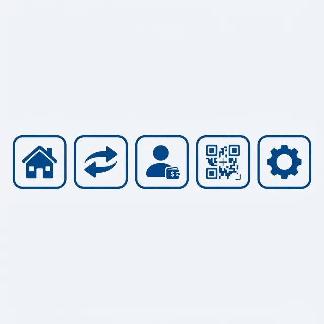
Five dark-blue icons inside matching rounded-square outlines: a house, opposing curved arrows, a user with a wallet, a QR motif, and a solid gear.
Ranks 5th of 12 as a strong, complete, and readily usable icon family. It falls behind the leaders mainly because its account and QR interiors are less restrained and precisely normalized.
- Prompt adherence 8
- Technical quality 9
- Artistic merit 7
- Detail execution 8
- Realism & coherence 8
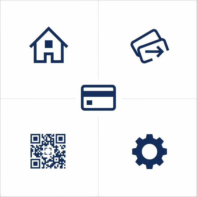
Five flat navy symbols arranged in four quadrants around a central bank card, with thin gray dividing lines and no labels.
Ranks fifth, with strong technical execution and complete concept coverage. Its mixed construction methods and diagram-like presentation keep it behind the more cohesive leading families.
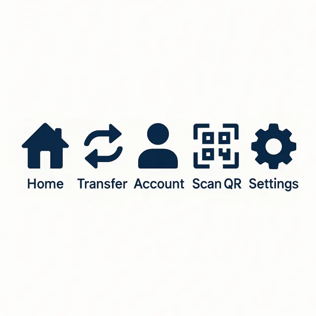
- Prompt adherence 9
- Technical quality 8
- Artistic merit 8
- Detail execution 8
- Realism & coherence 8
A horizontal row of five dark-blue symbols shows a house, opposing curved arrows, a person, a framed QR motif, and a gear, with matching labels on white.
This is an excellent, complete interpretation with strong semantic clarity. Minor shading, spacing differences, and uneven visual density place it below the most polished examples.
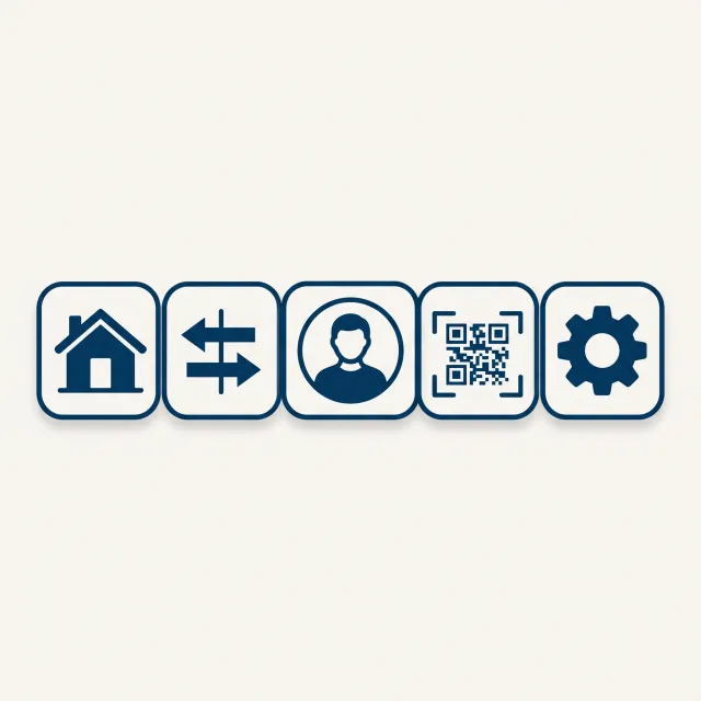
- Prompt adherence 7
- Technical quality 8
- Artistic merit 7
- Detail execution 7
- Realism & coherence 7
Five unlabeled navy icons sit inside adjacent rounded-square frames with drop shadows: a house, opposing arrows, portrait, QR code, and gear.
This is a competent, largely consistent set with clear concept coverage. Added depth effects and mildly uneven tile proportions keep it below the cleaner flat examples.
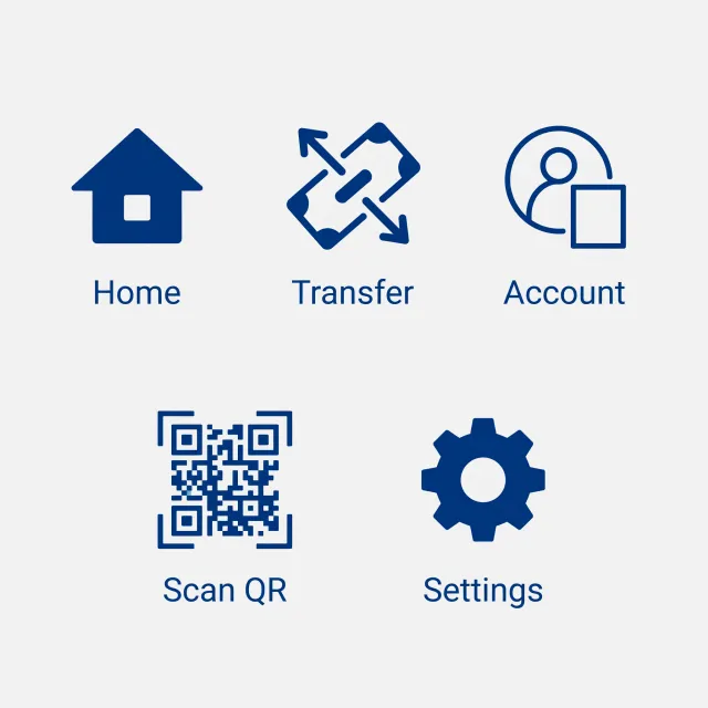
- Prompt adherence 8
- Technical quality 8
- Artistic merit 7
- Detail execution 7
- Realism & coherence 8
Five dark-blue labeled icons on a light background: a solid house, diagonal banknote with transfer arrows, account figure with a device, detailed QR scanner, and solid gear.
Rank 6 of 13: a complete and clearly usable interpretation of the prompt. It falls behind the strongest entries primarily because the five symbols do not share a sufficiently consistent construction style.

- Prompt adherence 8
- Technical quality 8
- Artistic merit 7
- Detail execution 6
- Realism & coherence 8
Five small navy icons in rounded-square borders, showing a house, cash-and-arrow transfer graphic, user silhouette, framed QR motif, and gear.
Ranks 6th of 12, with complete concept coverage and a coherent container system. Its crowded miniature details and uneven internal complexity hold it below the more polished leading sets.

- Prompt adherence 8
- Technical quality 8
- Artistic merit 7
- Detail execution 7
- Realism & coherence 8
Five navy rounded tiles with white pictograms and correct labels, arranged as two large upper tiles and three smaller lower tiles.
Ranks sixth, providing clear and complete banking navigation. Oversized upper tiles, uneven detail density, and subtle dimensional effects prevent the consistency achieved by the higher-ranked sets.

- Prompt adherence 8
- Technical quality 8
- Artistic merit 7
- Detail execution 6
- Realism & coherence 7
Five labeled navy icons arranged three above two: an outlined house, circular arrows, a circular user symbol, a simplified QR scanner, and a solid gear.
Ranks 7th of 12 as a readable and complete set with noticeable construction differences. More specific transfer and QR imagery, together with consistent optical weight, would substantially improve it.

- Prompt adherence 6
- Technical quality 9
- Artistic merit 7
- Detail execution 5
- Realism & coherence 7
Five labeled navy icons sit in faint rounded tiles: a house, opposing arrows, circular profile, generic scanner frame with one central square, and gear.
This is a technically polished near-miss rather than a complete answer to the brief. Missing QR-specific visual information is a major semantic weakness that lowers the overall score despite otherwise strong rendering.

- Prompt adherence 6
- Technical quality 8
- Artistic merit 6
- Detail execution 6
- Realism & coherence 6
Five labeled navy banking illustrations occupy white tiles on a navy field, including a dollar-marked house, money transfer, wallet, diagonally crossed QR graphic, and profile-centered gear.
This is a clear banking-specific presentation with respectable rendering. Ambiguous QR semantics and inconsistent complexity prevent it from matching the simpler, more disciplined icon sets.
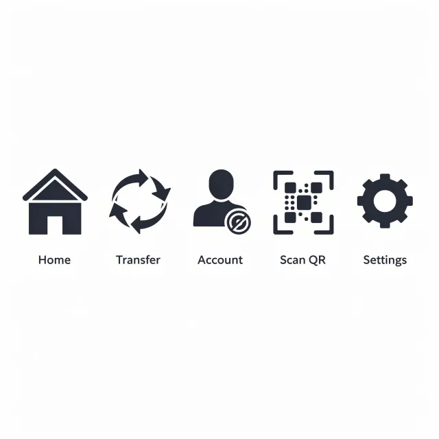
- Prompt adherence 6
- Technical quality 8
- Artistic merit 6
- Detail execution 7
- Realism & coherence 6
Five labeled charcoal-blue icons in a horizontal row, including circular transfer arrows and an account avatar with an additional circular badge.
Ranks seventh, remaining competent but noticeably less disciplined than the stronger sets. Its near-charcoal palette and ambiguous additions weaken otherwise clean rendering and correct item count.

- Prompt adherence 6
- Technical quality 8
- Artistic merit 6
- Detail execution 5
- Realism & coherence 6
Five navy outline icons in a horizontal row, labeled Home, Transfer, Account, Scan QR, and Settings on a pale gray background.
Ranks 8th of 12, with clean presentation but a meaningful weakness in one requested function. It is usable as a starting point, though the QR symbol and family consistency need revision.

- Prompt adherence 6
- Technical quality 6
- Artistic merit 5
- Detail execution 6
- Realism & coherence 6
A small horizontal row of navy house, circular transfer arrows, payment card, QR pattern, and gear appears on gray with soft shadows.
The image delivers the full concept set but only moderately cohesive styling. Soft rendering and dimensional shadows place it below the cleaner flat rows and the sharper framed set.
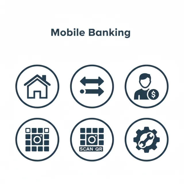
- Prompt adherence 5
- Technical quality 8
- Artistic merit 7
- Detail execution 5
- Realism & coherence 5
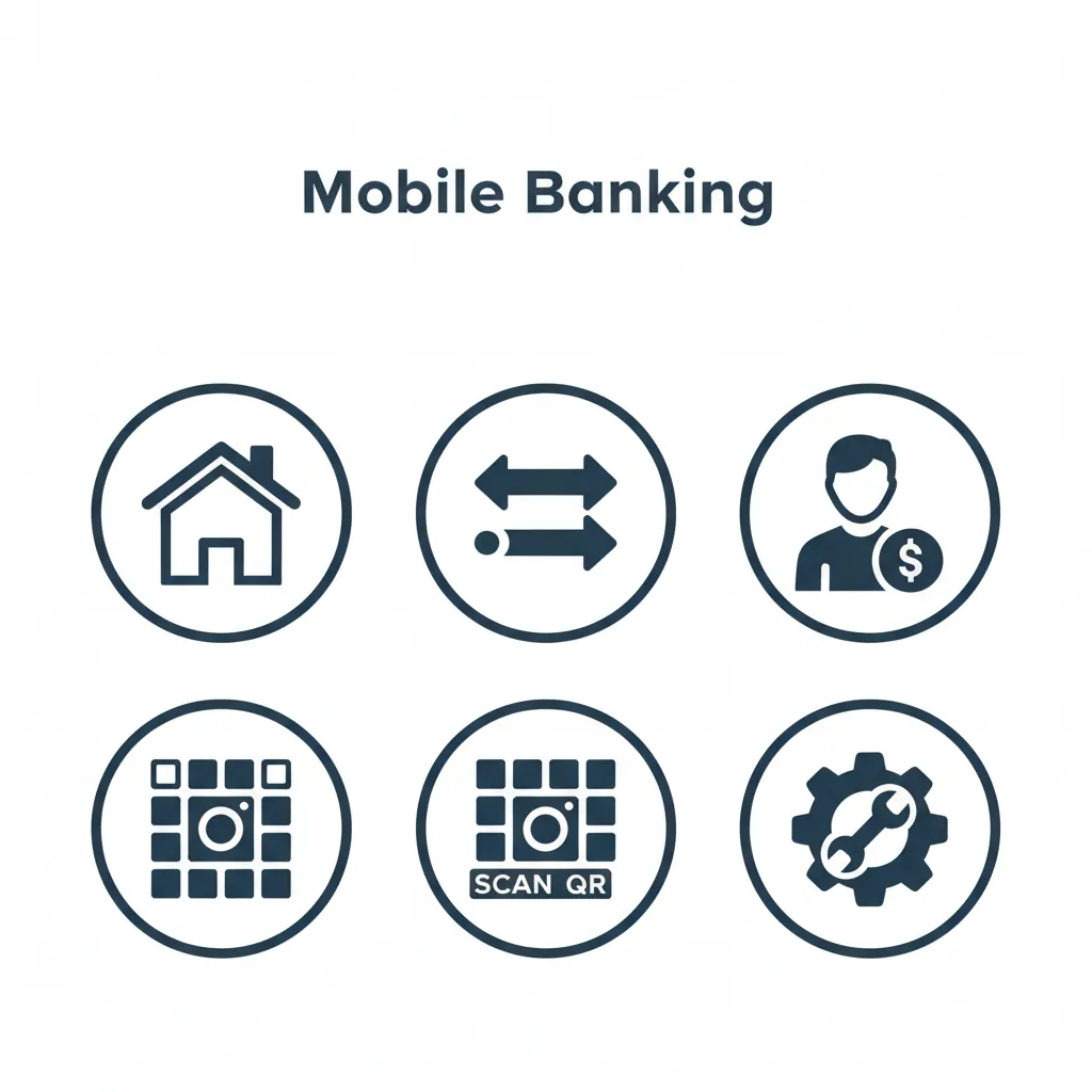
A Mobile Banking heading above six dark-blue circular badges showing a house, arrows, account holder, two camera-like grids, and a gear with a wrench.
Rank 7 of 13: one of the better-organized unsuccessful sets, with strong clarity and palette control. The incorrect count and camera-for-QR substitution remain substantial failures despite the polished presentation.
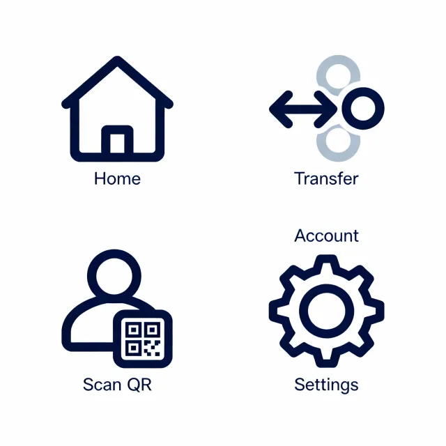
- Prompt adherence 5
- Technical quality 7
- Artistic merit 6
- Detail execution 6
- Realism & coherence 4
Four large icon groups in a two-by-two arrangement: an outlined house, transfer arrows with circular forms, a user with a QR badge, and a gear, accompanied by five labels.
Rank 8 of 13: clean linework and recognizable core shapes make this moderately successful visually. The missing independent Account icon and secondary blue tone keep it below the complete, consistent sets.

- Prompt adherence 5
- Technical quality 7
- Artistic merit 6
- Detail execution 5
- Realism & coherence 5
Six dark blue-teal icons in a two-row grid: a house, crossed directional arrows, a suited avatar, two different QR graphics, and a gear.
Ranks 9th of 12, offering competent rendering but noticeable counting, semantic, and consistency problems. It is stronger than the three-icon submission, yet needs substantial editing to satisfy the exact set.

- Prompt adherence 4
- Technical quality 7
- Artistic merit 5
- Detail execution 4
- Realism & coherence 4
Nine navy icons in a three-by-three grid beneath a banking-design heading, with several duplicated concepts and malformed labels.
Ranks eighth, benefiting from clean large shapes and a recognizable banking theme. The wrong item count, duplicated concepts, and malformed captions are substantial failures for a concise consistent icon-set brief.
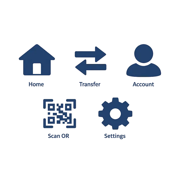
- Prompt adherence 5
- Technical quality 4
- Artistic merit 3
- Detail execution 5
- Realism & coherence 6
Five dark-blue banking icons and labels are arranged in a three-over-two layout against a dark, heavily vignetted blue-gray background.
Complete concept coverage is undermined by severe presentation problems. Poor contrast and non-flat rendering outweigh the correct labels and recognizable symbols.
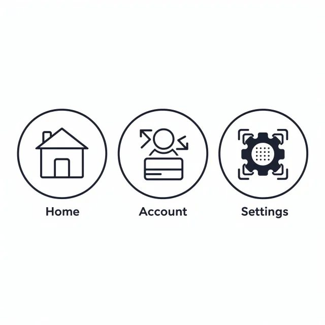
- Prompt adherence 4
- Technical quality 8
- Artistic merit 6
- Detail execution 5
- Realism & coherence 4
Three large circular navy badges labeled Home, Account, and Settings; the latter two combine banking, transfer, and scanning motifs.
Ranks 10th of 12 despite its clean rendering because two of five requested functions lack separate icons. Its strongest qualities are presentation and edge quality, not completeness or functional clarity.
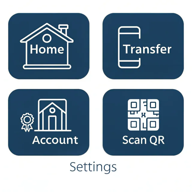
- Prompt adherence 3
- Technical quality 7
- Artistic merit 5
- Detail execution 4
- Realism & coherence 4
Four rounded dark-blue tiles contain cream-colored Home, Transfer, Account, and Scan QR graphics. Settings appears only as standalone text below the tiles.
The rendering is readable, but this does not function as a complete five-icon set. The missing Settings symbol and weak Transfer and Account mappings outweigh its acceptable visual finish.

- Prompt adherence 4
- Technical quality 6
- Artistic merit 4
- Detail execution 5
- Realism & coherence 4
Five navy glyphs on a pale background: a house, bank building, QR tile, overlapping payment card, and gear containing a clock, with four labels.
Rank 9 of 13: closer to the requested count and palette than several weaker entries. Incorrect labeling and overlapping assets nevertheless prevent it from working as a coherent five-function set.
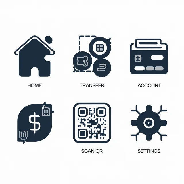
- Prompt adherence 4
- Technical quality 6
- Artistic merit 5
- Detail execution 4
- Realism & coherence 4
Six navy-and-gray graphics in a two-row grid: a house, composite transfer emblem, card, dollar symbol, QR motif, and radial settings hub.
Ranks ninth, with readable captions and some competent large-shape rendering. An extra icon, ambiguous functional metaphors, and inconsistent detail levels make the set substantially less useful than the middle-ranked alternatives.
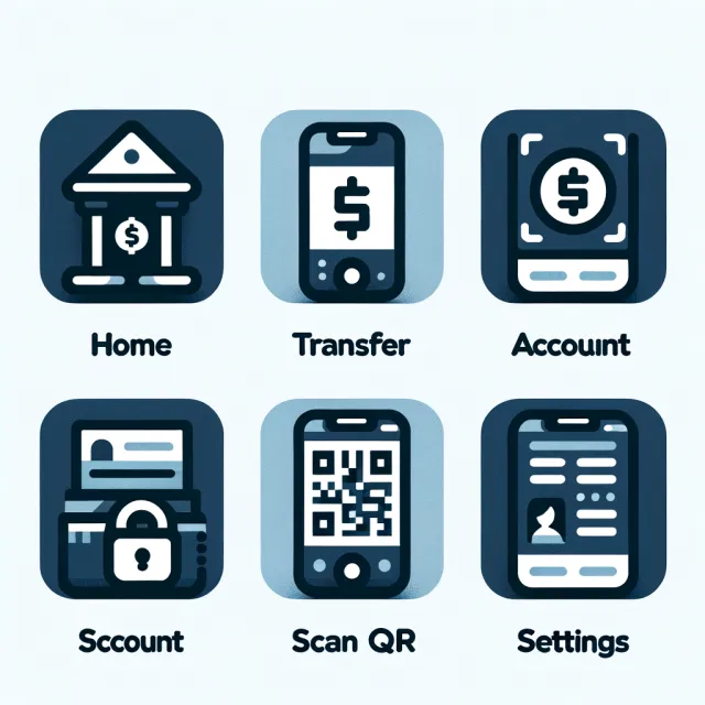
- Prompt adherence 4
- Technical quality 6
- Artistic merit 5
- Detail execution 4
- Realism & coherence 4
Six rounded banking-themed tiles arranged in two rows, using navy, pale blue, white, textured fills, and labels including a misspelled extra Account label.
Rank 10 of 13: visually organized, but substantially compromised by the extra icon, misspelling, and weak functional metaphors. Its color and surface treatment also fall short of the requested restrained flat style.

- Prompt adherence 3
- Technical quality 6
- Artistic merit 5
- Detail execution 4
- Realism & coherence 4
Six light-cyan outline graphics on a dark navy background, including a house, several card or device shapes, a framed gear, and a dense QR graphic.
Ranks tenth, offering a visually tidy dark-interface concept but weak adherence to the requested set. The wrong foreground color, extra item, and missing clear transfer function outweigh its reasonably clean outlines.

- Prompt adherence 2
- Technical quality 6
- Artistic merit 4
- Detail execution 3
- Realism & coherence 3
Four white rounded tiles on a navy background, with two Transfer labels, a scanning graphic, a QR code labeled Settings, and a garbled heading.
Ranks eleventh, despite reasonably crisp card containers. The wrong item count, duplicated function, and missing or mislabeled banking actions are fundamental failures.
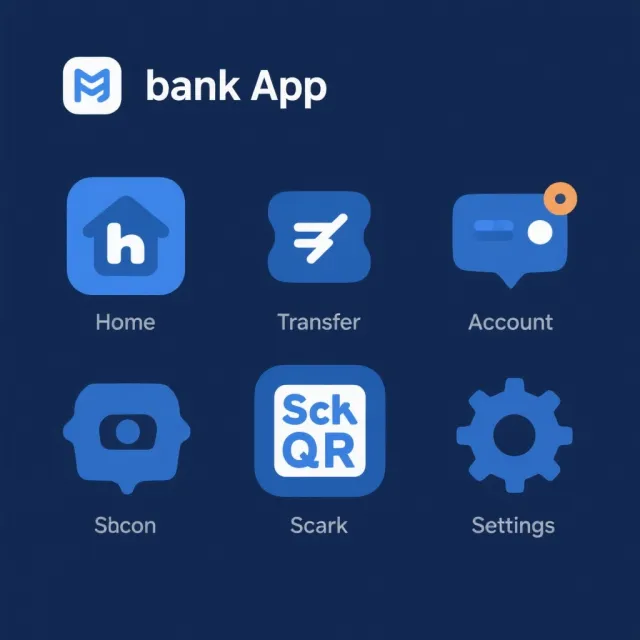
- Prompt adherence 2
- Technical quality 6
- Artistic merit 4
- Detail execution 2
- Realism & coherence 3
A banking-app header sits above six blue icon graphics on a navy background, including an orange notification badge and several malformed labels.
The image retains a recognizable banking-app theme but violates multiple core requirements. Wrong count, extra colors, ambiguous symbols, and broken labels make it one of the weakest results.
- Prompt adherence 3
- Technical quality 4
- Artistic merit 3
- Detail execution 3
- Realism & coherence 3
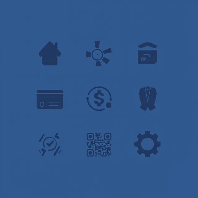
Nine dark navy symbols arranged in a three-by-three grid on a medium-blue background, including a house, card, dollar arrows, QR motif, suit, and gear.
Ranks 11th of 12 because the wrong item count, ambiguous symbols, and poor contrast substantially undermine the request. It retains some banking associations but is not a successful five-icon set.
- Prompt adherence 2
- Technical quality 8
- Artistic merit 6
- Detail execution 6
- Realism & coherence 5
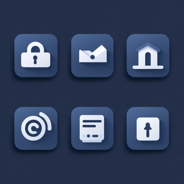
Six blue, shadowed rounded tiles on a dark background, carrying white symbols resembling a lock, envelope, building, spiral, document, and upward arrow.
Rank 11 of 13: strong rendering cannot compensate for delivering largely the wrong icon collection. It ranks above the more muddled lower entries through visual polish, not successful prompt fulfillment.

- Prompt adherence 2
- Technical quality 5
- Artistic merit 4
- Detail execution 3
- Realism & coherence 3
Multiple pale tiles and two phone-shaped frames containing navy person, document, badge, house, box, and light symbols, with several mismatched or malformed labels.
Rank 12 of 13: a banking-adjacent assortment rather than a usable five-icon set. Incorrect meanings, excessive elements, and weak presentation place it below the more polished but still noncompliant tile collection.
- Prompt adherence 2
- Technical quality 4
- Artistic merit 4
- Detail execution 3
- Realism & coherence 3
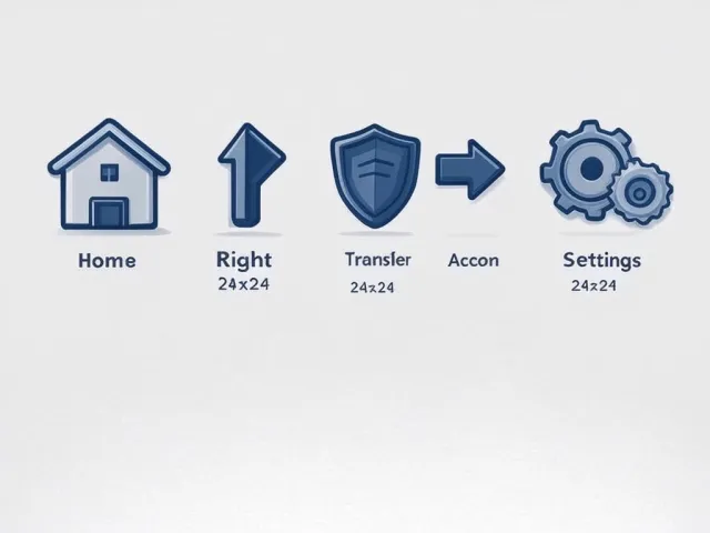
A row of five shaded blue illustrations on a pale background: a house, bent arrow, shield, right arrow, and paired gears, with inconsistent captions and size annotations.
Ranks twelfth, with only Home and Settings convincingly represented. Missing scanning functionality, incorrect visual metaphors, and non-flat styling make it a poor match despite its coordinated palette.
- Prompt adherence 2
- Technical quality 5
- Artistic merit 4
- Detail execution 2
- Realism & coherence 2
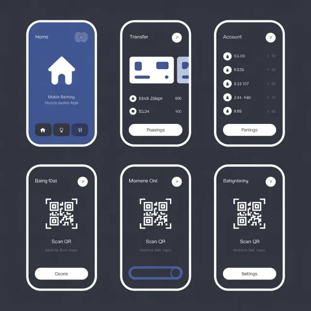
Six rounded phone-screen mockups on charcoal show Home, Transfer, Account, and three repeated QR screens, with numerous garbled interface strings.
This is the weakest match to the requested deliverable despite its orderly framing. Fundamental format and concept failures, compounded by extensive text artifacts, prevent it from functioning as the specified icon set.