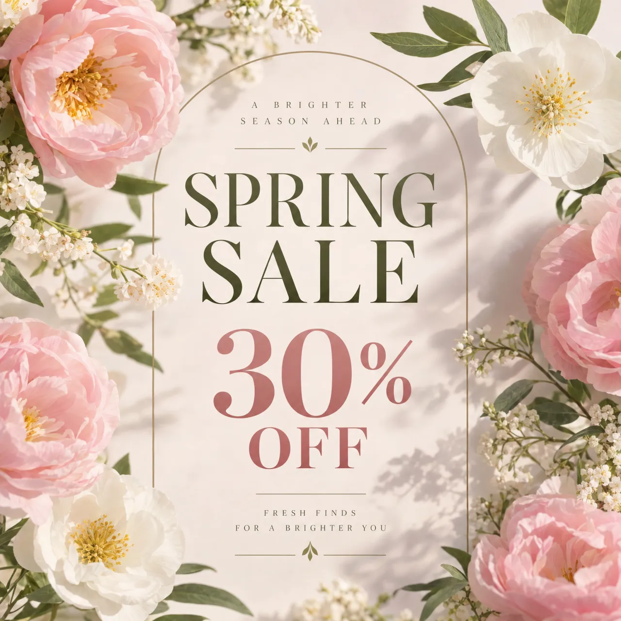
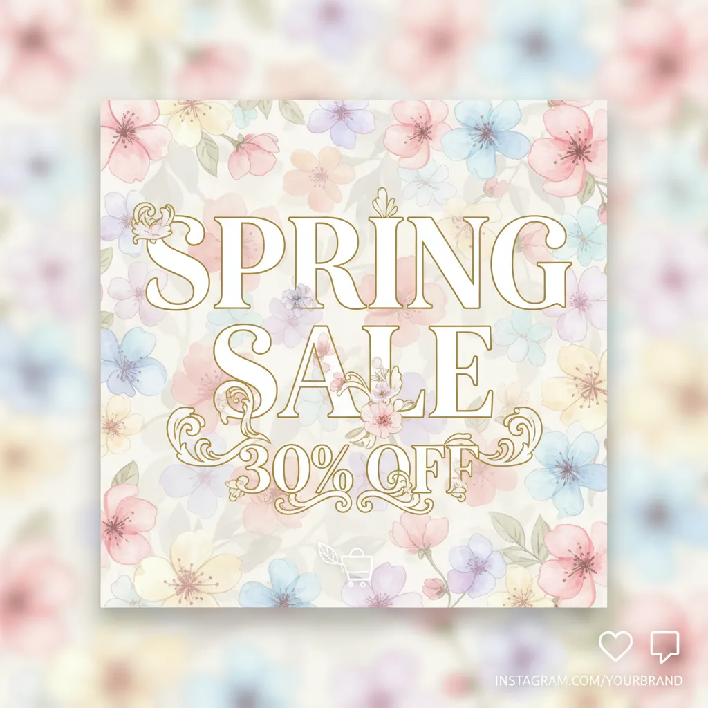
- Prompt adherence 9
- Technical quality 9
- Artistic merit 10
- Detail execution 9
- Realism & coherence 9
Pink and white flowers surround a thin gold arch on a warm cream background, with olive serif sale lettering, a large rose-colored discount, and small seasonal slogans.
A close second, with outstanding photographic art direction and a clear, elegant sale hierarchy. It falls slightly behind the leading image's more direct brief execution and consistently resolved illustrated detail.
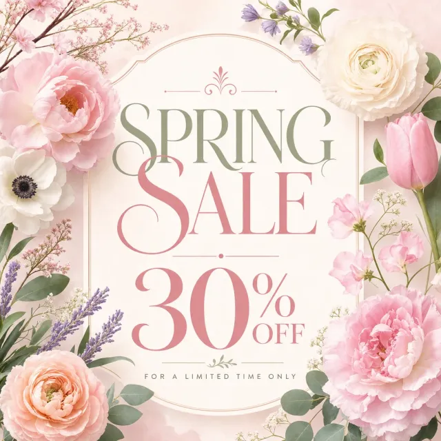
- Prompt adherence 9
- Technical quality 8
- Artistic merit 9
- Detail execution 9
- Realism & coherence 9
Naturalistic pink, peach, cream, and lavender flowers frame an ornate cream plaque with sage and rose serif lettering, a large discount, and a limited-time footer.
Ranked 2nd of 12, this combines excellent floral rendering with distinctive, professionally composed typography. Minor headline overlap and small secondary copy keep it just behind the cleaner top-ranked design.

- Prompt adherence 10
- Technical quality 9
- Artistic merit 9
- Detail execution 9
- Realism & coherence 10
A cream-paper graphic framed by pastel watercolor flowers, with sage-green 'SPRING,' pink 'SALE,' lavender '30% OFF,' and gold botanical dividers.
The strongest overall match, combining exact copy, integrated serif typography, and beautifully controlled pastel botanical illustration. Its slight contrast imbalance is the main reservation keeping it below a flawless 10.

- Prompt adherence 10
- Technical quality 9
- Artistic merit 9
- Detail execution 9
- Realism & coherence 9
A pastel floral graphic with pink peonies and tulips, lavender accents, and large olive-and-rose serif lettering on textured cream paper.
Ranks second and is the strongest literal interpretation of the prompt. It is exceptionally clear and cohesive, with slightly less atmospheric distinction than the first-ranked design.

- Prompt adherence 9
- Technical quality 9
- Artistic merit 9
- Detail execution 9
- Realism & coherence 9
A pale watercolor advertisement with pink and white corner bouquets, lavender sprigs, centered serif sale text, additional promotional copy, and an outlined SHOP NOW button.
A near-professional watercolor advertisement with correct wording, excellent spacing, and a cohesive palette. It ranks just behind the leading designs because the offer and call to action are slightly less visually forceful.
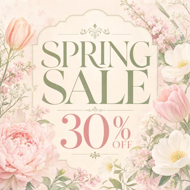
- Prompt adherence 9
- Technical quality 8
- Artistic merit 8
- Detail execution 9
- Realism & coherence 9
A warm ivory, ornamental arched panel contains sage serif 'SPRING SALE' lettering and a pink '30% OFF' offer, framed by delicate tulips, peonies, and white flowers.
Ranked 4th of 13, this is a highly accomplished pastel botanical advertisement. Slightly reduced contrast and the less straightforward discount arrangement keep it just below the strongest layouts.
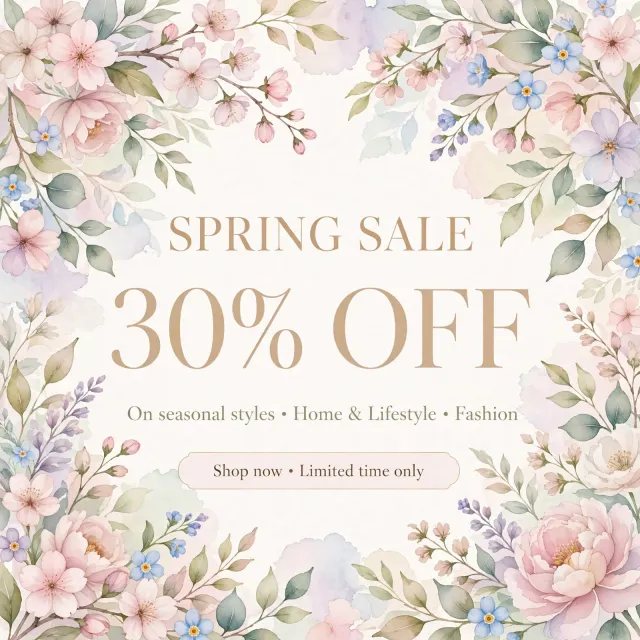
- Prompt adherence 9
- Technical quality 8
- Artistic merit 8
- Detail execution 9
- Realism & coherence 9
A watercolor border of pink blossoms, peonies, blue flowers, and sage foliage surrounds tan serif sale text, a category line, and a rounded promotional callout.
Ranked 5th of 12, this is a polished watercolor promotional graphic with excellent botanical detail. Moderate headline contrast and a comparatively conventional layout keep it below the most distinctive and immediately readable designs.
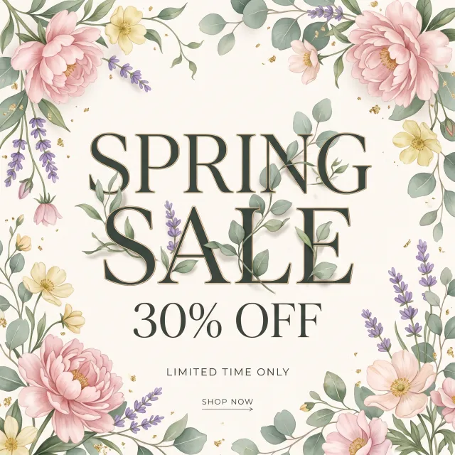
- Prompt adherence 9
- Technical quality 8
- Artistic merit 9
- Detail execution 9
- Realism & coherence 8
Watercolor flowers, lavender, green foliage, and gold flecks frame dark-green, gold-edged serif 'SPRING SALE' lettering, followed by '30% OFF' and a small shopping call to action.
Ranked 3rd of 13, this combines distinctive typographic integration with a complete, readable promotional message. Minor headline occlusion keeps it below the two clearest and most consistently resolved designs.
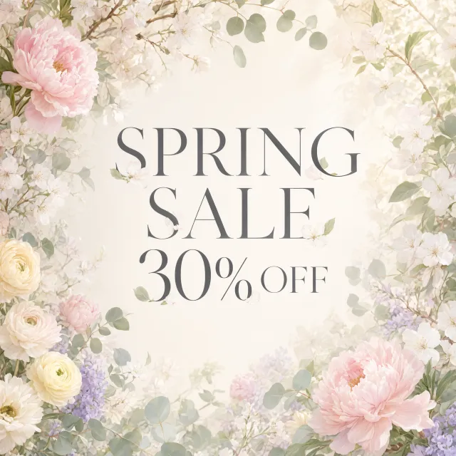
- Prompt adherence 9
- Technical quality 8
- Artistic merit 8
- Detail execution 8
- Realism & coherence 8
A luminous floral border of pink peonies, cream roses, white blossoms, and pale lavender surrounds large gray serif sale lettering.
Ranks sixth as a strong, directly usable interpretation with excellent main-text clarity. Washed-out peripheral details and occasional floral interference with letter edges limit its refinement.
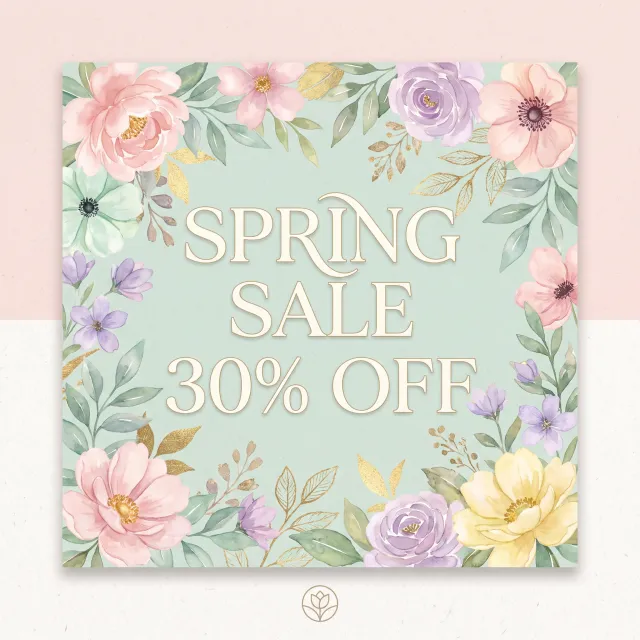
- Prompt adherence 9
- Technical quality 8
- Artistic merit 9
- Detail execution 9
- Realism & coherence 9
A mint-green floral card on a textured blush-and-white background, featuring pastel watercolor flowers, gold foliage, ivory serif sale lettering, and a small botanical emblem below.
One of the stronger illustrated options, with complete copy and an elegant pastel-and-gold treatment. The low-contrast outlined lettering keeps it below the clearest top-tier designs.
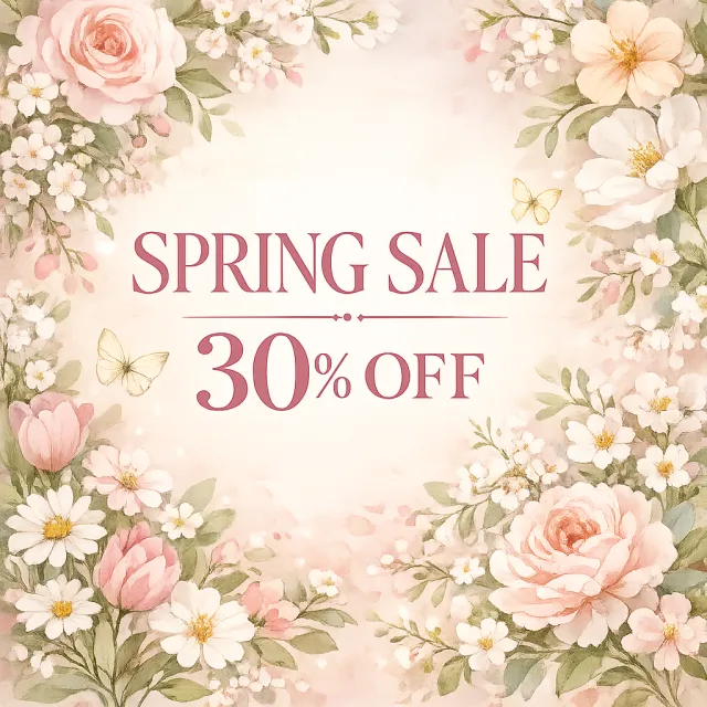
- Prompt adherence 9
- Technical quality 8
- Artistic merit 8
- Detail execution 8
- Realism & coherence 8
An airy watercolor floral frame with roses, tulips, small white flowers, pale butterflies, and rose-red serif sale text.
Ranks fourth for its cohesive palette and graceful floral framing. Delicate text strokes and a familiar decorative treatment keep it below the most polished examples.

- Prompt adherence 9
- Technical quality 7
- Artistic merit 9
- Detail execution 9
- Realism & coherence 8
An ornate gold frame and abundant pastel bouquets surround gilded serif sale lettering on textured ivory, with tiny flowers incorporated into the letters.
Ranked 4th of 12, this stands out for exceptional ornamentation and unusually integrated typography. Low text contrast is the principal limitation preventing its decorative sophistication from translating into a top-tier social post.
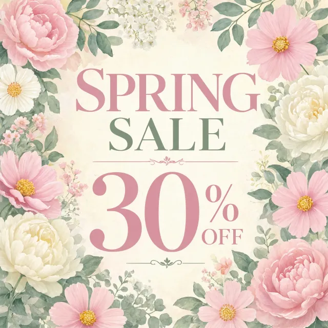
- Prompt adherence 9
- Technical quality 8
- Artistic merit 8
- Detail execution 9
- Realism & coherence 9
A watercolor floral border of pink and ivory blooms surrounds pink-and-sage serif text, with a particularly large 30% discount.
Ranks third for its strong discount hierarchy and well-resolved watercolor florals. Its dense border and very large numerals make it less spacious than the leading designs.
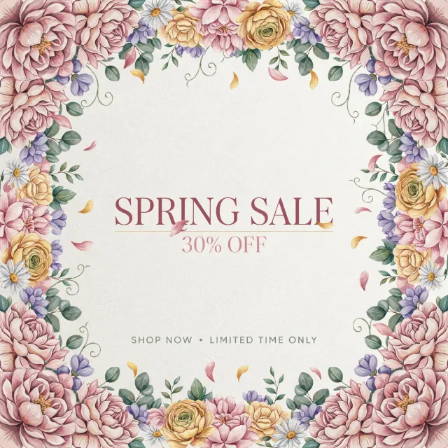
- Prompt adherence 9
- Technical quality 8
- Artistic merit 8
- Detail execution 9
- Realism & coherence 9
An ornate watercolor floral border surrounds a cream center containing rose-colored 'SPRING SALE,' lighter '30% OFF,' and a small SHOP NOW promotional line.
A polished, complete sale graphic with some of the richest botanical detail in the set. Its elaborate frame and comparatively subdued discount keep it behind the more focused leading compositions.

- Prompt adherence 8
- Technical quality 8
- Artistic merit 8
- Detail execution 9
- Realism & coherence 8
A dense, dimensional bouquet of pastel flowers and green foliage surrounds a cream plaque reading 'SPRING SALE 30% OFF' in dark serif lettering.
Ranked 5th of 13, this combines excellent legibility with unusually rich floral detail. Its heavier typography and crowded ornamentation keep it below the more refined top-ranked designs.

- Prompt adherence 8
- Technical quality 8
- Artistic merit 7
- Detail execution 8
- Realism & coherence 7
Dense pastel roses, ranunculus-like flowers, and eucalyptus surround a white square frame containing dark serif sale text and 'SITEWIDE & IN-STORE'.
Ranked 6th of 12, this is a competent, attractive promotional graphic with particularly clear main text. Its dense, redundant floral layering and additional promotional claim prevent it from reaching the strongest tier.

- Prompt adherence 8
- Technical quality 7
- Artistic merit 8
- Detail execution 8
- Realism & coherence 8
An ornate cream plaque sits on a peach-to-lavender background, surrounded by detailed flowers, gold flecks, petals, and decorative serif lettering.
Ranks eighth: rich in decorative detail, but less efficient as a promotional graphic. Lower discount contrast and competing ornamentation weaken an otherwise attractive design.

- Prompt adherence 9
- Technical quality 7
- Artistic merit 7
- Detail execution 7
- Realism & coherence 9
A minimalist cream watercolor graphic with faint pastel flowers along the bottom and upper-right corner, centered gray 'SPRING SALE,' and '30% OFF' beneath.
A clean and faithful interpretation with excellent wording accuracy. Its exceptionally faint florals and restrained visual hierarchy make it less engaging as an Instagram promotion than the higher-ranked designs.

- Prompt adherence 9
- Technical quality 8
- Artistic merit 7
- Detail execution 7
- Realism & coherence 8
Large dark-brown serif text is centered between soft peach flowers, pale yellow blossoms, and sage-green watercolor leaves.
Ranks seventh and is one of the clearest, most straightforward responses. Its conventional typography and comparatively simple floral rendering keep it below the more accomplished designs.

- Prompt adherence 7
- Technical quality 8
- Artistic merit 8
- Detail execution 7
- Realism & coherence 8
Cherry blossoms frame a wooden chair draped with a coral silk scarf, overlaid with ornate white 'Spring Sale 30% off' lettering and a small lifestyle logo and tagline.
An attractive and distinctive advertisement with complete core copy. Its product-focused interpretation, crowded flourishes, and unresolved scarf lettering keep it below the cleaner botanical graphics.

- Prompt adherence 5
- Technical quality 8
- Artistic merit 8
- Detail execution 8
- Realism & coherence 9
Pastel watercolor peonies, lavender, and sage leaves frame pink 'SPRING' lettering and a large sage-and-pink '30% OFF' offer, with gold ornaments and heart motifs.
Ranked 10th of 13, this is visually polished but omits a key part of the explicitly requested wording. That content failure substantially lowers its score despite its strong illustration and clean execution.

- Prompt adherence 6
- Technical quality 7
- Artistic merit 6
- Detail execution 7
- Realism & coherence 7
A cream-and-gold sale card surrounded by colorful roses, tulips, and hydrangeas, with additional sitewide wording, a shopping slogan, and a website address.
Ranks tenth because visual density and unsupported promotional additions reduce its usefulness for the specific brief. It is competent and colorful, but less focused than the stronger alternatives.

- Prompt adherence 8
- Technical quality 6
- Artistic merit 7
- Detail execution 7
- Realism & coherence 7
Pink blossoms and tulips, purple lavender, and white baby's breath surround large pink serif text reading 'SPRING SALE 30% OFF' on a pale pink-and-mint background.
Ranked 7th of 13, this has richer botanical variety than several lower-ranked entries. Its crowded discount line is a noticeable functional weakness that keeps it below the clearer top-tier layouts.

- Prompt adherence 9
- Technical quality 6
- Artistic merit 6
- Detail execution 7
- Realism & coherence 6
Photographic pink roses and pastel hydrangeas frame a white center containing large dusty-rose serif text reading 'SPRING SALE 30% OFF'.
Ranked 8th of 13, this succeeds at clear wording and recognizable pastel florals. Its heavy shadows and somewhat composited appearance keep it below the more cohesive designs.
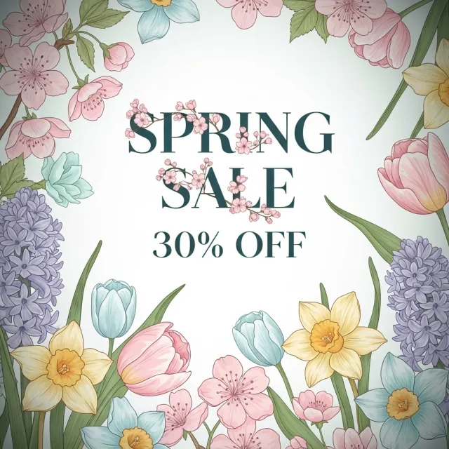
- Prompt adherence 8
- Technical quality 6
- Artistic merit 7
- Detail execution 7
- Realism & coherence 8
A botanical illustration border of tulips, blossoms, daffodils, and purple flower clusters surrounds dark green serif lettering, with small blossom branches crossing the headline.
Ranked 7th of 12, this offers stronger botanical integration than the lower-ranked templates. Nevertheless, interference with the required headline and a congested border hold it below the cleaner, more immediately usable posts.

- Prompt adherence 9
- Technical quality 6
- Artistic merit 6
- Detail execution 6
- Realism & coherence 7
Four oversized pastel watercolor flowers surround a translucent white square panel with large dark-purple 'SPRING SALE 30% OFF' lettering and blurred gray shadows.
It communicates the full offer clearly, but the overbearing shadows and basic floral treatment reduce its polish. It belongs below the more cohesive watercolor designs despite its strong wording accuracy.

- Prompt adherence 8
- Technical quality 6
- Artistic merit 6
- Detail execution 6
- Realism & coherence 8
Oversized gold and dark green serif lettering fills a square composition over abstract translucent peach flowers and sweeping sage-colored stems.
Ranked 8th of 12, this is a bold and readable interpretation with a coherent abstract style. Tight margins, overpowering headline scale, and less resolved floral integration place it below the more balanced designs.

- Prompt adherence 8
- Technical quality 6
- Artistic merit 7
- Detail execution 5
- Realism & coherence 7
A framed close-up bouquet of pink, blue, and pale-yellow flowers carries white serif 'SPRING SALE 30% OFF' and the misspelled upper caption 'SECIAL OFFER.'
The essential offer is correct and the pastel bouquet is appealing. The visible caption typo, soft rendering, and heavy shadows prevent a professional-ready rating.
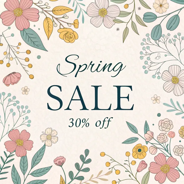
- Prompt adherence 6
- Technical quality 7
- Artistic merit 6
- Detail execution 7
- Realism & coherence 8
A cream paper graphic bordered by outlined pink and yellow flowers and teal foliage, with script Spring, large serif SALE, and italic 30% off.
Ranks ninth as a readable and charming graphic with noticeable stylistic deviations. Mixed typography and a harder, more colorful illustration style weaken adherence to the elegant pastel brief.
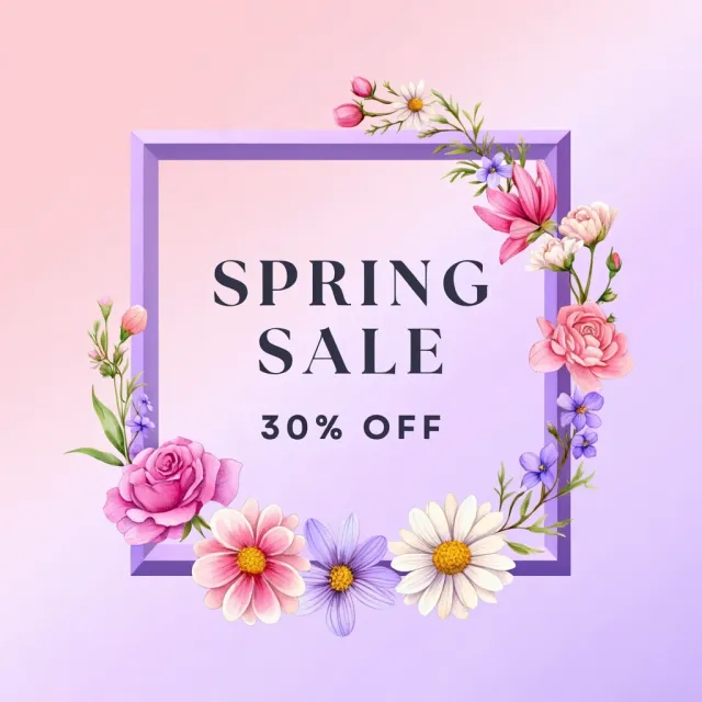
- Prompt adherence 8
- Technical quality 7
- Artistic merit 5
- Detail execution 7
- Realism & coherence 7
A pink-to-lilac gradient post with a beveled purple rectangular frame, illustrated roses and daisies, and centered dark sale lettering.
Ranked 9th of 12, this is a functional post with accurate text and appealing floral details. Its heavy frame and inconsistent visual language keep it below the more refined designs.

- Prompt adherence 9
- Technical quality 6
- Artistic merit 6
- Detail execution 6
- Realism & coherence 8
Soft peach flowers and lavender-gray foliage frame a pale textured background, thin gold rectangle, and centered serif text reading 'SPRING SALE 30% OFF'.
Ranked 9th of 13, this is a faithful but visually understated solution. Its low contrast and limited botanical definition reduce its effectiveness relative to the more assertive, polished designs.

- Prompt adherence 8
- Technical quality 6
- Artistic merit 6
- Detail execution 6
- Realism & coherence 7
Oversized black serif 'Spring Sale 30% off' sits across mint and pink rectangular panels, surrounded by textured lavender and pink watercolor peonies.
The full message is readable, but oversized black type and stacked color panels overpower the pastel floral illustration. It is competently assembled yet noticeably less balanced and integrated than the stronger designs.
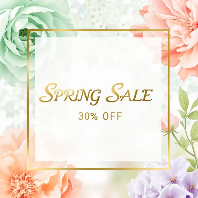
- Prompt adherence 8
- Technical quality 6
- Artistic merit 5
- Detail execution 6
- Realism & coherence 7
Large mint, peach, and lavender flowers surround a translucent white panel with a gold square border and gold sale typography.
Ranked 10th of 12, this meets the brief but offers relatively weak visual integration and impact. Its low-contrast gold text and oversized white panel place it behind the more cohesive floral layouts.
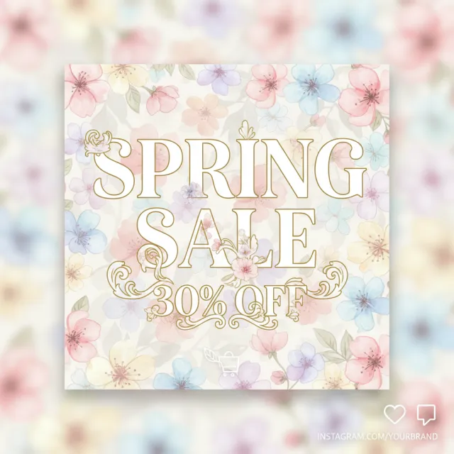
- Prompt adherence 8
- Technical quality 5
- Artistic merit 5
- Detail execution 5
- Realism & coherence 7
A square watercolor floral panel carries cream-filled, gold-outlined serif text and ornate flourishes, surrounded by a blurred floral background and small social-interface icons.
Ranked 11th of 13, this preserves the requested content but communicates it less effectively than the cleaner alternatives. Weak contrast and excessive decoration are substantial disadvantages for a small Instagram display.

- Prompt adherence 5
- Technical quality 7
- Artistic merit 7
- Detail execution 7
- Realism & coherence 8
A pale pink graphic with an abundant illustrated floral border, a thin white inset frame, and large white serif 'SPRING SALE' text without the discount.
Visually attractive but incomplete, since it never states the 30% discount. This major omission places it below designs that deliver the full offer, even when their styling is less refined.
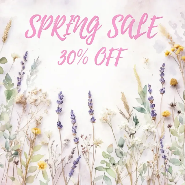
- Prompt adherence 5
- Technical quality 7
- Artistic merit 6
- Detail execution 7
- Realism & coherence 8
Bright pink brush-script sale lettering sits above a pale arrangement of lavender, yellow flowers, grasses, and delicate botanical stems.
Ranks twelfth because the wrong font style is a major failure against this particular prompt. Appealing botanicals cannot fully compensate for the typographic mismatch and weaker layout balance.

- Prompt adherence 4
- Technical quality 6
- Artistic merit 4
- Detail execution 4
- Realism & coherence 5
Brown serif lettering reads 'SPRING SALE' followed by another 'SALE' and '30% OFF' over a very pale pastel background with faint floral wreath outlines.
Ranked 12th of 12, this is the weakest result because of its obvious duplicated headline. Nearly invisible florals and an underdeveloped composition compound a significant error in the requested advertising copy.

- Prompt adherence 4
- Technical quality 6
- Artistic merit 5
- Detail execution 6
- Realism & coherence 5
A black smartphone mockup displays a pastel floral SPRING SALE 30% OFF design against a blurred floral background.
Ranks last because it substitutes a product mockup for the requested graphic. Readable on-screen content does not overcome the wrong deliverable and distracting handset construction.
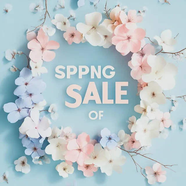
- Prompt adherence 2
- Technical quality 6
- Artistic merit 6
- Detail execution 4
- Realism & coherence 7
An oval wreath of white, pink, and pale-blue blossoms frames raised lettering on a textured blue background; the heading is misspelled and the offer ends with 'OF'.
Ranked 12th of 13, this has an attractive floral treatment but cannot function as the requested advertisement. Multiple central text failures and the wrong font category substantially outweigh its visual polish.

- Prompt adherence 5
- Technical quality 4
- Artistic merit 4
- Detail execution 4
- Realism & coherence 6
A soft-focus photograph of pink and white roses carries stacked white serif text reading 'SPRING SALE SALE 30% OFF,' with SALE repeated.
The theme is recognizable, but duplicated copy, weak contrast, and soft detail significantly undermine the result. It is substantially less usable than the complete, cleanly organized designs.
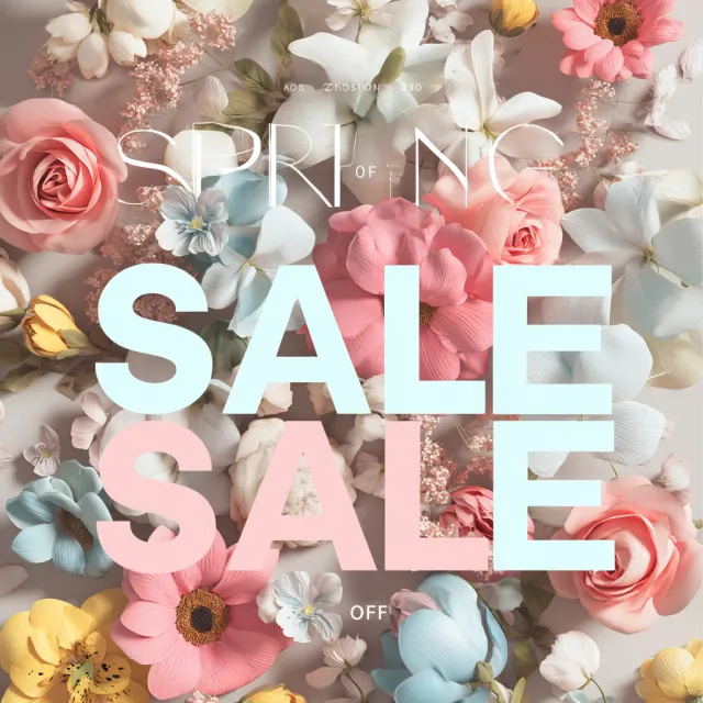
- Prompt adherence 3
- Technical quality 5
- Artistic merit 4
- Detail execution 4
- Realism & coherence 6
A dense arrangement of tactile pastel flowers sits behind a thin white SPRING heading, two enormous SALE rows, fragmented small upper text, and OFF near the bottom.
The weakest result because the essential discount message fails despite detailed floral rendering. Garbled supporting text, duplicate SALE rows, and inconsistent typography make it unsuitable as the requested advertisement.

- Prompt adherence 3
- Technical quality 4
- Artistic merit 4
- Detail execution 3
- Realism & coherence 5
Oversized black serif lettering sits over heavily blurred pastel flowers, with 'SALE' rendered as '3ALE' and the final word of the discount malformed.
Ranked 13th of 13, this is the least successful combination of message accuracy and visual execution. Critical text errors, uneven typography, and minimal resolved floral detail make it unsuitable as the requested post.