- Prompt adherence 9
- Technical quality 10
- Artistic merit 9
- Detail execution 9
- Realism & coherence 9
A dark-green outlined leaf incorporates an internal coffee-bean-like curve above clean uppercase EVERGREEN BREW on white.
Ranks first for its economical coffee-and-leaf concept, crisp execution, and cohesive typography. It is the strongest complete logo here, with only minor ambiguity in the interior symbol.
- Prompt adherence 10
- Technical quality 9
- Artistic merit 8
- Detail execution 9
- Realism & coherence 9
A single dark-green leaf with a white curved vein above clean, stacked 'Evergreen Brew' lettering on white.
Ranked 1st of 13, this is the strongest balance of prompt fidelity, clarity, and practical logo design. Its familiar concept stops short of exceptional originality, but its execution is cleaner and more economical than the alternatives.
- Prompt adherence 9
- Technical quality 9
- Artistic merit 9
- Detail execution 9
- Realism & coherence 9
A small dark-green leaf/coffee-bean hybrid above 'EVERGREEN BREW' and the tagline 'SUSTAINABLE COFFEE · ROASTED WITH CARE' on white.
Ranks 2nd of 13 and offers the strongest coffee-specific concept in the set. The extra tagline and smaller secondary lettering make it marginally less exact to the brief than the leading entry.

- Prompt adherence 10
- Technical quality 9
- Artistic merit 8
- Detail execution 9
- Realism & coherence 9
A dark green outlined leaf with one tapered vein above bold 'EVERGREEN' and lighter 'BREW' lettering on white.
Rank 1 of 12: the strongest combination of literal prompt adherence, clean construction, and balanced typography. Its conventional concept prevents a flawless score, but the execution is near-professional.

- Prompt adherence 10
- Technical quality 9
- Artistic merit 8
- Detail execution 9
- Realism & coherence 9
A flat muted-green leaf with white branching veins above the charcoal, two-line name 'Evergreen Brew' on white.
Ranks 1st of 13 for its unusually direct and polished fulfillment of the brief. It offers the strongest combination of prompt fidelity, clean execution, and practical logo readability.

- Prompt adherence 9
- Technical quality 8
- Artistic merit 8
- Detail execution 8
- Realism & coherence 9
A filled green leaf with a sweeping white vein above widely spaced 'EVERGREEN' and smaller 'BREW' flanked by horizontal rules.
Rank 2 of 12: one of the most successful minimalist interpretations, combining a clear leaf with refined typography. Minor fill variation and unnecessary side rules place it just behind the strongest image.

- Prompt adherence 9
- Technical quality 9
- Artistic merit 8
- Detail execution 8
- Realism & coherence 9
A slender green outlined leaf with a branching vein above light sans-serif 'Evergreen Brew' lettering on two lines.
Rank 3 of 12: a clean, highly compliant logo with elegant typography and convincing restraint. It narrowly trails the top two because its tall, slender emblem and straightforward wordmark are slightly less visually distinctive.

- Prompt adherence 8
- Technical quality 9
- Artistic merit 8
- Detail execution 8
- Realism & coherence 9
An abstract two-tone green leaf or steam-like emblem sits above serif Evergreen Brew, with paired arcs and a SUSTAINABLE COFFEE tagline on white.
Ranks fifth, with one of the more polished and complete brand presentations. It falls behind the simpler leaders because the extra slogan and ornamental arcs move beyond the tightly specified minimal treatment.
- Prompt adherence 9
- Technical quality 8
- Artistic merit 8
- Detail execution 8
- Realism & coherence 9
A dark-green leaf above bold 'Evergreen' and lighter 'Brew' lettering, with horizontal rules flanking the lower line on white.
Ranked 3rd of 13, this is a polished, highly usable interpretation with strong prompt adherence. Minor surface variation and a somewhat conventional design keep it just below the two strongest entries.
- Prompt adherence 9
- Technical quality 8
- Artistic merit 8
- Detail execution 8
- Realism & coherence 8
A large open green leaf outline curves around bold dark-green 'Evergreen Brew' lettering on white.
Ranks 4th of 13 for its clean execution and comparatively inventive text–symbol integration. Slight compositional imbalance keeps it below the most polished entries.

- Prompt adherence 9
- Technical quality 9
- Artistic merit 8
- Detail execution 8
- Realism & coherence 8
A dark-green outlined leaf incorporates a cup-like handle above a single-line Evergreen Brew wordmark on white.
Ranks third for adding a useful coffee reference while remaining clean and strongly aligned with the brief. Slight ambiguity and weight buildup in the combined symbol keep it below the two leaders.

- Prompt adherence 8
- Technical quality 9
- Artistic merit 8
- Detail execution 8
- Realism & coherence 9
A dark-green leaf above serif 'EVERGREEN' and spaced 'BREW' lettering, enclosed by an interrupted circular frame on white.
Ranked 4th of 13, this is a polished and appealing brand mark with strong internal coherence. Its extra framing and organic flourishes make it less directly minimalist than the top three.
- Prompt adherence 10
- Technical quality 9
- Artistic merit 7
- Detail execution 8
- Realism & coherence 9
A slim green outlined leaf with geometric veins and a curved stem appears above a single line of uppercase EVERGREEN BREW on white.
Ranks fourth as one of the most literal and technically clean responses to the brief. Its comparatively generic concept and dense vein junctions prevent it from matching the strongest designs.

- Prompt adherence 8
- Technical quality 9
- Artistic merit 8
- Detail execution 8
- Realism & coherence 9
A dark green circular badge containing an outlined leaf and small coffee bean, with bold 'Evergreen' and lighter 'Brew' text.
Rank 4 of 12: a polished and contextually effective logo with strong construction. It falls behind the top three because the bean and large circular frame introduce unnecessary complexity.

- Prompt adherence 8
- Technical quality 8
- Artistic merit 7
- Detail execution 7
- Realism & coherence 8
A green circular badge contains a solid leaf with white veins, uppercase EVERGREEN, and smaller BREW flanked by horizontal rules.
Ranks sixth: balanced, legible, and broadly faithful, but more badge-like and decorative than the leaders. Extra framing and delicate internal veins reduce its minimalist precision.

- Prompt adherence 7
- Technical quality 8
- Artistic merit 8
- Detail execution 7
- Realism & coherence 8
A circular green badge with a filled, white-veined leaf above serif 'Evergreen' and spaced uppercase 'BREW' with side rules.
Rank 5 of 12: an attractive and cohesive badge with professional-looking typography. Its additional ornament and minor rendering unevenness make it less effective for this specific minimalist brief than the top four.

- Prompt adherence 9
- Technical quality 8
- Artistic merit 6
- Detail execution 7
- Realism & coherence 8
A small outlined green leaf above a single-line dark-green 'Evergreen Brew' wordmark on white, with faint edge shading.
Ranks 5th of 13 because it is faithful, legible, and technically competent. Its generic identity and slight dimensional effects keep it below the more distinctive, polished designs.
- Prompt adherence 9
- Technical quality 8
- Artistic merit 7
- Detail execution 7
- Realism & coherence 7
A large dark-green outlined leaf with tapered veins integrated beside stacked uppercase 'EVERGREEN BREW' text on white.
Ranked 5th of 13, this is a clean and distinctive response with strong prompt fidelity. Its disproportionate icon and somewhat unfinished-looking contour integration keep it below the leading designs.

- Prompt adherence 7
- Technical quality 8
- Artistic merit 7
- Detail execution 6
- Realism & coherence 7
A dark green line-art leaf with branching veins and a curling coffee-bean enclosure above uppercase 'EVERGREEN BREW'.
Rank 6 of 12: a solid, conceptually relevant design with a somewhat overworked emblem. It is more distinctive than the lower-ranked generic marks but less clean and scalable than the leaders.

- Prompt adherence 8
- Technical quality 7
- Artistic merit 6
- Detail execution 6
- Realism & coherence 7
A large dark green leaf-shaped emblem with sweeping white internal curves above oversized serif 'Evergreen' and spaced 'BREW'.
Rank 7 of 12: a readable, upscale-leaning concept weakened by overscaled proportions and fragile details. It falls below the more balanced and immediately legible leaf-based designs.
- Prompt adherence 7
- Technical quality 8
- Artistic merit 5
- Detail execution 6
- Realism & coherence 8
A tall, symmetrical dark-green leaf filled with repeated diagonal veins above uppercase 'EVERGREEN BREW' on white.
Ranked 8th of 13, this is cleanly rendered but less successful in proportion and restraint. The oversized, densely striped leaf limits its visual refinement and practical scalability.

- Prompt adherence 6
- Technical quality 8
- Artistic merit 7
- Detail execution 6
- Realism & coherence 7
A dark-green, tree-like lobed leaf rises through a brown coffee-cup outline above green 'Evergreen' and brown 'Brew' lettering on white.
Ranks 7th of 13 for its relevant concept and competent rendering, but its expanded iconography is less faithful to the brief. The ambiguous foliage and subdued internal contrast hold it below the cleaner leaf-only marks.
- Prompt adherence 9
- Technical quality 8
- Artistic merit 5
- Detail execution 6
- Realism & coherence 6
Large black sans-serif Evergreen Brew lettering is stacked beneath a small outlined leaf on an almost-white background.
Ranks seventh: highly readable and close to the brief, but aesthetically underdeveloped. Generic typography and a weak icon-to-wordmark balance keep it outside the stronger group.

- Prompt adherence 9
- Technical quality 7
- Artistic merit 6
- Detail execution 6
- Realism & coherence 6
A solid dark-green leaf with a white central vein above large, stacked 'Evergreen Brew' text on a white background.
Ranked 7th of 13, this is strongly on-brief but comparatively less refined. Heavy typography and inconsistent finishing keep it below the more professionally balanced single-leaf designs.
- Prompt adherence 9
- Technical quality 8
- Artistic merit 5
- Detail execution 6
- Realism & coherence 6
A thin green outlined leaf above a large, dark green rounded 'Evergreen Brew' wordmark arranged across two lines.
Rank 9 of 12: a compliant and usable starting point, limited primarily by weak icon-to-type balance. It is less refined than the similarly simple but more disciplined leading designs.

- Prompt adherence 9
- Technical quality 7
- Artistic merit 5
- Detail execution 6
- Realism & coherence 7
A bright green outlined leaf above a black, single-line 'Evergreen Brew' wordmark on white.
Rank 10 of 12: a competent, highly compliant result whose main limitations are generic styling and uneven visual weight. It lacks the typographic refinement and integrated proportions of the leading designs.

- Prompt adherence 8
- Technical quality 7
- Artistic merit 6
- Detail execution 6
- Realism & coherence 6
A small gray-green outlined leaf with fine veins sits above widely spaced uppercase EVERGREEN and a smaller BREW on white.
Ranks tenth: it satisfies the basic content requirements but has weaker symbol execution than the leading examples. Fine veins, soft contours, and mismatched visual weights reduce its effectiveness as a scalable logo.

- Prompt adherence 7
- Technical quality 8
- Artistic merit 6
- Detail execution 6
- Realism & coherence 6
A brown outlined leaf crossing a fragmented geometric E-like monogram above the uppercase, two-line name 'EVERGREEN BREW' on white.
Ranks 8th of 13, with strong rendering but a less resolved central emblem. Simplifying or clarifying the E-like structure would bring it closer to the stronger minimalist entries.
- Prompt adherence 7
- Technical quality 8
- Artistic merit 6
- Detail execution 6
- Realism & coherence 6
A large dark-green outlined leaf containing tree-like branches, curved bands, and dots sits above rounded uppercase EVERGREEN BREW on a near-white background.
Ranks ninth: technically clean and recognizable, but substantially overdecorated for this brief. Its busy internal structure holds it below the simpler, more cohesive alternatives.

- Prompt adherence 6
- Technical quality 8
- Artistic merit 7
- Detail execution 6
- Realism & coherence 7
A muted green, three-part flame-like emblem above widely spaced 'EVERGREEN' and brown 'BREW' lettering on white.
Rank 8 of 12: aesthetically competent, but its attractive abstraction weakens adherence to the single-leaf requirement. It trails the clearer, more economical botanical marks.

- Prompt adherence 4
- Technical quality 7
- Artistic merit 6
- Detail execution 6
- Realism & coherence 7
A green circular badge on white, featuring three central leaves, two smaller side leaves, and stacked 'EVERGREEN BREW' lettering.
Ranked 10th of 13, this is a competent decorative badge rather than a successful interpretation of the specific brief. The multiple leaves and excessive ornament substantially outweigh its balanced composition.

- Prompt adherence 4
- Technical quality 8
- Artistic merit 6
- Detail execution 7
- Realism & coherence 8
A black-outlined, green two-leaf sprout above heavy rounded 'EVERGREEN BREW' lettering on a pale sage background.
Rank 11 of 12: technically competent, but the wrong leaf count and background substantially reduce its success for this brief. Those explicit deviations outweigh its otherwise clean rendering.

- Prompt adherence 6
- Technical quality 6
- Artistic merit 5
- Detail execution 5
- Realism & coherence 5
A shaded bright-green leaf above large black 'Evergreen Brew' lettering, with a faint oval shadow beneath the logo on a white field.
Ranks 10th of 13 because it communicates the requested subject but delivers a comparatively generic and over-effected treatment. Removing the shading and shadow would substantially improve its suitability.

- Prompt adherence 4
- Technical quality 7
- Artistic merit 5
- Detail execution 4
- Realism & coherence 5
A shaded green leaf with numerous veins and small brown berry-like clusters above a green-and-brown serif 'Evergreen Brew' wordmark.
Rank 12 of 12: the clearest departure from the core minimalist brief. Its readable text and competent rendering cannot compensate for an overly illustrative, ornamented symbol.
- Prompt adherence 4
- Technical quality 6
- Artistic merit 5
- Detail execution 3
- Realism & coherence 4
Two versions of an outlined green leaf logo, one on white and one on a dark panel, with 'EVERGREEN BREW' and the nonsensical subtitle 'STOUIEA'.
Ranks 12th of 13 because the repeated nonsense text requires correction before the design could be used. Its competent basic rendering cannot compensate for the textual defect and substantial presentation deviations.

- Prompt adherence 3
- Technical quality 6
- Artistic merit 5
- Detail execution 5
- Realism & coherence 6
A two-leaf white outline above green 'Evergreen Brew' lettering surrounded by a thick white sticker border on dark green.
Ranked 11th of 13, this remains recognizable as a coffee-brand logo but misses several explicit requirements. The wrong background and multiple leaves are more consequential than its adequate readability.
- Prompt adherence 5
- Technical quality 4
- Artistic merit 3
- Detail execution 4
- Realism & coherence 5
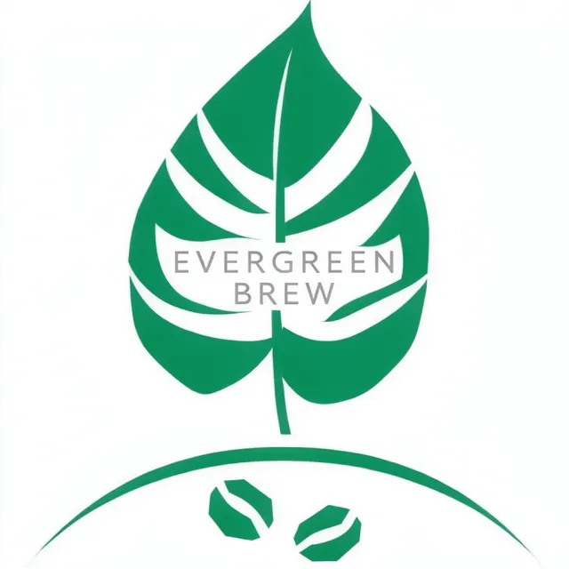
An oversized green leaf containing gray 'EVERGREEN BREW' text, with two coffee-bean symbols beneath a broad arc on white.
Ranked 12th of 13, this communicates sustainable coffee but fails as a balanced minimalist logo. Cropping, excessive symbolism, and a subordinate wordmark significantly compromise its usability.

- Prompt adherence 5
- Technical quality 5
- Artistic merit 4
- Detail execution 3
- Realism & coherence 5
A dark-green, densely hatched leaf with a small hooked stem above widely spaced uppercase 'EVERGREEN BREW' on white.
Ranks 11th of 13 because excessive, poorly controlled linework undermines an otherwise correct basic layout. The symbol needs substantial simplification rather than additional detail.

- Prompt adherence 4
- Technical quality 5
- Artistic merit 6
- Detail execution 5
- Realism & coherence 7
Two white-filled leaves with dark outlines appear above large dark serif Evergreen Brew lettering on a grainy sage-green background.
Ranks twelfth because leaf count, background color, and vector cleanliness all depart from the prompt. Heavy grain and crowded scaling further separate it from the better-executed alternatives.

- Prompt adherence 3
- Technical quality 3
- Artistic merit 3
- Detail execution 3
- Realism & coherence 4
A lime-green leaf above dark-green 'Evergreen Brew' text inside an open oval, surrounded by a green glow on gray.
Ranked 13th of 13, this is the weakest interpretation because both presentation and readability suffer. The recognizable leaf and correct text cannot compensate for the wrong background and unsuitable effect-heavy styling.

- Prompt adherence 5
- Technical quality 3
- Artistic merit 3
- Detail execution 3
- Realism & coherence 4
Very large black 'Evergreen Brew' lettering overlaps a tall dark-green leaf with white linear veins on white.
Ranks 13th of 13 because the central layout undermines the logo's primary function: clear brand recognition. It requires a fundamental recomposition rather than minor polishing.
- Prompt adherence 3
- Technical quality 9
- Artistic merit 5
- Detail execution 7
- Realism & coherence 8
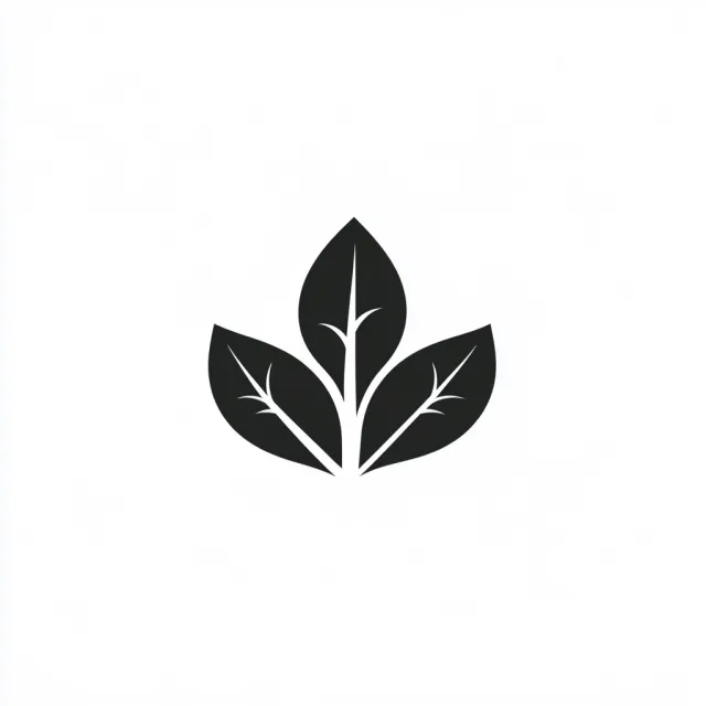
A black three-leaf sprig with white branching vein cutouts is centered on a white background, without any brand text.
Ranks thirteenth because the required brand text is absent and the single-leaf instruction is violated. Clean rendering cannot compensate for failing these central requirements.