- Prompt adherence 9
- Technical quality 9
- Artistic merit 9
- Detail execution 8
- Realism & coherence 9
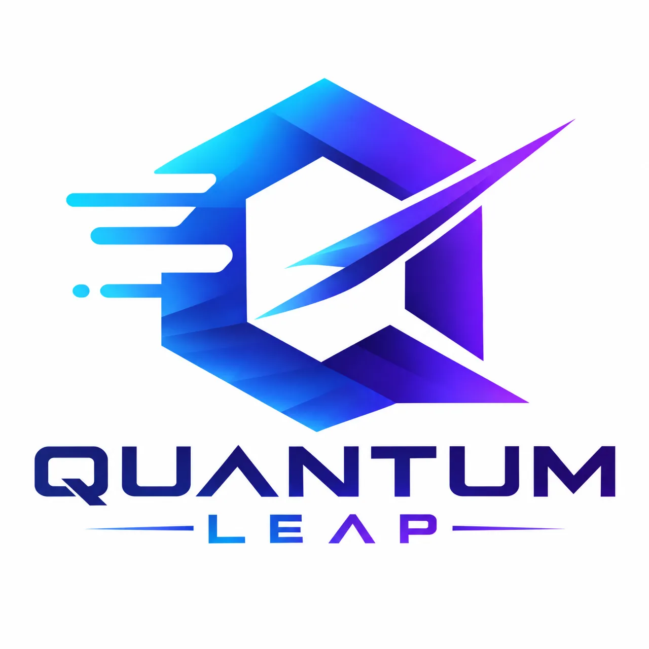
A faceted cyan-blue-purple Q-like emblem with leftward motion streaks and a sharp diagonal slash above a custom angular 'QUANTUM LEAP' wordmark.
Ranked 1st of 13 for the strongest balance of distinctive symbolism, prompt adherence, and professional execution. Only minor small-scale reproduction concerns keep it from a flawless score.
- Prompt adherence 10
- Technical quality 9
- Artistic merit 9
- Detail execution 8
- Realism & coherence 9
A blue-purple angular emblem combines an open polygon, directional arrows, circuit-node trails, and bold italic 'QUANTUM LEAP' text on black.
Ranked 1st of 13. It offers the strongest combination of prompt fidelity, concept communication, readable integrated text, and disciplined visual impact.

- Prompt adherence 9
- Technical quality 9
- Artistic merit 9
- Detail execution 9
- Realism & coherence 9
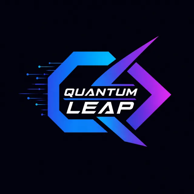
A blue-purple angular bolt and partial circular ring surround a white italic 'QUANTUM LEAP' wordmark, with linked nodes and horizontal speed streaks on navy.
Ranked 1st of 12, this offers the strongest combination of exact branding, sharp geometry, connection, and speed. It is nearly production-ready, with modest simplification of the smallest accents as its main remaining refinement.
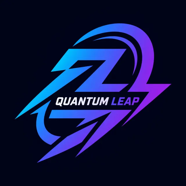
- Prompt adherence 8
- Technical quality 9
- Artistic merit 8
- Detail execution 8
- Realism & coherence 9
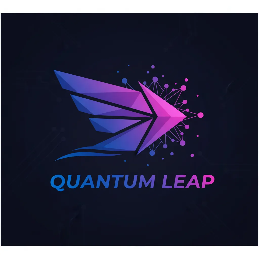
Large cyan-to-purple lightning-like angular paths and curved sweeps frame italic 'QUANTUM LEAP' text within a dark navy composition.
Ranked 3rd of 13. Its clean execution and strong motion motif stand out, but weaker connection symbolism and uneven text contrast keep it below the two leaders.

- Prompt adherence 9
- Technical quality 9
- Artistic merit 8
- Detail execution 8
- Realism & coherence 8
A blue-purple angular Q/L-style emblem surrounds 'QUANTUM LEAP,' with an ascending arrow, orbital sweep, spherical nodes, and motion streaks.
Ranked 2nd of 13: this is the most explicit synthesis of connection, speed, and enclosed brand text. Its additional orbital decoration makes it slightly less streamlined than the winner.
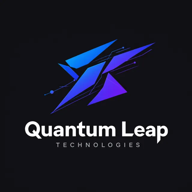
- Prompt adherence 8
- Technical quality 9
- Artistic merit 8
- Detail execution 8
- Realism & coherence 8
Blue-purple triangular shards and circuit-like connections sit above a white 'Quantum Leap' wordmark and a smaller gray 'TECHNOLOGIES' descriptor on black.
Ranked 3rd of 13: this is a polished, conceptually appropriate technology identity with excellent name readability. The extra descriptor and fragmented symbol make it a little less exact and compact than the leading designs.
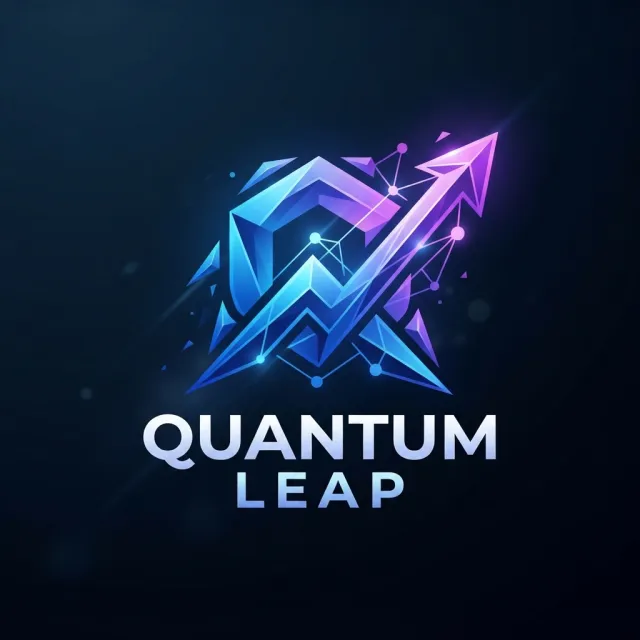
- Prompt adherence 9
- Technical quality 9
- Artistic merit 8
- Detail execution 7
- Realism & coherence 8
A dimensional blue-purple faceted emblem combines nested angular forms, connected nodes, and an upward-right arrow above metallic 'QUANTUM LEAP' lettering on dark navy.
Ranked 4th of 12, this strongly interprets the requested concepts and delivers polished rendering. Its dependence on dimensional effects and fine secondary details makes it less versatile than the cleaner identities above it.

- Prompt adherence 9
- Technical quality 8
- Artistic merit 8
- Detail execution 7
- Realism & coherence 7
A blue-purple right-pointing arrow with branching circuit traces above a bold 'Quantum Leap' wordmark, plus a detached circuit flourish at lower right.
Ranked 3rd of 13 for its especially clear expression of both connection and speed. Removing the detached circuitry and simplifying small junctions would bring it closer to the top.
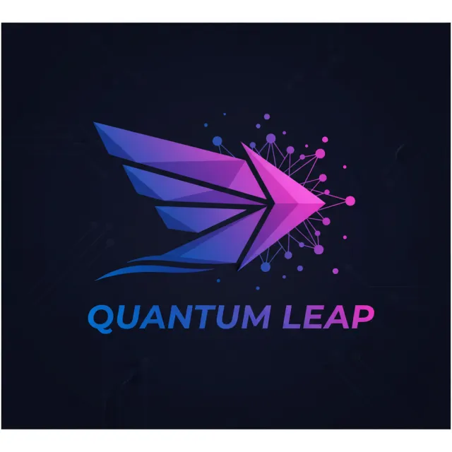
- Prompt adherence 9
- Technical quality 8
- Artistic merit 8
- Detail execution 7
- Realism & coherence 8
A blue-to-magenta faceted arrow with trailing shards and a connected-node network appears above italic 'QUANTUM LEAP' lettering on a dark circuit-patterned panel.
Ranked 4th of 13. It communicates both abstract concepts especially well, but its fine-detail density makes it less versatile than the leading designs.
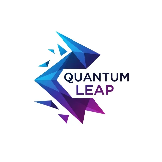
- Prompt adherence 8
- Technical quality 9
- Artistic merit 8
- Detail execution 8
- Realism & coherence 8
A fractured, faceted blue-to-purple angular bracket frames bold navy 'QUANTUM' and purple 'LEAP' text, with detached triangular fragments on white.
Ranked 3rd of 12, this is one of the most restrained and usable designs in the set. It trails the top two because its connection and speed symbolism is somewhat less immediate.

- Prompt adherence 8
- Technical quality 9
- Artistic merit 7
- Detail execution 8
- Realism & coherence 9
A minimal angular blue-purple Q/arrow symbol sits above large navy 'Quantum Leap' text on a white background.
Ranked 4th of 13: this is one of the cleanest and most usable logos in the group. Its weaker connection metaphor and comparatively ordinary typography prevent a higher placement.
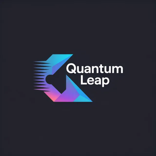
- Prompt adherence 9
- Technical quality 9
- Artistic merit 8
- Detail execution 8
- Realism & coherence 8
A sharp cyan-blue-purple folded emblem with leftward speed streaks framing a bold, stacked white 'Quantum Leap' wordmark on charcoal.
Ranked 2nd of 13 for its strong combination of prompt fidelity, clarity, and integrated branding. Only the finer motion detailing keeps it below the best entry.

- Prompt adherence 8
- Technical quality 7
- Artistic merit 7
- Detail execution 6
- Realism & coherence 6
An angular blue-purple open-frame emblem with a diagonal arrow-like tail, small nodes and streaks, above a bold white 'Quantum Leap' wordmark on navy.
Ranked 6th of 13, it delivers a recognizable and mostly faithful tech logo. Simplifying the icon's secondary strokes would improve both coherence and reproduction quality.
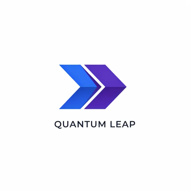
- Prompt adherence 7
- Technical quality 9
- Artistic merit 6
- Detail execution 8
- Realism & coherence 9
Two clean blue and purple right-pointing chevrons above a widely spaced uppercase 'QUANTUM LEAP' wordmark on white.
Ranked 4th of 13 because its clarity and reproduction readiness outperform many more elaborate attempts. Generic symbolism and incomplete expression of connection prevent an excellent overall score.
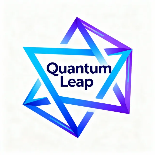
- Prompt adherence 8
- Technical quality 8
- Artistic merit 7
- Detail execution 6
- Realism & coherence 7
Interwoven cyan, blue, and purple triangular ribbon paths surround bold, stacked navy 'Quantum Leap' text on a white background.
Ranked 6th of 13. It fulfills the brief reasonably well, but ambiguous ribbon continuity and bulky framing keep it below the cleaner wordmark-and-emblem design.
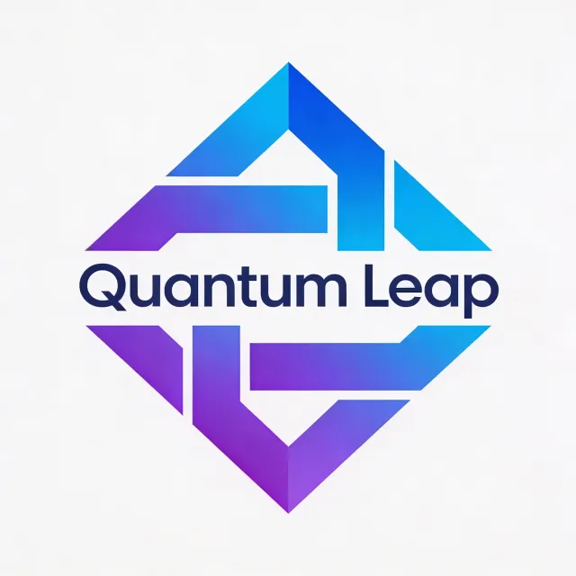
- Prompt adherence 8
- Technical quality 8
- Artistic merit 7
- Detail execution 7
- Realism & coherence 8
A segmented blue-purple angular diamond frame surrounding a dark blue 'Quantum Leap' wordmark across its center on a white background.
Ranked 5th of 13, it is a clear and coherent interpretation with strong branding integration. Its weaker speed cue and less distinctive symbol keep it below the leaders.
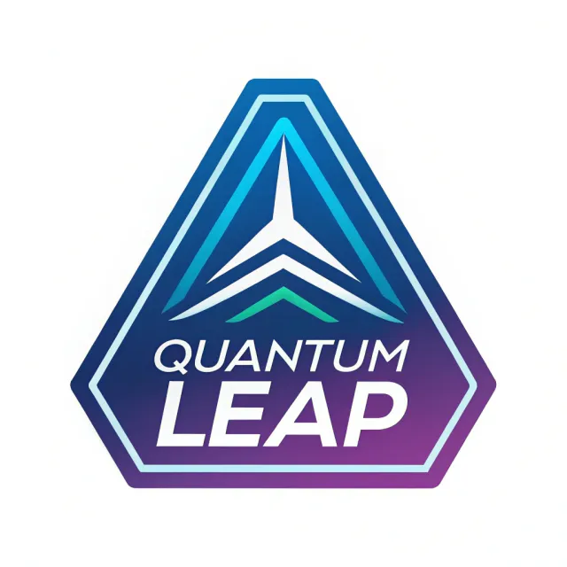
- Prompt adherence 7
- Technical quality 8
- Artistic merit 6
- Detail execution 8
- Realism & coherence 8
A tapered blue-purple badge with cyan borders, stacked upward arrow motifs, and white italic 'QUANTUM LEAP' lettering.
Ranked 6th of 13: this is a competent, readable badge with especially strong text integration. A generic crest-like identity and weak connection metaphor limit its distinction.
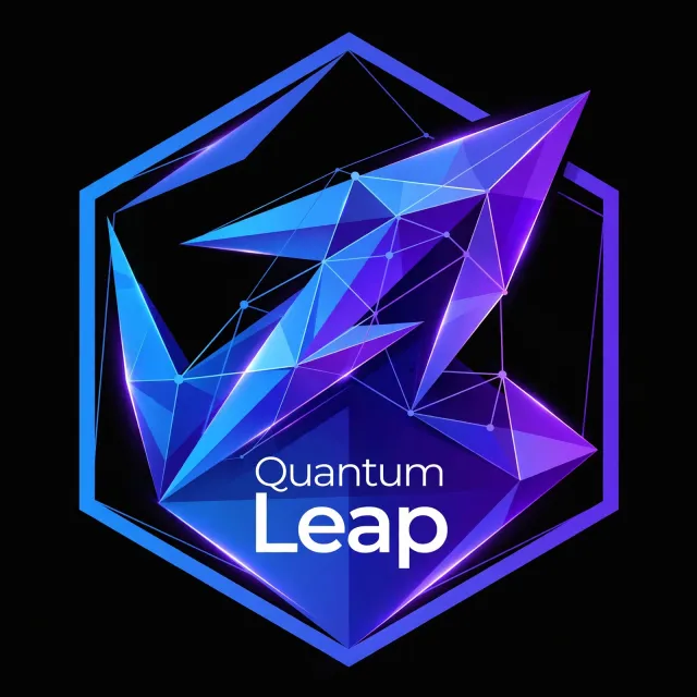
- Prompt adherence 8
- Technical quality 7
- Artistic merit 6
- Detail execution 5
- Realism & coherence 6
A large blue-purple hexagonal badge contains faceted arrow-like shards, a web of connected nodes, glowing seams, and white 'Quantum Leap' text near the bottom.
Ranked 7th of 12, this includes the requested elements but is less effective as a reusable logo than the cleaner entries above it. Crowded internal geometry and uneven typographic hierarchy outweigh the appealing gradient treatment.

- Prompt adherence 8
- Technical quality 8
- Artistic merit 6
- Detail execution 6
- Realism & coherence 7
A dense neon-blue and purple geometric badge contains metallic 'QUANTUM LEAP' lettering, layered arrows, faceted polygons, and connected-node meshes.
Ranked 7th of 13. It communicates the brief thoroughly, but excessive detail and limited scalability outweigh its impressive rendering.
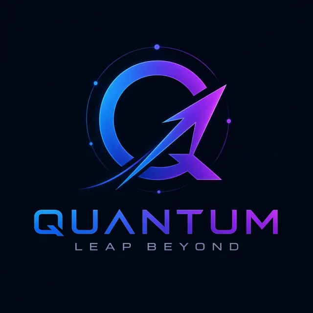
- Prompt adherence 5
- Technical quality 9
- Artistic merit 8
- Detail execution 7
- Realism & coherence 8
A glowing blue-purple circular Q and rising arrow surrounded by orbital nodes, above 'QUANTUM' and the smaller phrase 'LEAP BEYOND' on black.
Ranked 8th of 13 despite strong visual polish because the altered brand wording is a substantial prompt failure. Correcting the name would make it considerably more competitive.
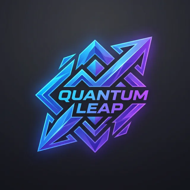
- Prompt adherence 7
- Technical quality 8
- Artistic merit 6
- Detail execution 5
- Realism & coherence 6
A glowing cyan-to-purple lattice of faceted arrows, diamonds, and zigzags surrounds italic 'QUANTUM LEAP' lettering on dark charcoal.
Ranked 9th of 13: this is technically competent and visually energetic. Its excessive ornamentation and weaker conceptual clarity make it less useful than the cleaner or more explicitly connected designs.

- Prompt adherence 6
- Technical quality 8
- Artistic merit 7
- Detail execution 5
- Realism & coherence 6
Glowing blue-purple orbital ribbons wrap around an upward diagonal arrow, with bright nodes, circuit-like background traces, and 'Quantum Leap' text extending to the right.
Ranked 8th of 12, this is visually rich but more successful as promotional artwork than as a logo. Excessive effects, curved complexity, and weaker wordmark hierarchy limit its suitability for the brief.
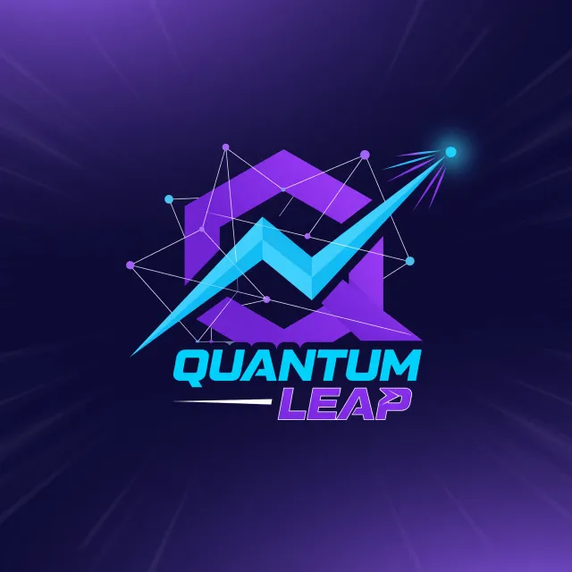
- Prompt adherence 8
- Technical quality 7
- Artistic merit 6
- Detail execution 6
- Realism & coherence 6
A purple geometric frame, cyan zigzag arrow, and network of connected nodes appear above 'QUANTUM LEAP' on a purple motion-streak background.
Ranked 8th of 13: strong conceptual adherence is offset by substantial visual clutter. It communicates the brief well as an illustration, but less successfully as a scalable startup logo.
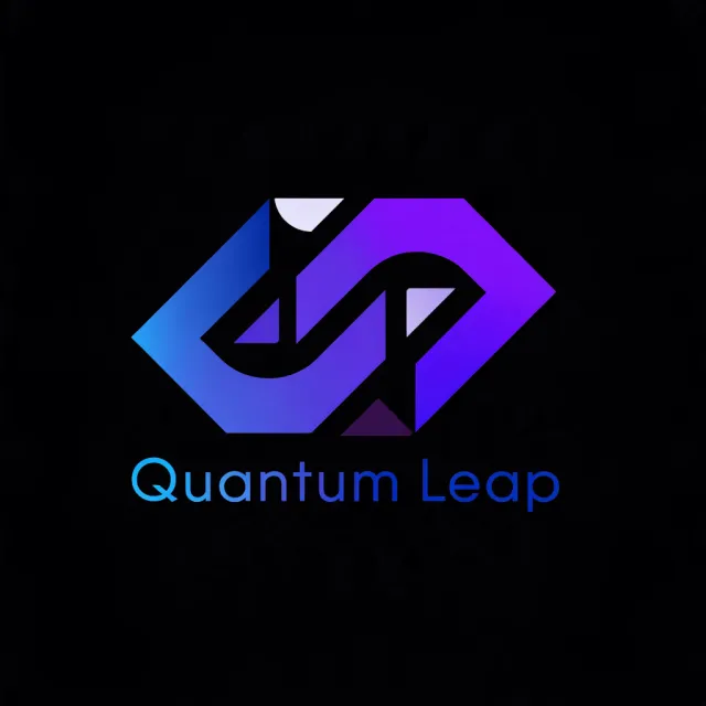
- Prompt adherence 6
- Technical quality 7
- Artistic merit 6
- Detail execution 5
- Realism & coherence 6
Two interlocking blue-purple angular bands form a geometric emblem with pale inset wedges, above a thin gradient 'Quantum Leap' wordmark on black.
Ranked 9th of 12, this has a usable connection-based foundation but lacks a convincing speed cue. Low wordmark contrast and unresolved inset shapes make it less finished than the stronger minimalist designs.

- Prompt adherence 6
- Technical quality 9
- Artistic merit 7
- Detail execution 6
- Realism & coherence 8
A rounded blue-purple ribbon emblem with motion streaks and circular endpoints above 'QUANTUM LEAP' and a placeholder tagline.
Ranked 7th of 13, it is polished but not a finished response to the brief. The placeholder text and softened geometry keep it below the cleaner, more angular options.

- Prompt adherence 6
- Technical quality 7
- Artistic merit 6
- Detail execution 6
- Realism & coherence 7
A blue-purple faceted chevron above a white 'Quantum Leap' wordmark, with a fragmented Q, on a dark navy background.
Ranked 9th of 13, this is competent but conceptually underdeveloped. Its clean presentation cannot fully compensate for weak communication of connection and speed.
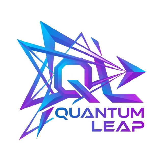
- Prompt adherence 7
- Technical quality 7
- Artistic merit 5
- Detail execution 5
- Realism & coherence 5
An elaborate cyan-blue-purple arrangement of spikes, intersecting triangular outlines, a central geometric Q, and an angular 'QUANTUM LEAP' wordmark.
Ranked 10th of 13, it captures the requested energy but sacrifices logo clarity to overdesign. Its complexity is a more substantial weakness than the restrained imperfections in the stronger entries.

- Prompt adherence 8
- Technical quality 7
- Artistic merit 5
- Detail execution 4
- Realism & coherence 6
A dense, roughly symmetrical burst of interlaced blue-purple triangular ribbons surrounds a central 'Quantum Leap' wordmark on a light gray background.
Ranked 9th of 13. Strong literal adherence is undermined by excessive geometry, weak hierarchy, and poor small-scale usability.
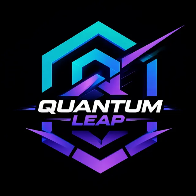
- Prompt adherence 6
- Technical quality 7
- Artistic merit 5
- Detail execution 5
- Realism & coherence 5
A fragmented cyan-purple hexagonal frame and diagonal spikes surround bold white 'QUANTUM' and purple 'LEAP' lettering on black.
Ranked 10th of 13: readable typography prevents this from being unsuccessful outright. Nevertheless, the disjointed frame and poorly prioritized decoration make it noticeably weaker as a cohesive logo.
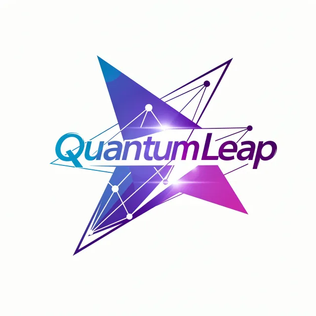
- Prompt adherence 7
- Technical quality 6
- Artistic merit 5
- Detail execution 4
- Realism & coherence 5
An oversized italic 'QuantumLeap' gradient wordmark crosses blue-purple triangular panels, wireframe connections, circular nodes, and bright lens flares on white.
Ranked 10th of 12, this includes the requested ingredients but combines them without sufficient restraint. Congested layering, flare interference, and weaker name treatment substantially reduce its effectiveness as a logo.

- Prompt adherence 5
- Technical quality 7
- Artistic merit 4
- Detail execution 5
- Realism & coherence 5
A blue-purple C-shaped ring overlaps rounded cyan and violet capsules, with black 'Quantum Leap' text placed across the central horizontal bar on navy.
Ranked 11th of 12, this is relevant and readable but only partially captures the requested visual character. Its soft geometry and weak conceptual expression place it below the more purposeful angular designs.

- Prompt adherence 7
- Technical quality 6
- Artistic merit 5
- Detail execution 5
- Realism & coherence 6
A large faceted Q-like geometric ring sits behind metallic 'QUANTUM LEAP' text on a pastel blue-purple-pink background with radiating streaks.
Ranked 10th of 13. It includes the essential content, but excessive presentation effects and uncertain geometry substantially weaken its suitability as a startup logo.

- Prompt adherence 6
- Technical quality 5
- Artistic merit 5
- Detail execution 4
- Realism & coherence 5
A glossy blue-purple three-dimensional emblem combines angular plates, orbital swooshes, glowing nodes, and dark recessed 'QUANTUM LEAP' text on gray.
Ranked 11th of 13: correct wording keeps it above the misspelled and severely cropped candidates. Poor text contrast and excessive rendered complexity significantly undermine its core function as a logo.
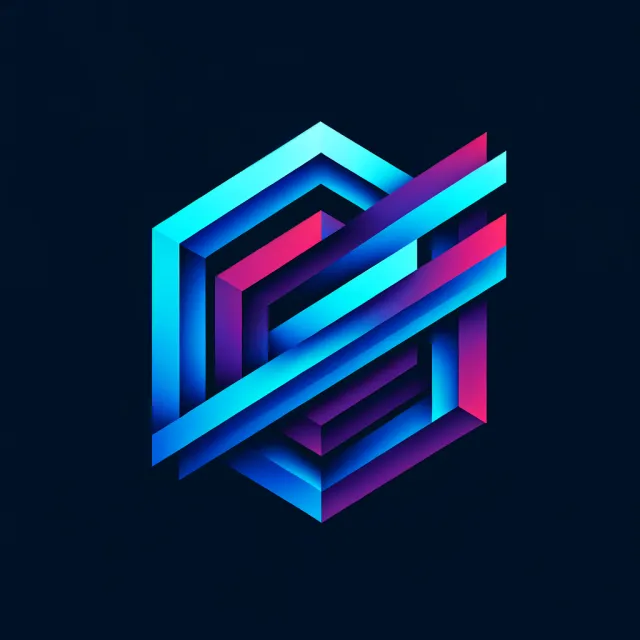
- Prompt adherence 4
- Technical quality 9
- Artistic merit 8
- Detail execution 8
- Realism & coherence 8
An intricate, interwoven geometric emblem with cyan, blue, purple, and magenta ribbon-like faces on a dark navy background; no text appears.
Ranked 11th of 13. The polished emblem cannot compensate for completely omitting the explicitly requested brand name.

- Prompt adherence 3
- Technical quality 9
- Artistic merit 7
- Detail execution 8
- Realism & coherence 9
Two overlapping, dimensional diamond-shaped ribbons form a vertical figure-eight motif in purple, pink, and cyan on a dark background.
Ranked 12th of 13. Despite strong rendering, the absent brand name and weak expression of speed make it less successful than the other geometric emblem.
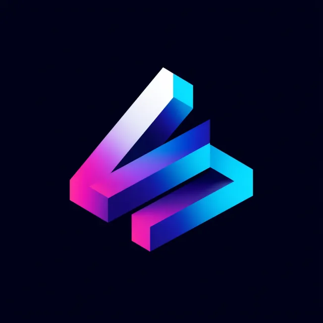
- Prompt adherence 3
- Technical quality 9
- Artistic merit 8
- Detail execution 5
- Realism & coherence 8
A colorful isometric folded-bar symbol with cyan, blue, purple, magenta, and white faces on a nearly black background, without any text.
Ranked 12th of 13 despite its attractive rendering because it lacks the explicitly required company name. That central omission outweighs its substantial technical and aesthetic strengths.
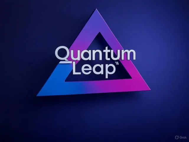
- Prompt adherence 5
- Technical quality 4
- Artistic merit 4
- Detail execution 4
- Realism & coherence 5
A dimensional blue-purple-pink hollow triangle with overlapping pale 'Quantum Leap' lettering on a softly lit dark blue background.
Ranked 11th of 13, it includes the required name but lacks clean execution and conceptual specificity. Its softness and typographic clutter are more conspicuous than the minor issues in the mid-ranked entries.

- Prompt adherence 3
- Technical quality 5
- Artistic merit 5
- Detail execution 3
- Realism & coherence 5
A cyan-purple folded triangular symbol with luminous circuit traces appears above the incorrect text 'Quantrum Leave' on a grainy dark background.
Ranked 12th of 13: the geometric concept is recognizable, but the incorrect brand name makes the asset unusable for the requested startup. That central failure outweighs its reasonably attractive colors and shape.

- Prompt adherence 4
- Technical quality 5
- Artistic merit 4
- Detail execution 3
- Realism & coherence 4
An oversized blue-purple polygonal composition with white circuit traces and tightly compressed angular lettering inside a lower-right triangular wedge.
Ranked 13th of 13 because its typography is the least usable and its composition is poorly suited to logo reproduction. Crisp polygon rendering does not overcome those fundamental communication failures.

- Prompt adherence 3
- Technical quality 6
- Artistic merit 4
- Detail execution 3
- Realism & coherence 5
A small cyan-magenta glowing hexagonal frame surrounds slanted white 'QUANTUM' lettering and an unreadable angular mark on a mostly empty navy background.
Ranked 12th of 12, this is the weakest result because the complete requested name cannot be read. Its competent neon styling cannot compensate for that critical branding failure.
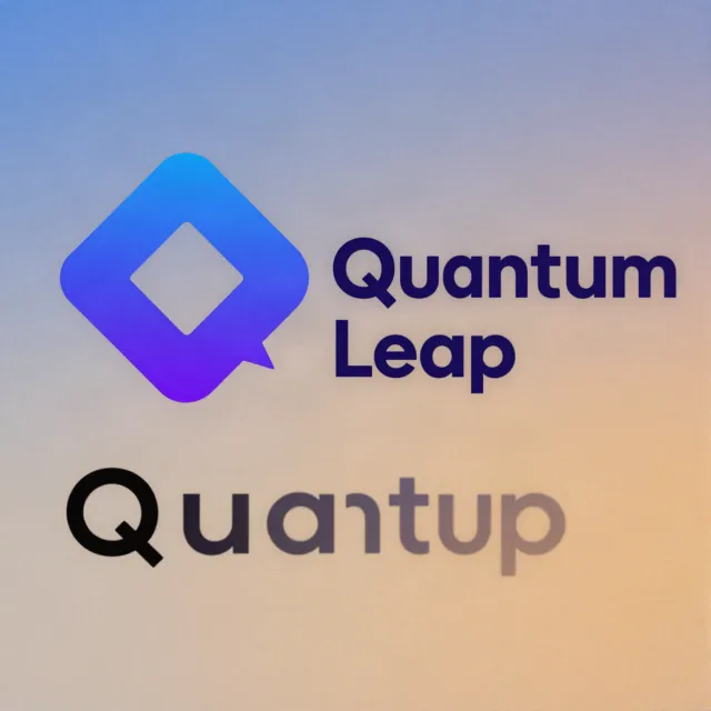
- Prompt adherence 3
- Technical quality 4
- Artistic merit 3
- Detail execution 3
- Realism & coherence 3
A rounded blue-purple diamond-shaped Q appears beside 'Quantum Leap,' with an additional large, erroneous word resembling 'Quantup' below on a softly colored background.
Ranked 13th of 13. The erroneous extra word and unresolved composition make this the least successful result despite the usable upper icon.
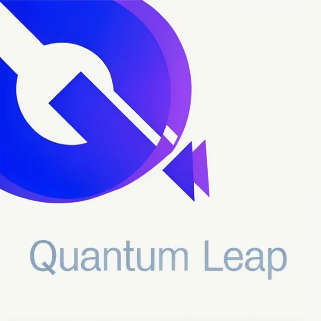
- Prompt adherence 4
- Technical quality 2
- Artistic merit 2
- Detail execution 2
- Realism & coherence 3
A heavily cropped blue-purple circular Q-like symbol fills the upper-left, with triangular accents and pale-blue 'Quantum Leap' text below.
Ranked 13th of 13: this is the weakest complete deliverable because its defining symbol is severely cropped and its finish is poor. Correct spelling cannot compensate for the unusable framing and weak presentation.