Summary for Graphic Design
The Graphic Design category exposes the true precision of AI image generation models. It demands strict adherence to constraints like typography, flat styling, negative space, and exact formatting—areas where many highly-artistic models stumble.
🏆 Top Performing Models:
- Takumi 1: The undisputed leader in this category with an exceptional 1427 Elo. It excels at combining pristine vector-style geometry with flawless text integration.
- GPT Image 2.5 Flare: Secures second place at 1296 Elo, proving highly reliable at adhering to layout and minimal design constraints.
- Grok Imagine 2.0: Takes third place with 1280 Elo, demonstrating strong capabilities in typography and stylistic accuracy.
📈 Major Trends:
- Text is King: Typographic accuracy remains a massive differentiator. Models that misspell words or crowd text automatically drop in rankings, regardless of artistic merit.
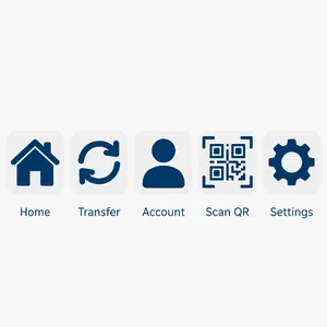
- The "Flat Vector" Struggle: Many models struggle to turn off their advanced rendering capabilities. When asked for "flat vector" or "minimalist," lower-tier models often output 3D shading, drop shadows, or glossy highlights.
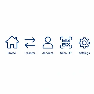
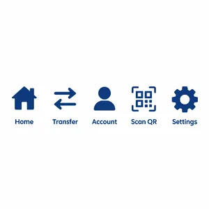
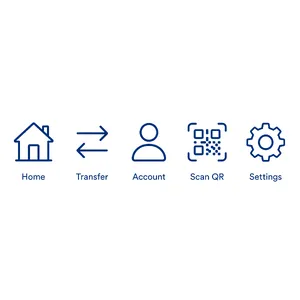
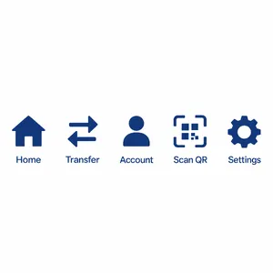
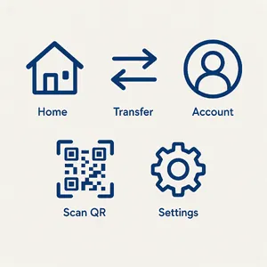
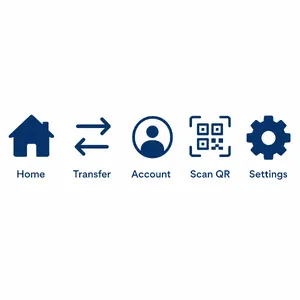
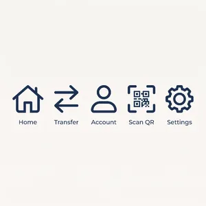
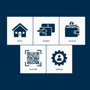
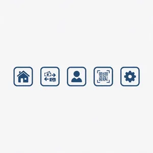
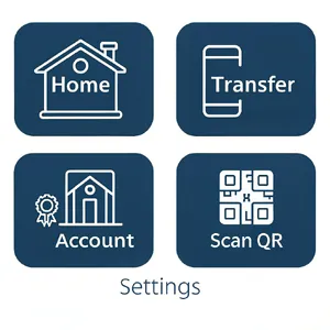
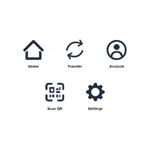
- Counting & Grouping: The ability to generate a specific number of items (e.g., exactly 5 icons) and maintain stylistic consistency across them remains a significant hurdle for most current AI models.
😲 Notable Results:
- Midjourney's Weakness: Renowned artistic powerhouses like Midjourney v7 (653 Elo) and Midjourney V6.1 (688 Elo) perform surprisingly poorly here. Their tendency to favor elaborate realism and complex textures actively hurts them when the brief calls for strict, flat, minimalist design assets.
General Analysis & Useful Insights
Graphic design prompts require a delicate balance of artistic restraint and technical obedience. Here is a deeper look at the patterns, strengths, and weaknesses observed across the models.
🌟 Comparative Strengths
Top models like Takumi 1 and the GPT Image 2.5 family succeed because they understand graphic design hierarchy.
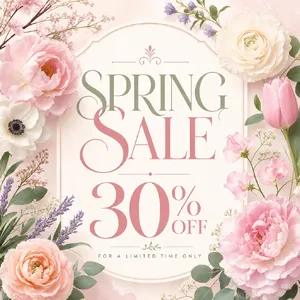
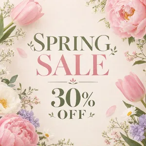
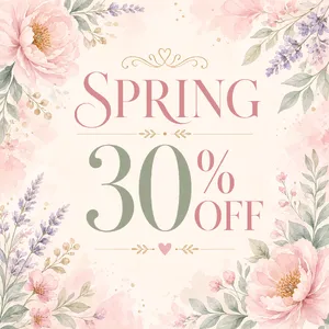
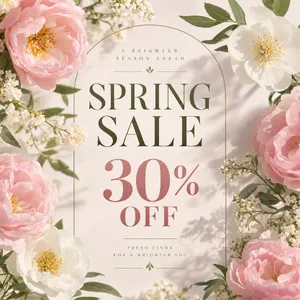
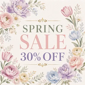
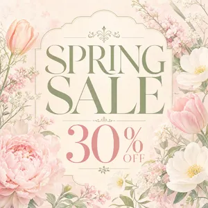
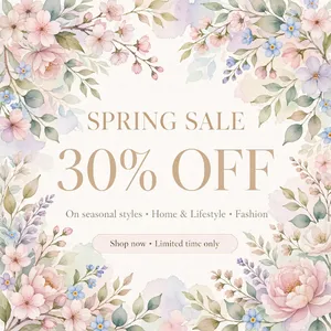
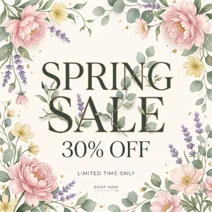
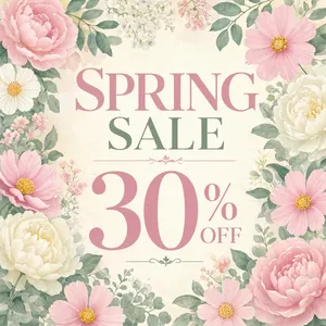
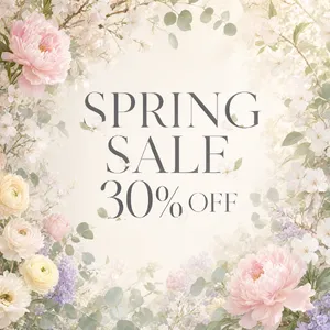
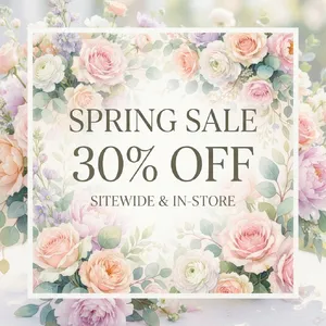
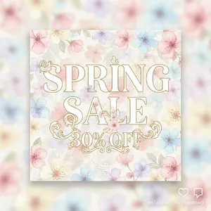
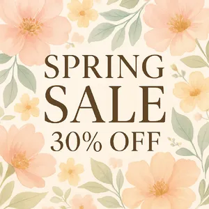
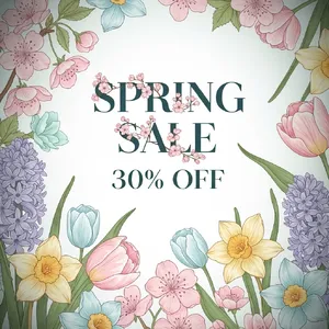
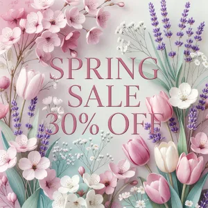
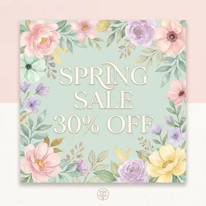
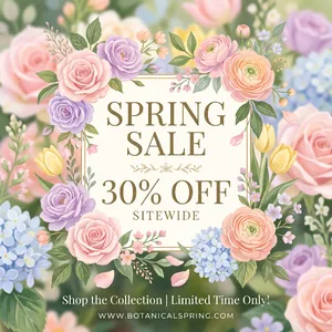
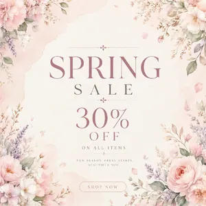
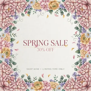
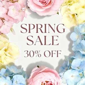
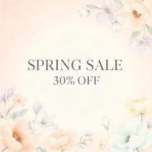
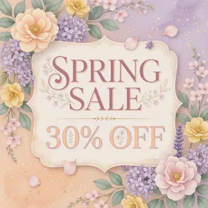
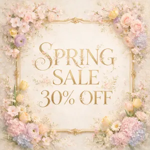
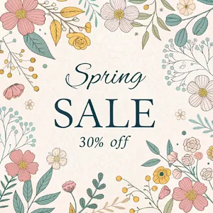
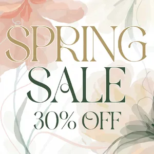
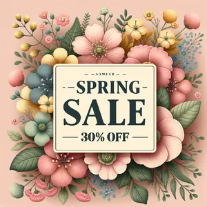
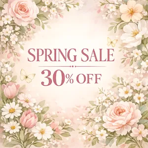
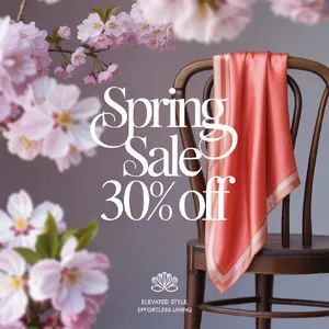
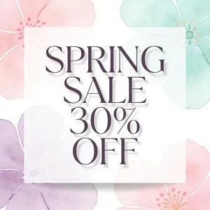
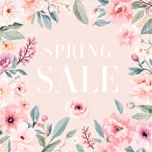
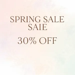
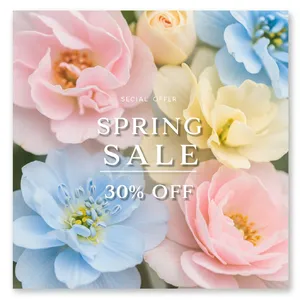
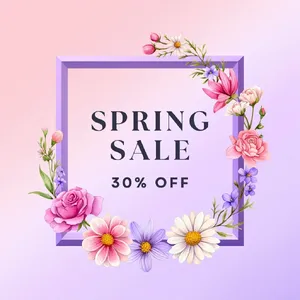
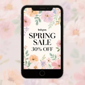
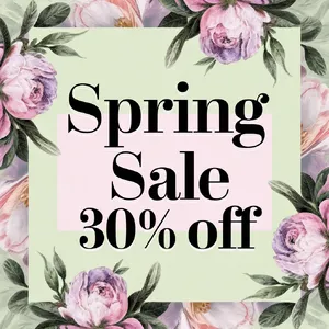
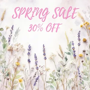
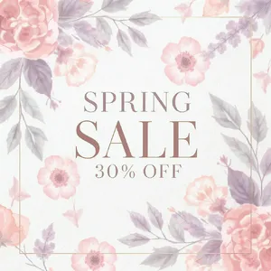
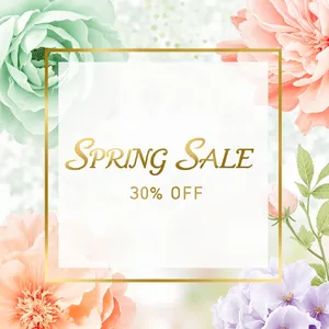
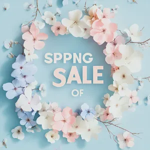
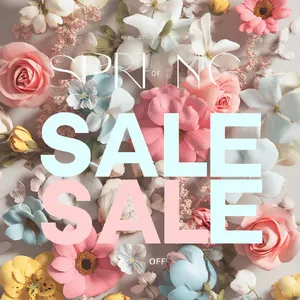
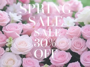
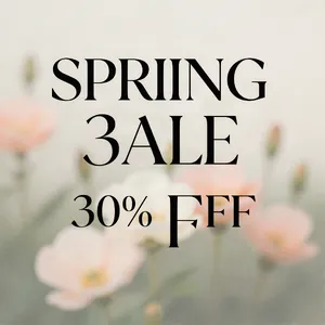
- Optical Balancing: They correctly weigh text against imagery. For example, in the Spring Sale Post, top models ensure the floral elements decorate rather than obscure the "30% OFF" text.
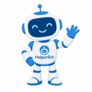
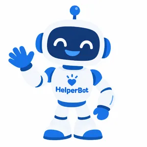
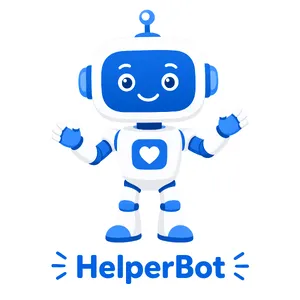
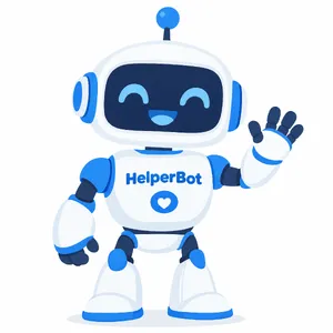
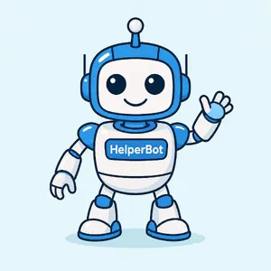
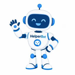
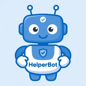
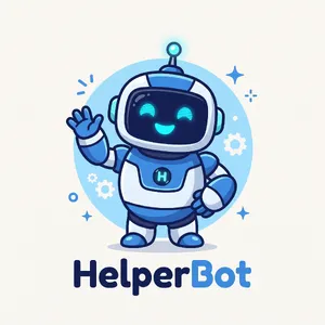
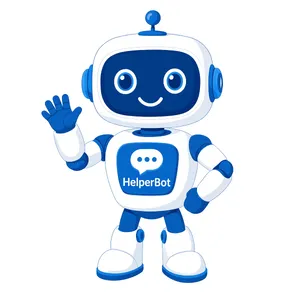
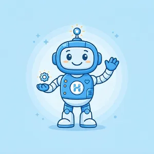
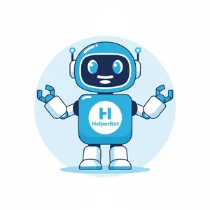
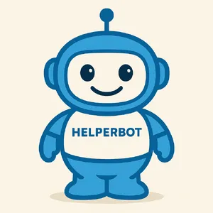
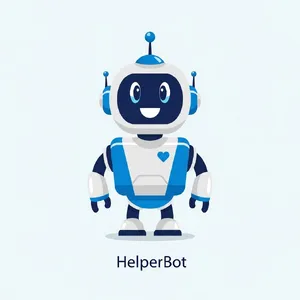
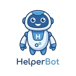
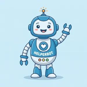
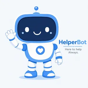
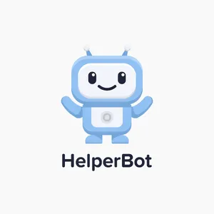
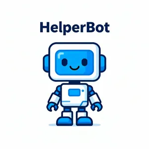
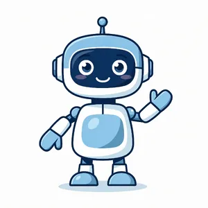
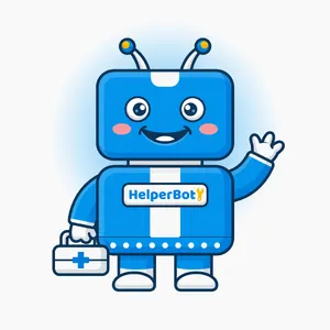
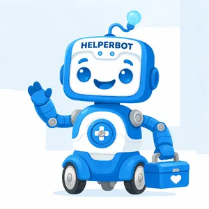
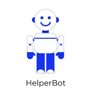
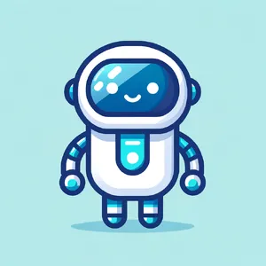
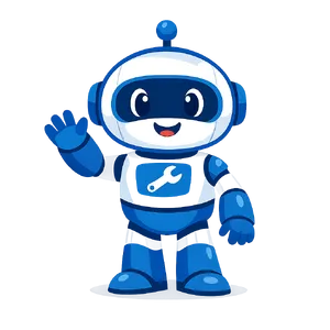
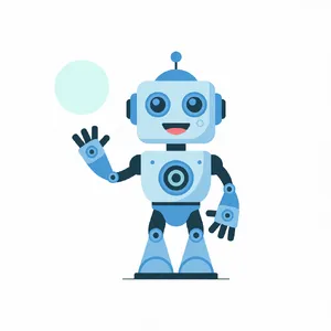
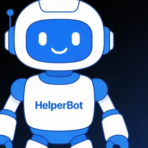
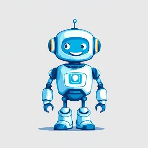
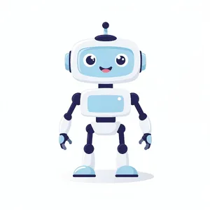
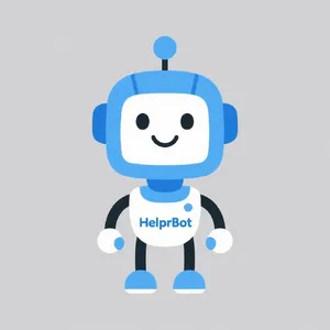
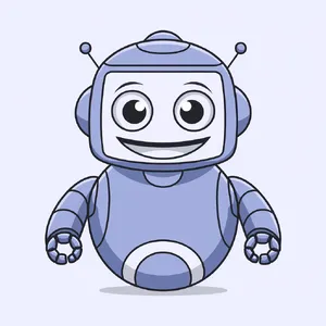
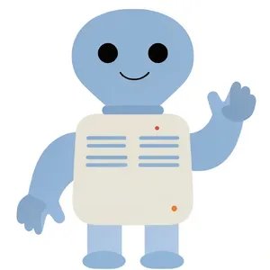
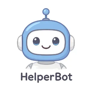
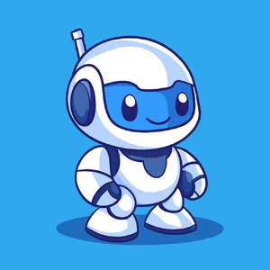
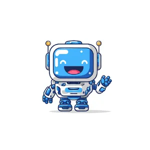
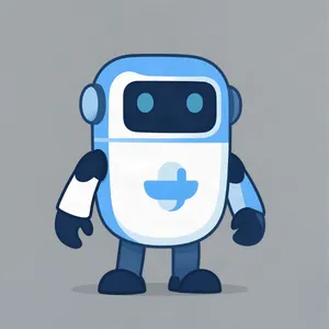
- Stylistic Restraint: When asked for a simple, friendly robot mascot in HelperBot Mascot, the best models used simple curves and solid colors, avoiding unnecessary paneling, gears, or "sci-fi" grunge.
💎 Quality Factors of Top Performers
What separates a 1300+ Elo model from a 900 Elo model in Graphic Design?
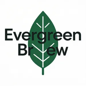
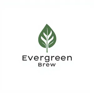
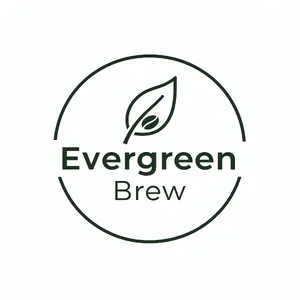
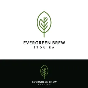
- Clean Silhouettes: In logo design, a strong silhouette is mandatory. Top performers deliver crisp edges that would theoretically translate well to vector paths (SVG).
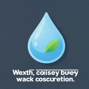
- Perfect Spelling: A logo or UI asset with a typo is instantly unusable. Top models rarely hallucinate extra characters or misspell standard words.
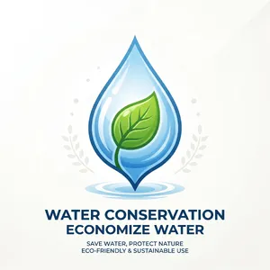
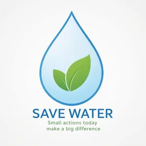
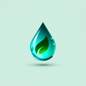
- Understanding Negative Space: The best generations leave "breathing room." For instance, in the Water Conservation Icon, top images let the single leaf sit cleanly inside the droplet without crowding the edges.
⚠️ Common Failure Modes
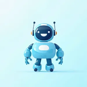
- Over-Rendering: Many models fail "flat design" tests by adding 3D effects. MiniMax Image-01's Mascot failed by generating a glossy 3D render instead of a flat vector.
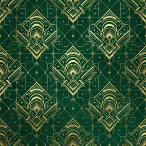
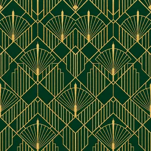
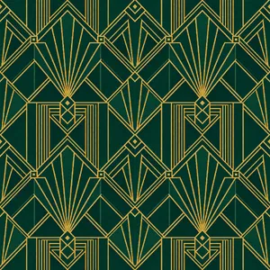
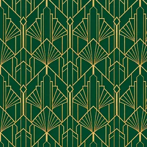
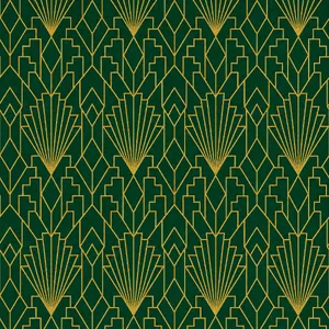
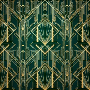
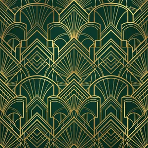
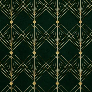
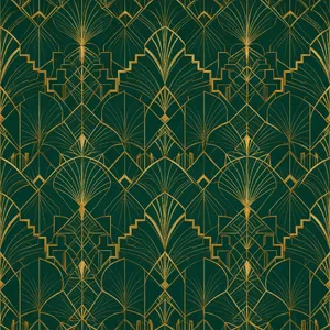
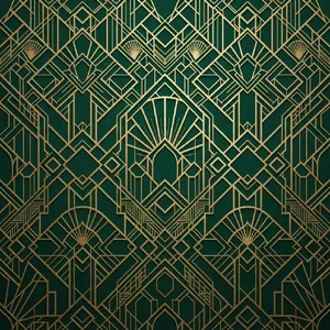
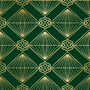
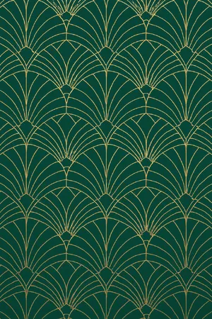
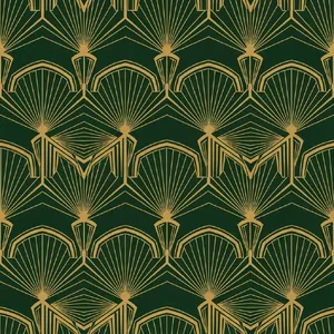
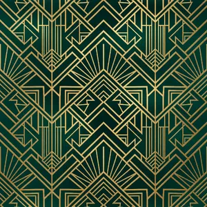
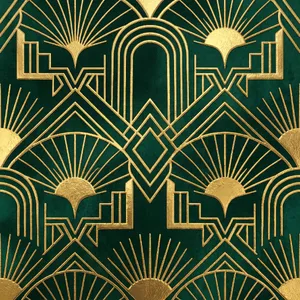
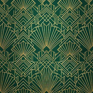
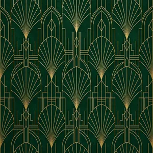
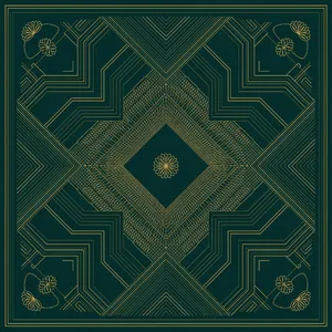
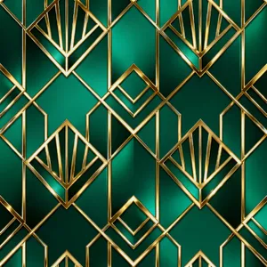
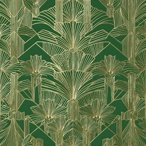
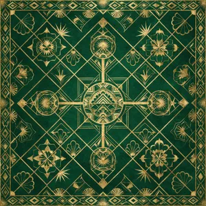
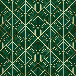
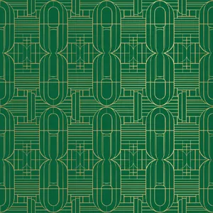
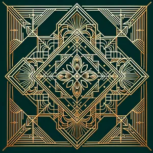
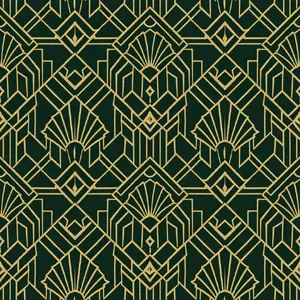
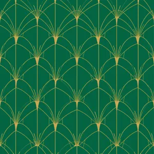
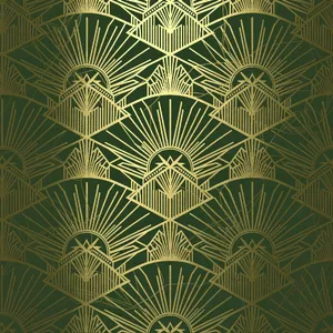
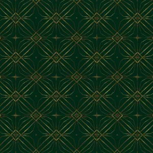
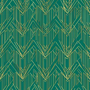
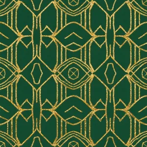
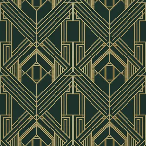
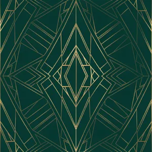
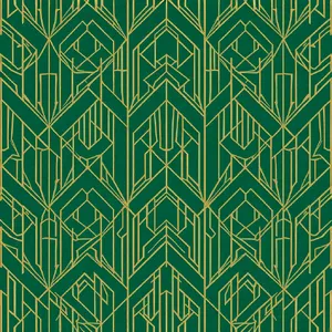
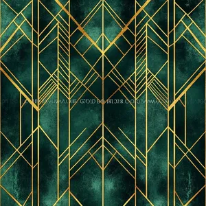
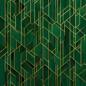
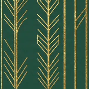
- Format Disobedience: In the Art Deco Pattern prompt, the goal was a seamless pattern. Lower-tier models failed to match edge phases (where the left edge continues to the right), rendering the pattern useless for repeating tile prints.
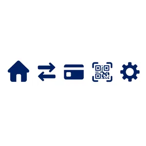
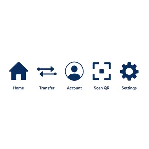
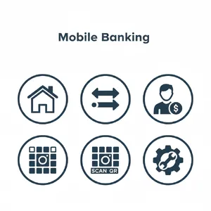
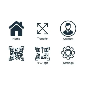
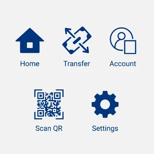
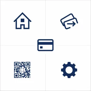
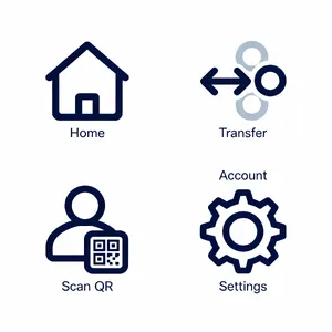
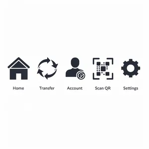
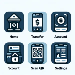
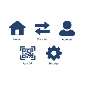
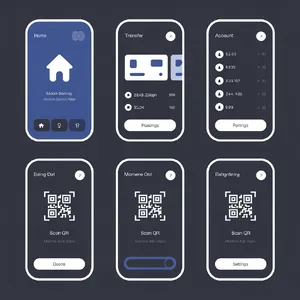
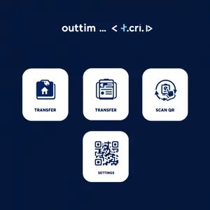
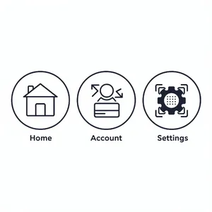
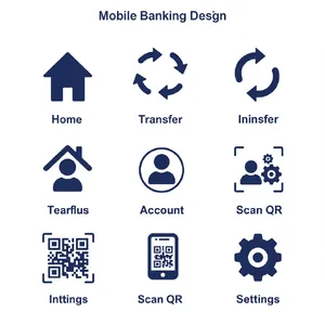
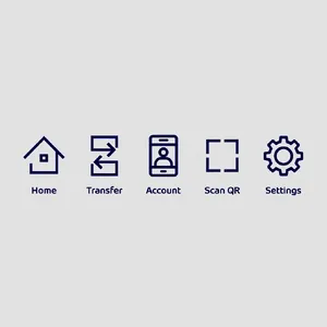
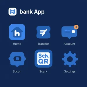
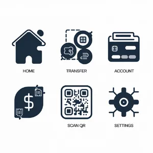
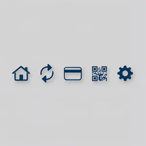
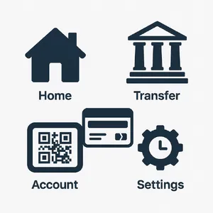
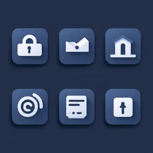
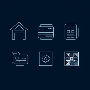
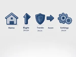
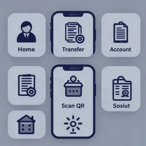
- Counting Errors: In the Banking App Icons prompt, models were asked for exactly five icons. Many generated four, six, or even nine. Takumi 1's Icons was one of the few to flawlessly generate exactly five distinct, consistent icons.
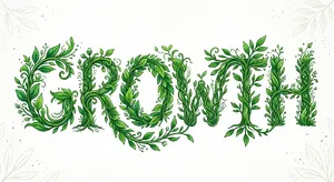
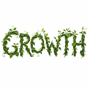
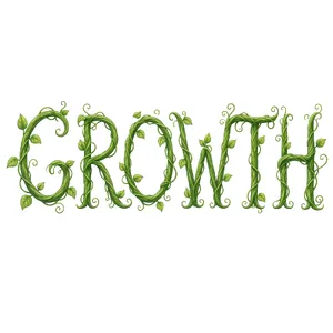
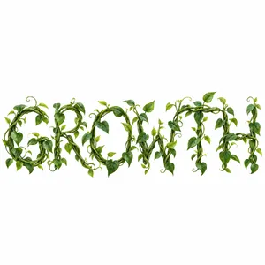
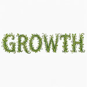
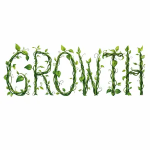
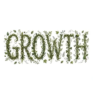
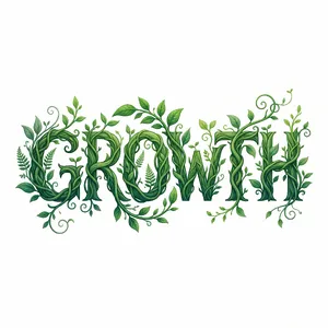
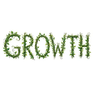
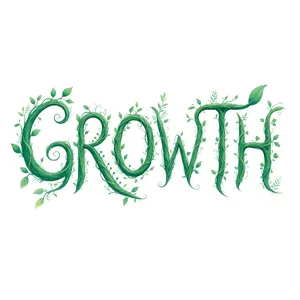
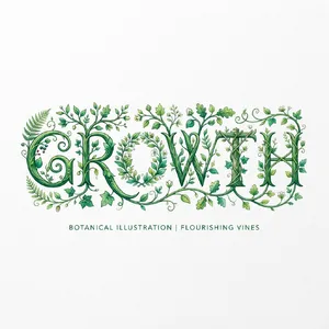
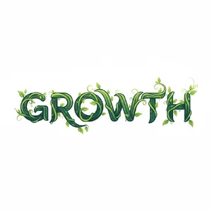
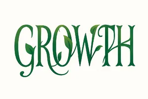
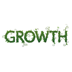
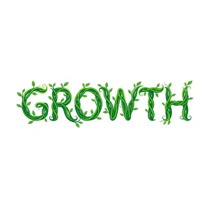
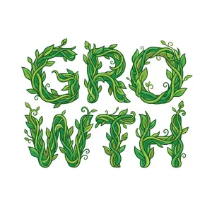
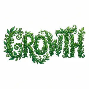
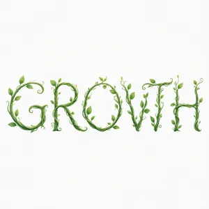
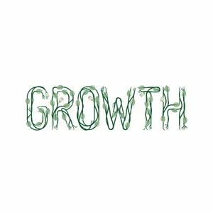
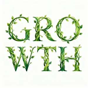
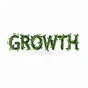
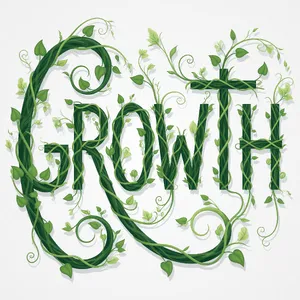
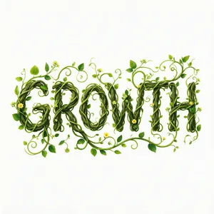
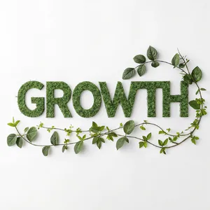
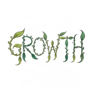
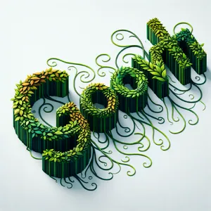
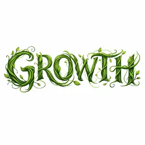
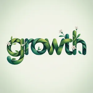
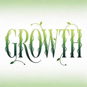
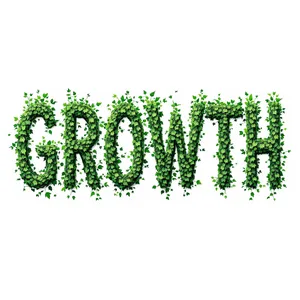
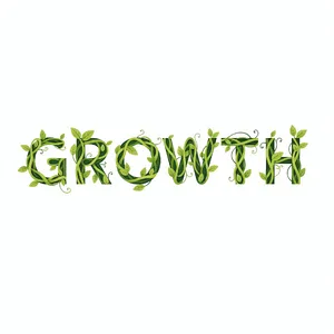
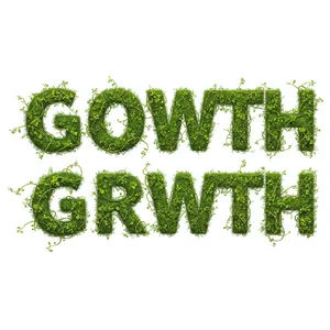
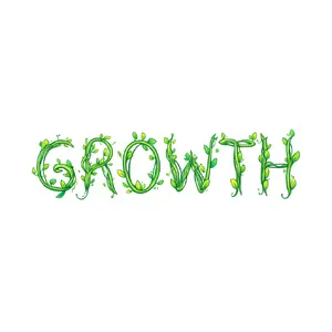
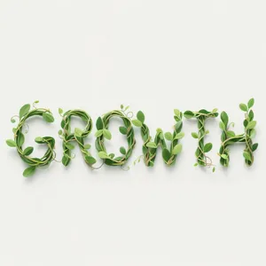
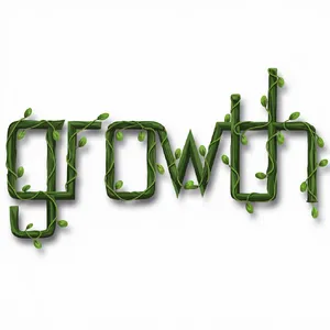
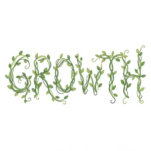
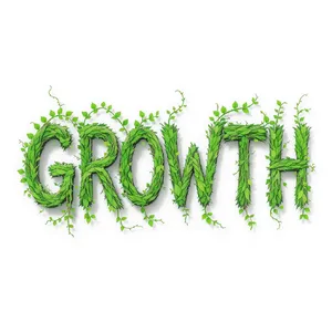
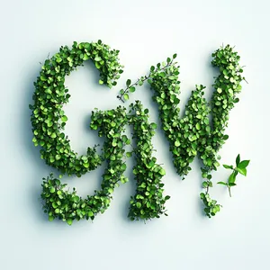
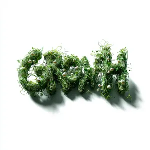
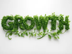
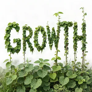
- Conceptual Synthesis Failure: When asked to make typography out of vines in the GROWTH Vines prompt, weak models simply took a standard font and pasted leaves on top of it, rather than structurally forming the letters with the stems.
Best Model Analysis by Use Case
The Graphic Design category encompasses several distinct disciplines. Here is a breakdown of model performance across specialized design scenarios.
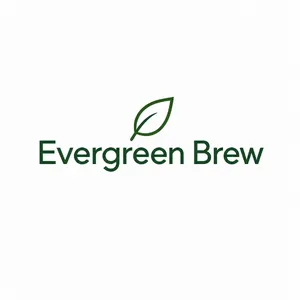
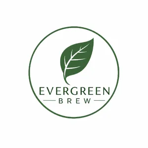
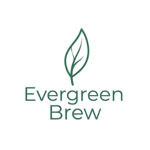
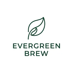
1. Logo Design & Branding 🎯
2. UI/UX & Iconography 📱
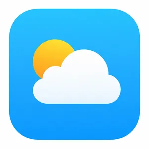
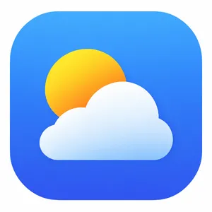
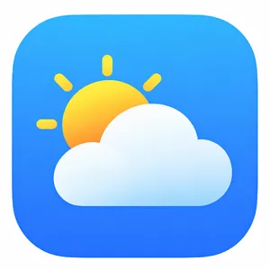
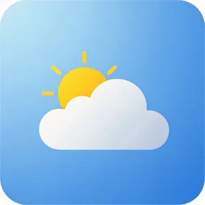
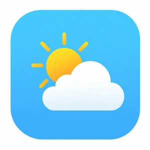
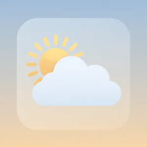
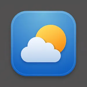
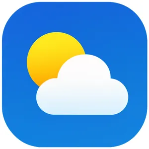
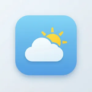
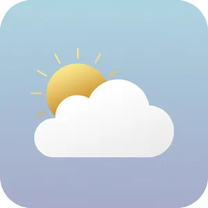
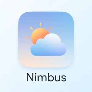
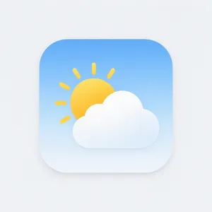
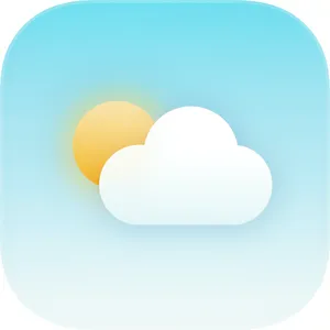
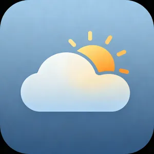
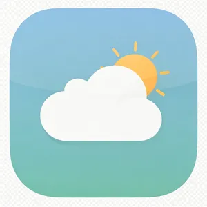
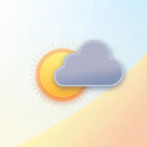
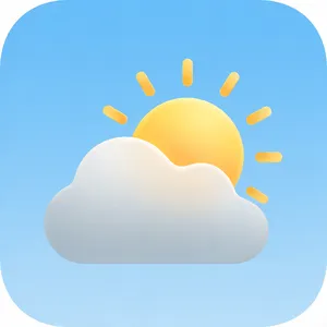
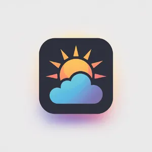
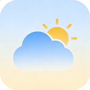
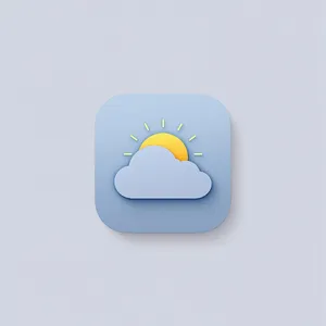
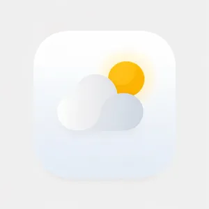
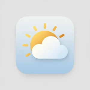
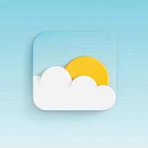
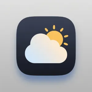
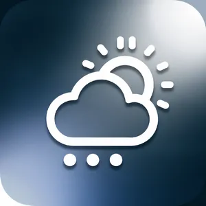
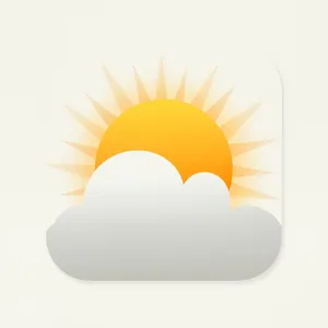
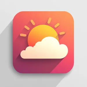
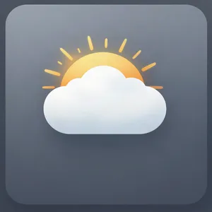
- The Test: Creating coherent asset families, like the Banking App Icons and the Weather App Icon.
- Top Picks: Takumi 1 and GPT Image 2.5 Flare.
- Insights: Consistency is everything. Models must maintain the same line weight, corner radii, and color palette across multiple elements. The Takumi 1 Banking Icons achieved near-perfection by maintaining exact stroke weights and visual density across five completely different conceptual symbols.
3. Layout & Social Media Assets 🖼️
- The Test: The Spring Sale Post tested the ability to frame text with decorative elements (florals) while maintaining a legible promotional hierarchy.
- Top Picks: FLUX 3 Image and GPT Image 2.5 Sunburst.
- Insights: This requires spatial awareness. FLUX 3's Post won its matchup by integrating the text color with the surrounding flowers, creating a cohesive ad where the text wasn't fighting the background for attention.
4. Seamless Patterns & Textures 🧩
- The Test: The Art Deco Pattern required generating a high-resolution, repeating geometric texture.
- Top Picks: Takumi 1 and Grok Imagine 2.0.
- Insights: Seamless tiling is highly technical. Takumi 1's Pattern succeeded by ensuring the geometric motifs reached opposing edges at matching phases, creating a genuinely tileable graphic—a rare feat for AI image generators.
5. Abstract & Conceptual Graphics 🚀
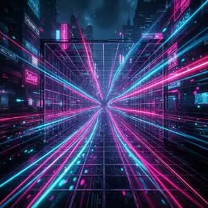
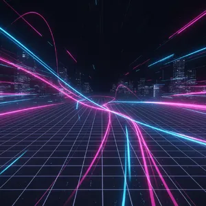
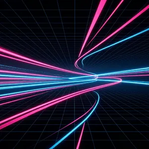
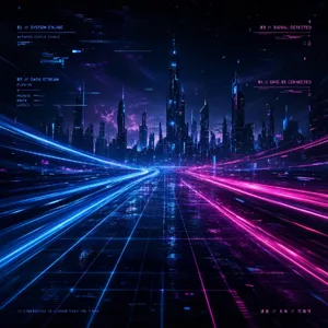
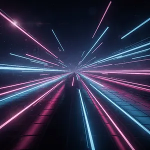
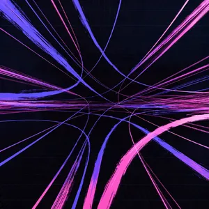
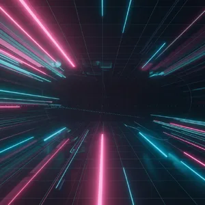
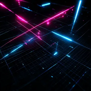
- The Test: The Cyberpunk Background and GROWTH Vines prompts tested non-representational aesthetics and conceptual synthesis.
- Top Picks: Nano Banana 2 and Takumi 1.
- Insights: For pure abstract vibe generation, the
Nano Banana family handles luminous and glowing elements beautifully. For conceptual synthesis (turning vines into letters), Takumi 1's Growth showed an unparalleled ability to bend organic shapes into legible, calligraphic typography.