Summary for Text in Images
🏆 Key Discoveries
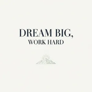
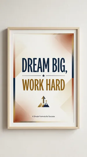
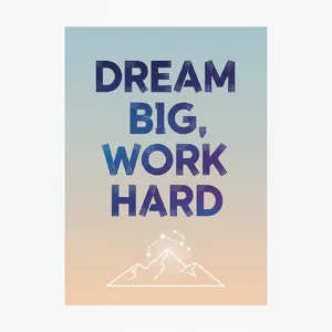
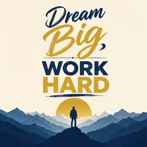
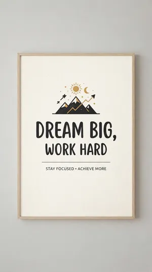
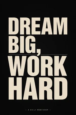
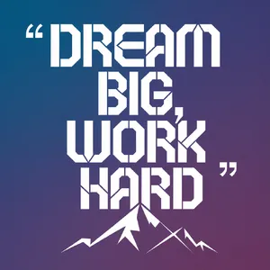
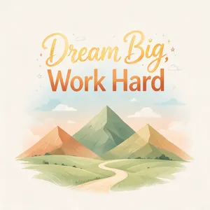
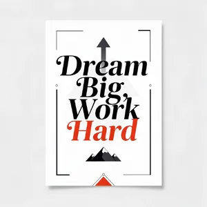
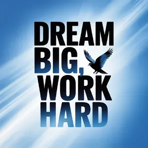
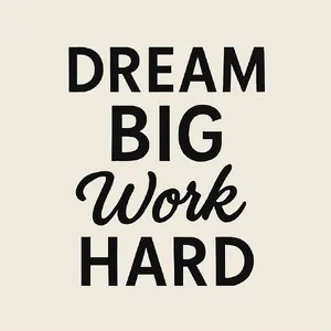
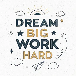
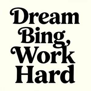
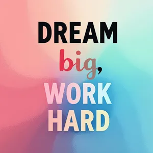
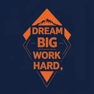
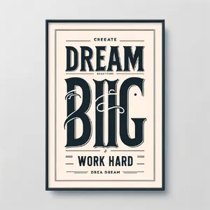
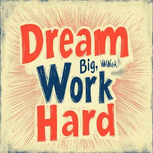
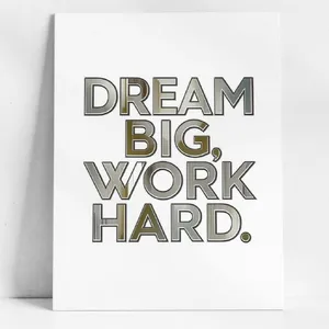
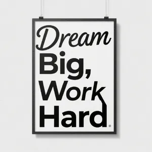
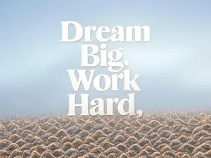
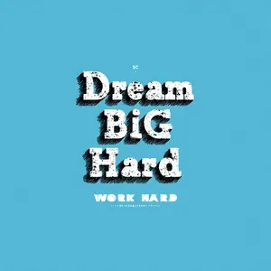
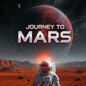
Generating legible, correctly spelled text has historically been the Achilles' heel of AI image models. However, this dataset reveals a massive leap forward in typographic capabilities. The days of scrambled, alien-looking alphabets are fading!
Top-Performing Models:
- Grok Imagine 2.0 (Preview): An absolute powerhouse. It consistently dominated across almost all prompts, proving exceptional at both large headlines and complex environmental integration.
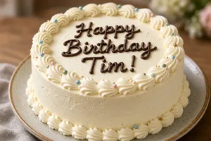
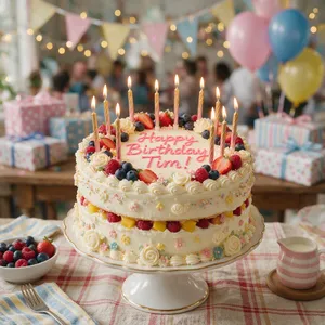
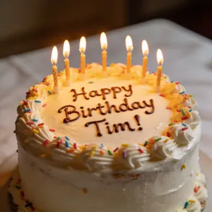
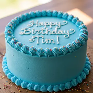
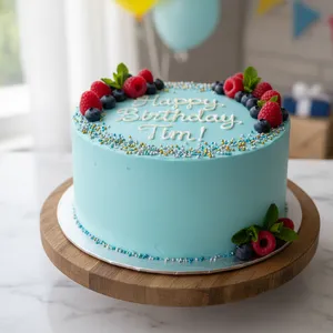
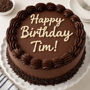
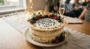
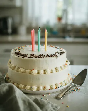
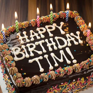
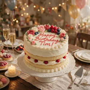
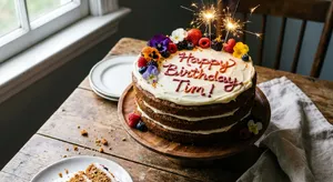
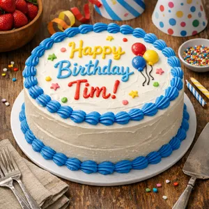
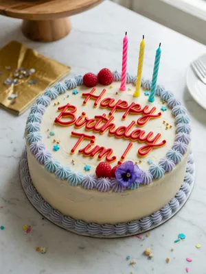
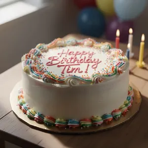
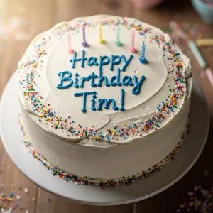
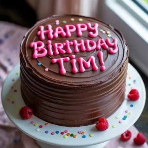
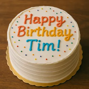
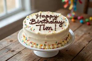
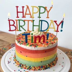
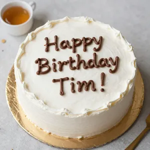
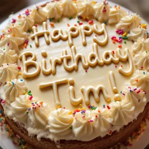
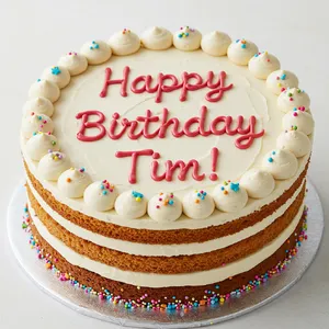
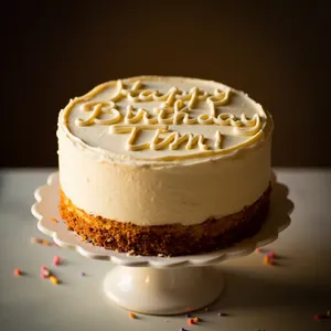
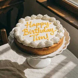
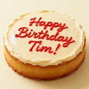
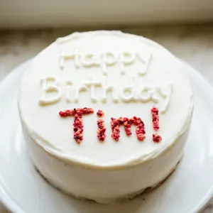
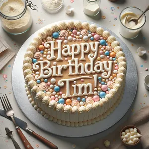
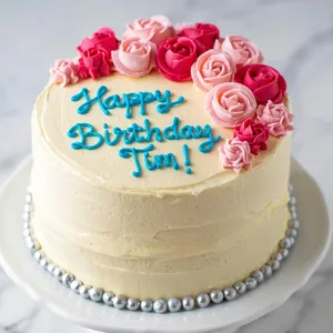
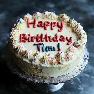
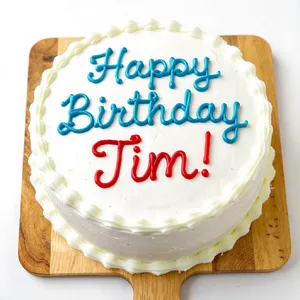
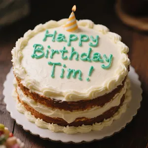
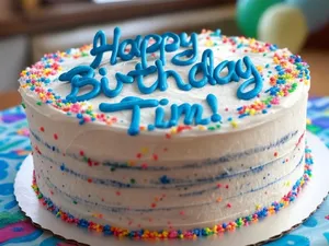
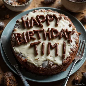
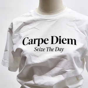
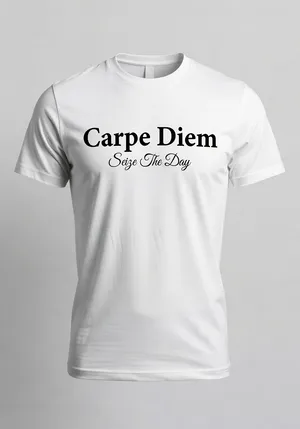
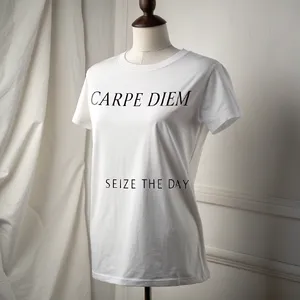
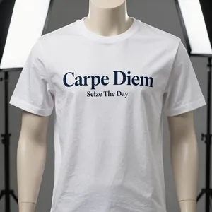
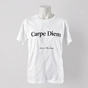
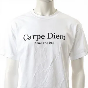
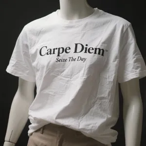
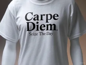
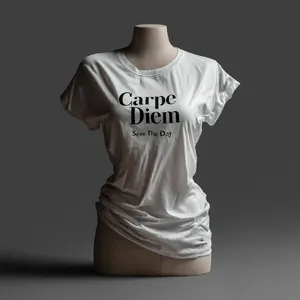
- Takumi 1: A top-tier contender that excels at realistic text rendering on difficult textures like wrinkled fabric and birthday cakes.
- GPT Image 2: Highly reliable for spelling accuracy and professional commercial-style presentation.
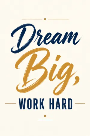
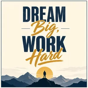
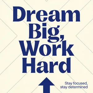
- Imagen 4.0 Ultra: Flawless in graphic design scenarios, producing crisp, vectorized-looking typography.
Notable Trends & Surprises:
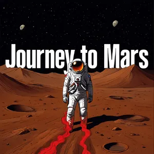
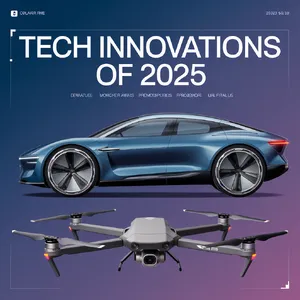
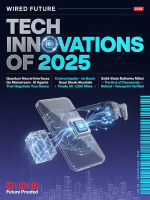
- The Microtext Hurdle: Almost all models still struggle with tiny, secondary text (like barcodes, magazine issue dates, or fine print on posters), often resorting to convincing but ultimately gibberish shapes.
- Midjourney's Paradox: Despite having some of the highest artistic scores, Midjourney V6.1 and Midjourney v7 frequently stumbled on exact spelling requirements, proving that stunning visuals don't automatically guarantee typographic accuracy.
🔍 Deep Dive: Patterns & Strengths
1. The Typography Integration Challenge
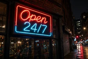
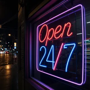
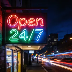
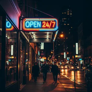
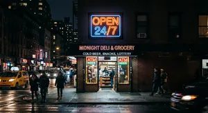
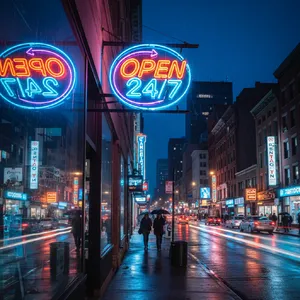
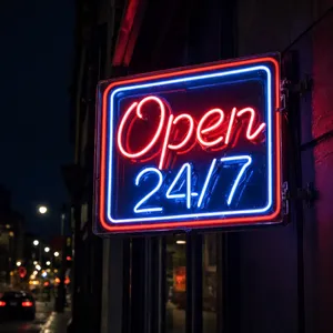
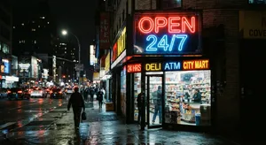
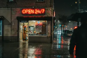
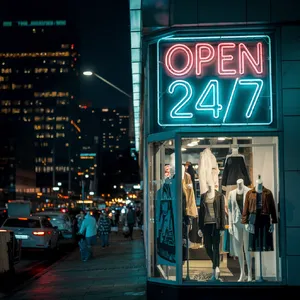
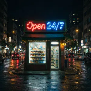
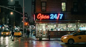
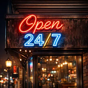
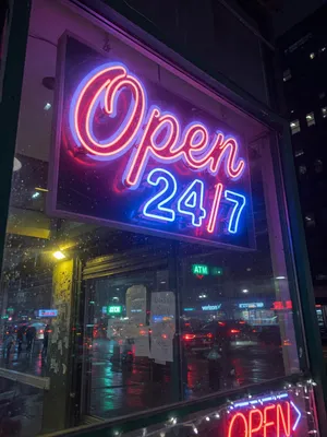
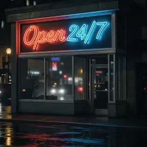
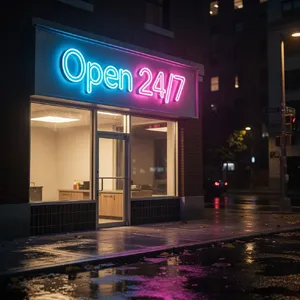
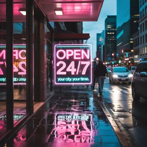
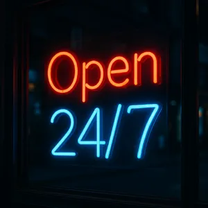
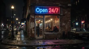
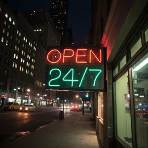
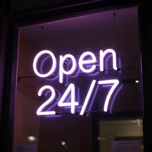
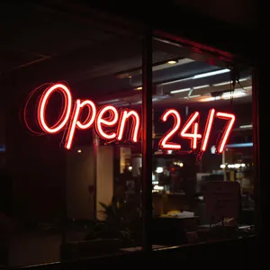
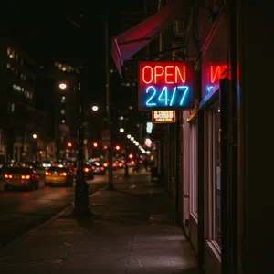
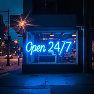
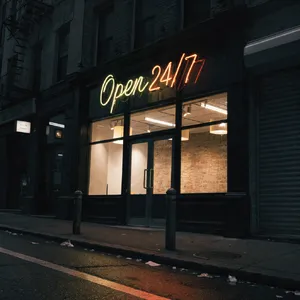
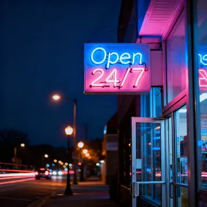
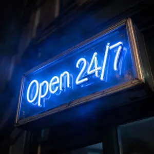
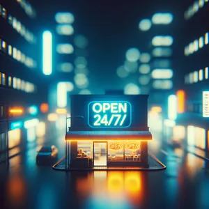
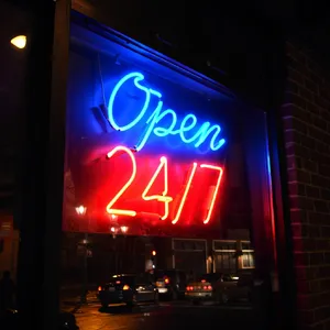
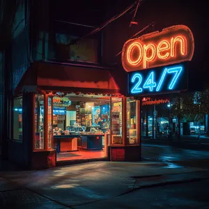
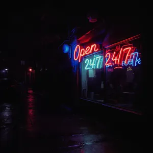
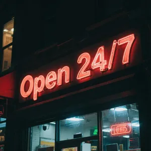
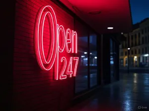
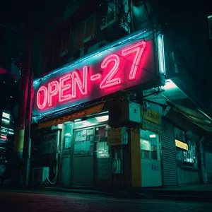
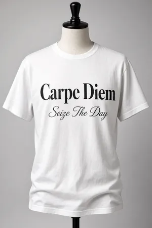
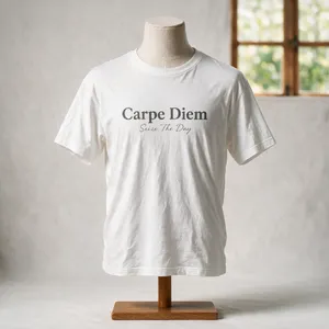
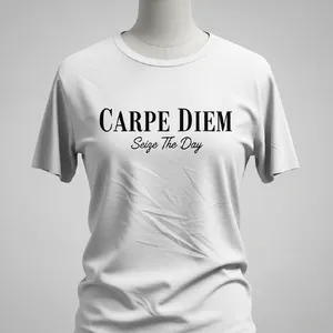
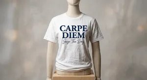
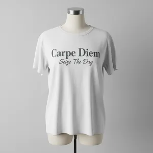
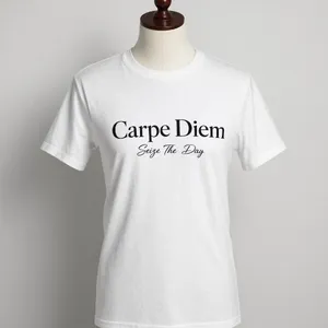
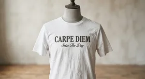
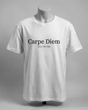
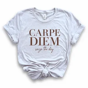
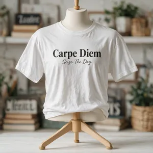
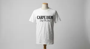
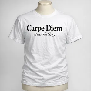
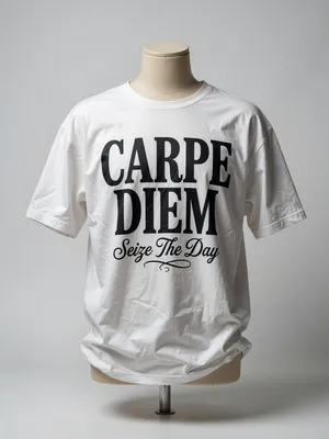
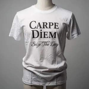
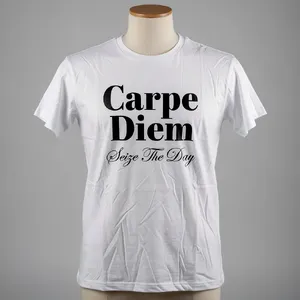
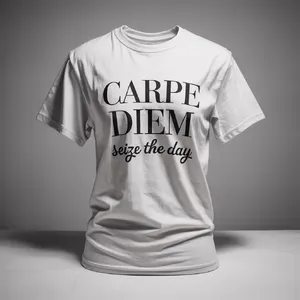
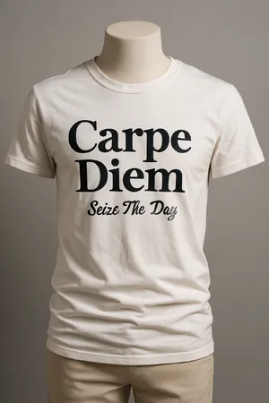
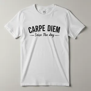
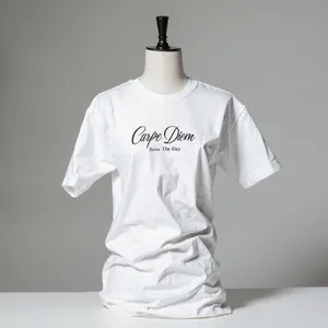
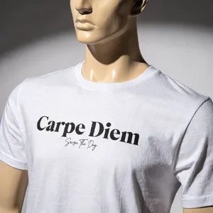
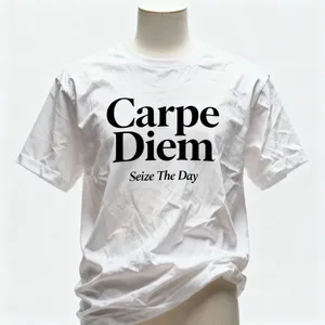
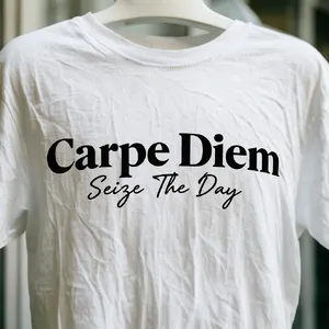
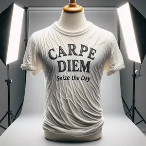
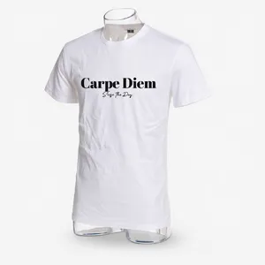
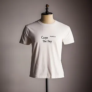
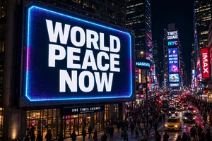
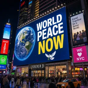
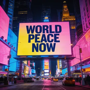
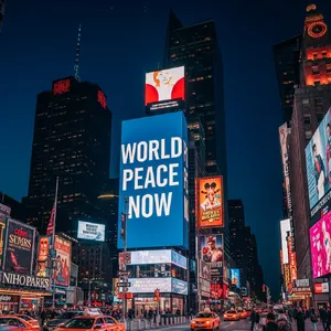
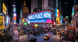
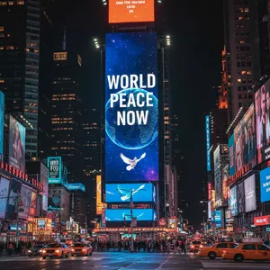
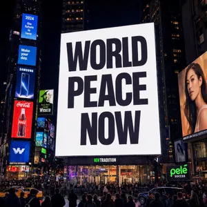
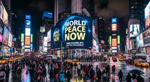
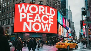
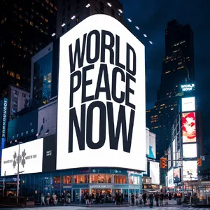
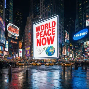
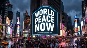
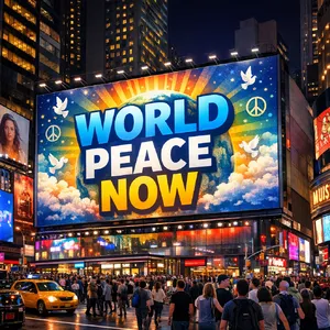
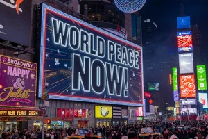
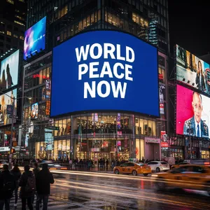
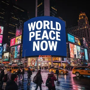
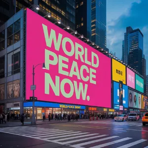
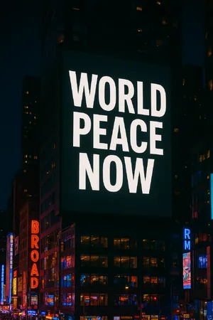
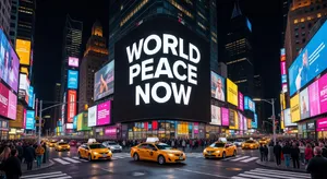
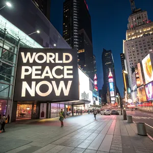
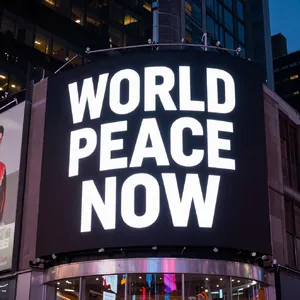
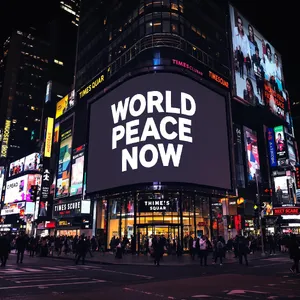
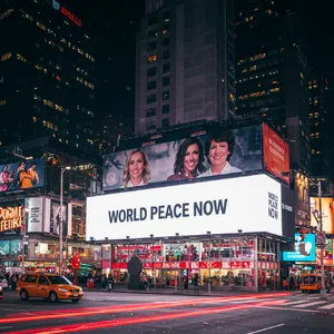
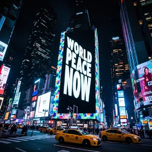
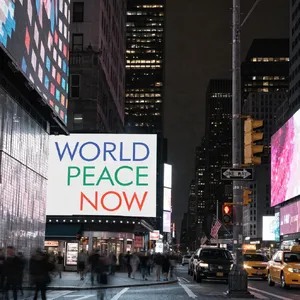
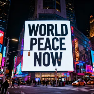
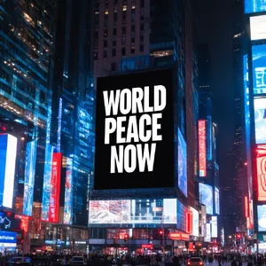
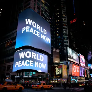
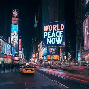
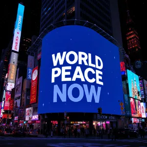
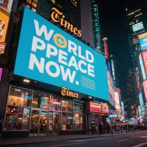
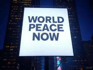
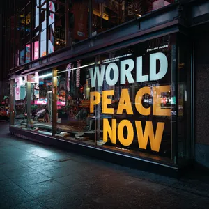
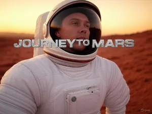
Perfectly spelled text is only half the battle; integrating it naturally into a scene is what separates the good from the great. Models like Grok Imagine 2.0 (Preview) and Nano Banana 2 excelled at environmental text. They understood how neon glows, how light reflects off a wet Times Square Billboard, and how text should warp on a Wrinkled T-shirt. Lower-performing models often "pasted" pristine vector text on top of an image, ruining the photorealism.
2. The Curse of the Gibberish Microtext
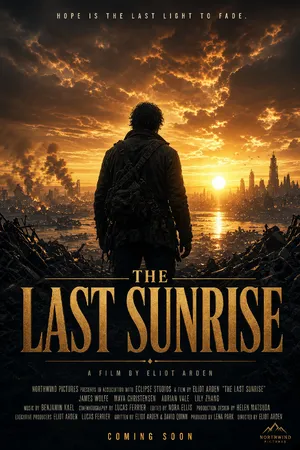
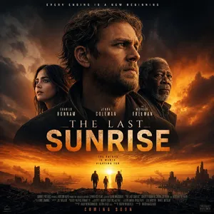
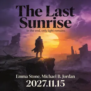
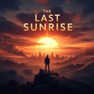
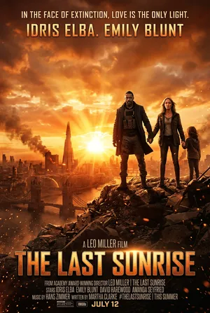
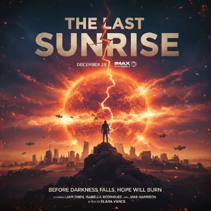
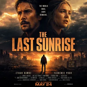
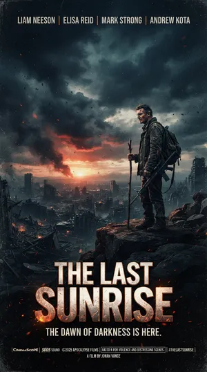
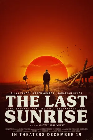
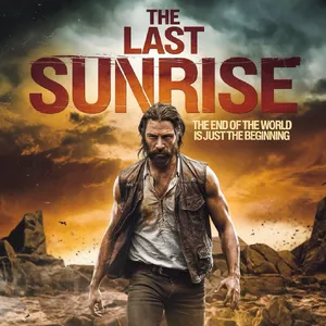
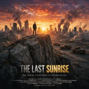
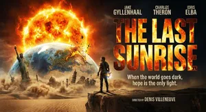
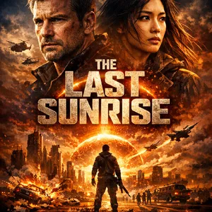
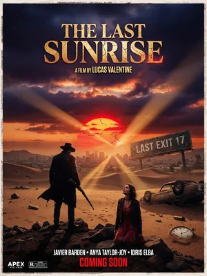
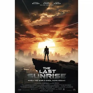
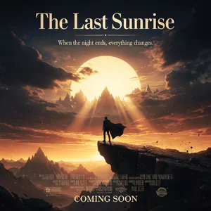
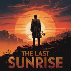
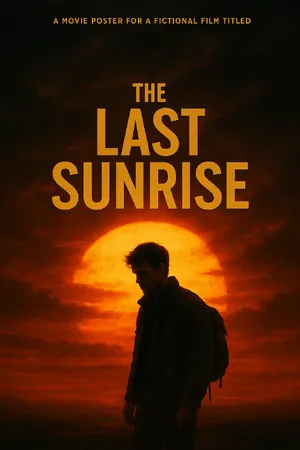
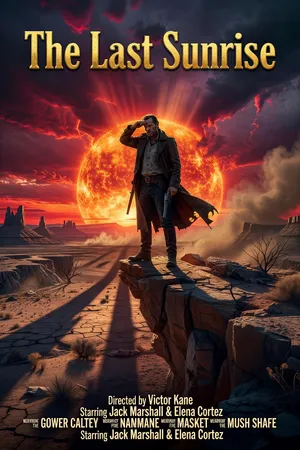
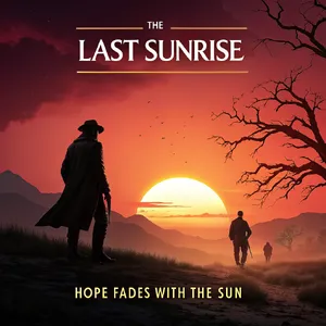
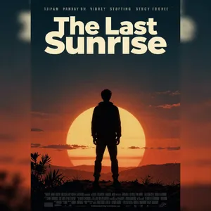
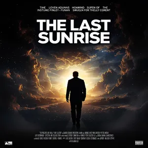
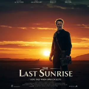
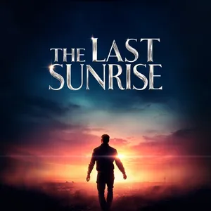
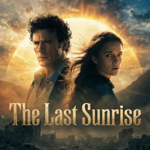
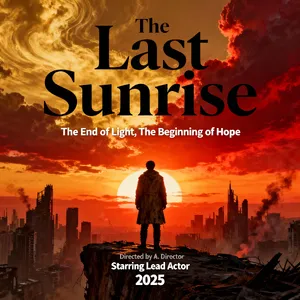
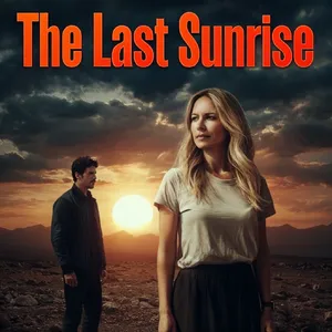
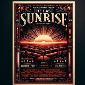
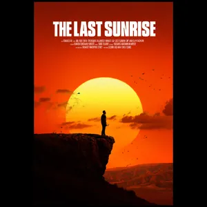
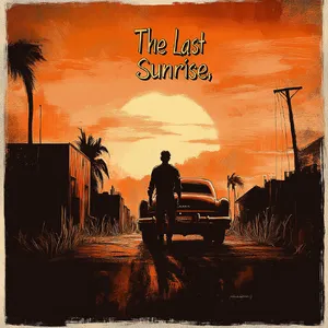
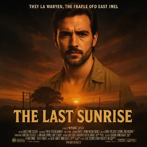
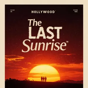
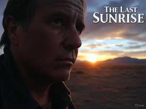
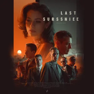
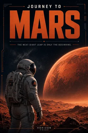
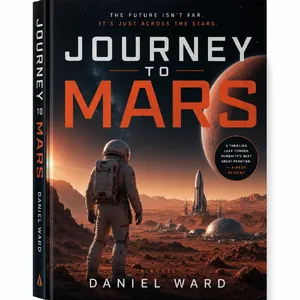
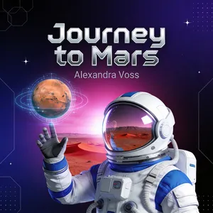
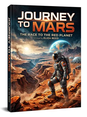
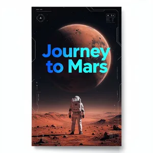
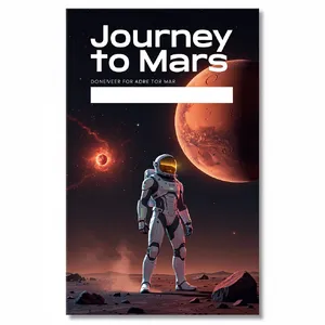
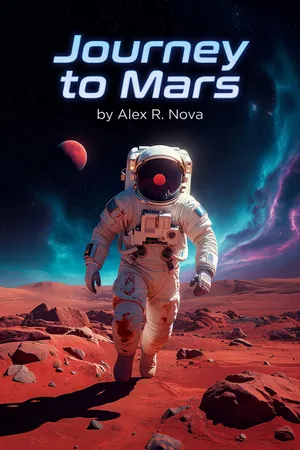
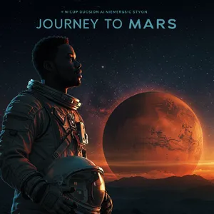
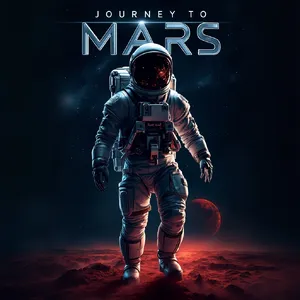
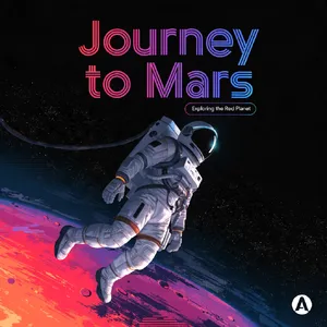
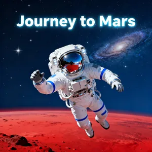
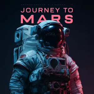
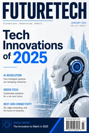
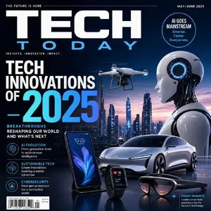
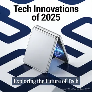
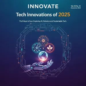
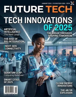
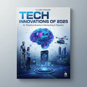
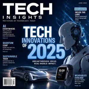
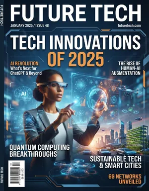
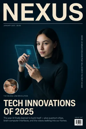
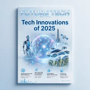
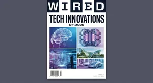
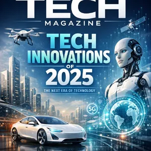
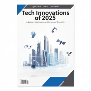
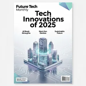
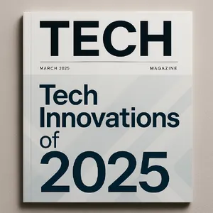
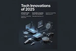
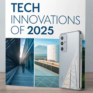
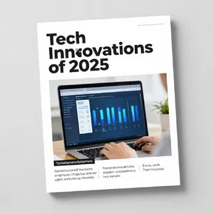
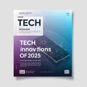
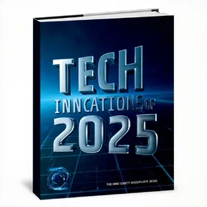
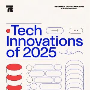
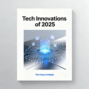
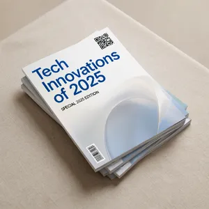
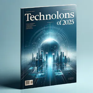
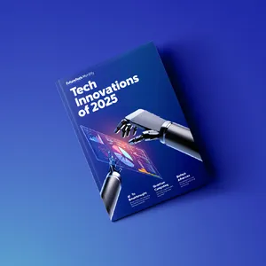
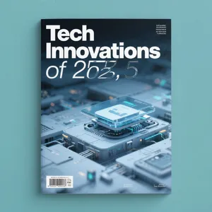
When tasked with complex layouts like a Tech Magazine or a The Last Sunrise Poster, models are forced to fill negative space with secondary text. A major failure mode across the board was the generation of "pseudo-text." While the main headline would be perfect, the author names, taglines, and subheadings dissolved into unreadable runes. Models like Ideogram 4.0 (Quality) performed slightly better here, organizing microtext with high editorial discipline.
3. Prompt Length vs. Model Accuracy
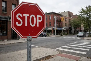
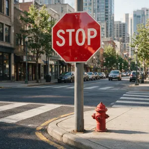
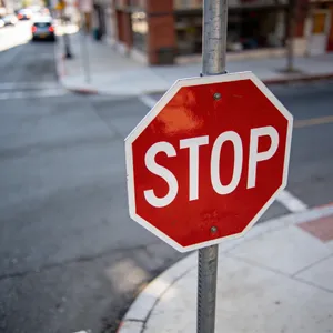
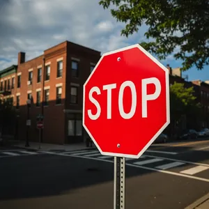
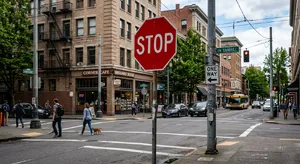
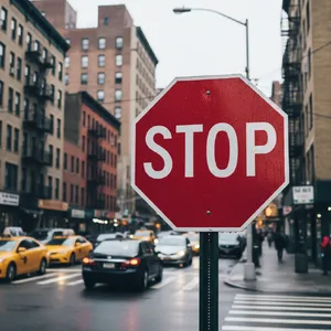
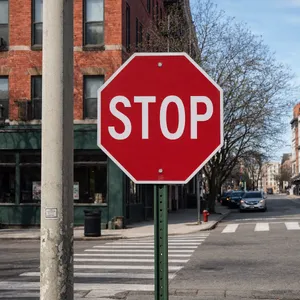
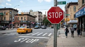
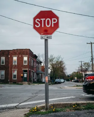
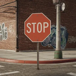
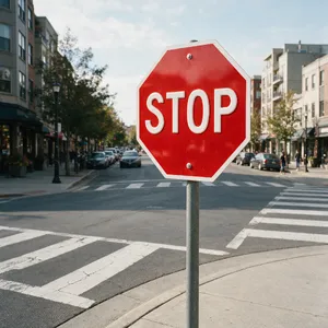
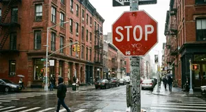
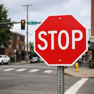
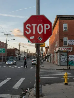
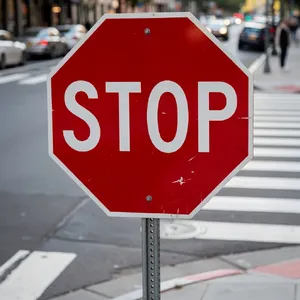
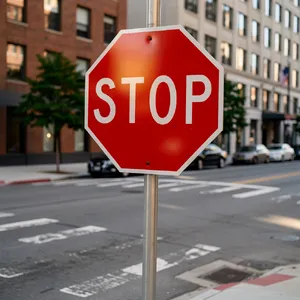
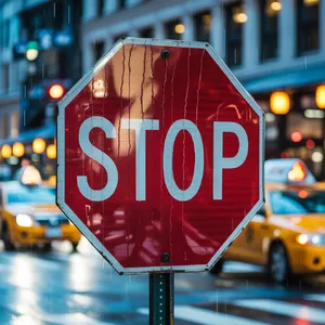
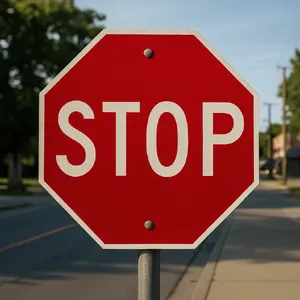
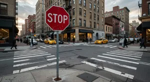
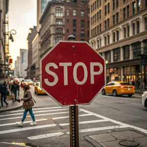
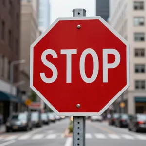
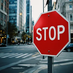
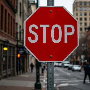
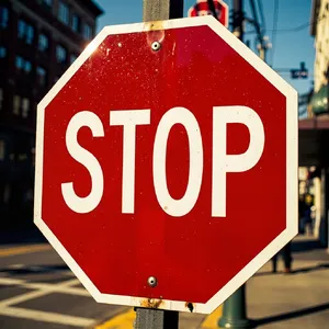
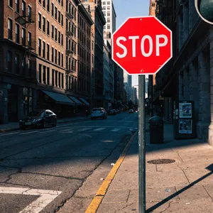
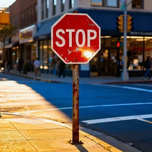
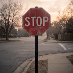
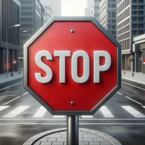
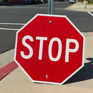
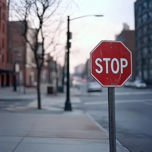
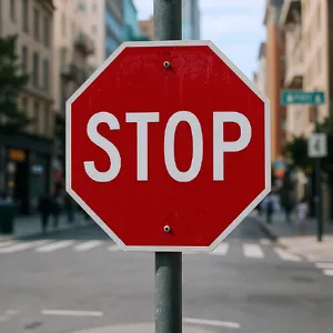
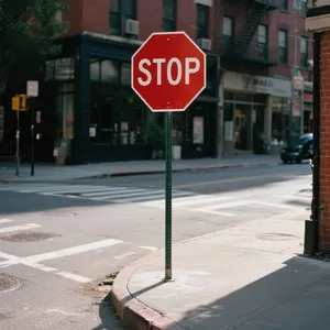
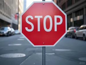
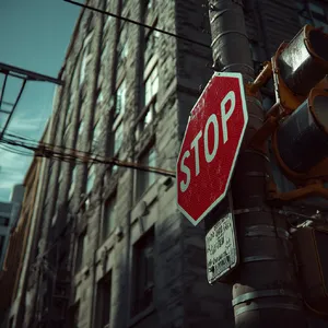
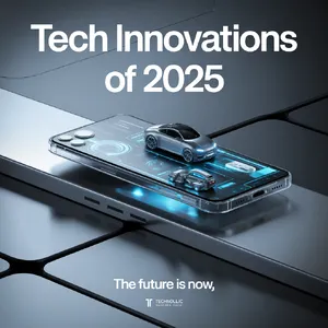
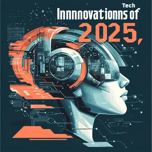
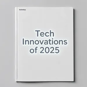
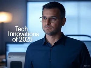
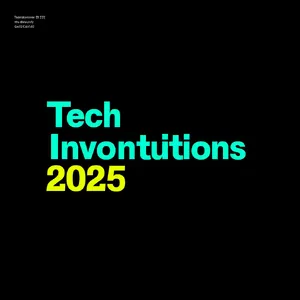
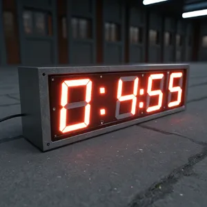
There is a direct correlation between the length of the requested text and the likelihood of a model hallucinating. Short prompts like Urban Stop Sign (which just requires "STOP") had incredibly high success rates. Longer phrases like "Tech Innovations of 2025" caused middle-tier models to drop letters, duplicate words, or miss punctuation marks.
🛠️ Best Models by Use Case
Different models shine depending on how and where you need your text to appear.
🌆 Photorealistic Signage & Billboards
If you need text integrated into physical cityscapes, neon signs, or reflective surfaces...
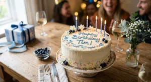
🎂 Physical Textures (Fabric, Icing, 3D Objects)
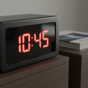
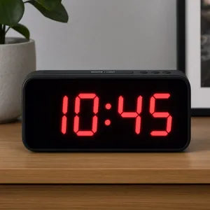
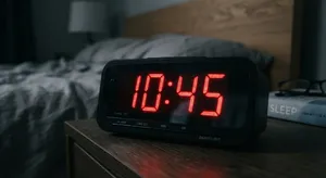
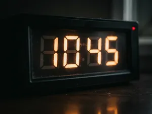
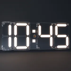
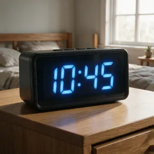
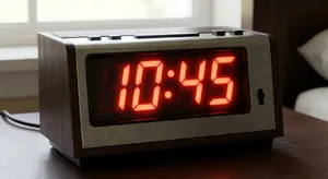
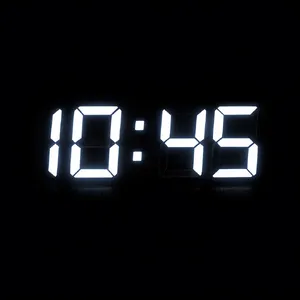
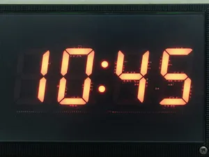
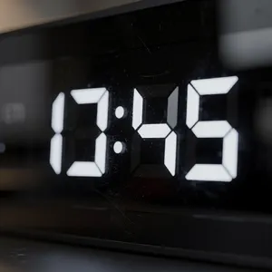
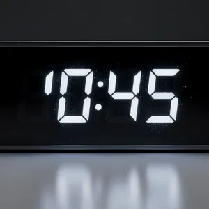
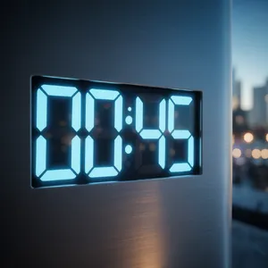
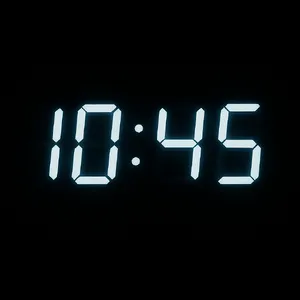
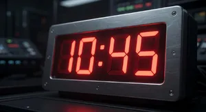
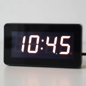
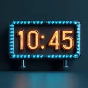
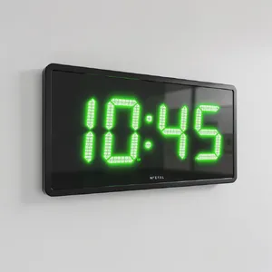
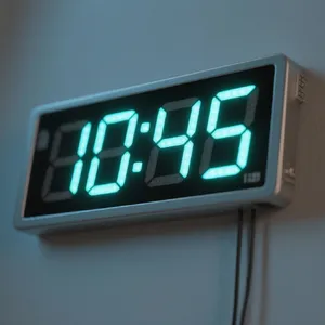
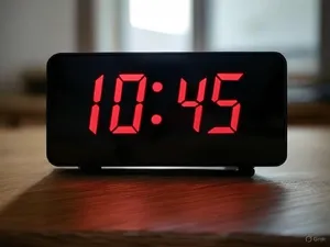
If you need text piped onto a cake, printed on wrinkled fabric, or built out of LED lights...
- Best Model: Takumi 1
- Runner Up: GPT Image 2
- Analysis: Takumi 1 understands physical volume. In the Birthday Cake and Wrinkled T-shirt challenges, it beautifully rendered text that actually interacted with the physical surface (compressing into fabric folds or sitting as dimensional chocolate icing).
🎨 Graphic Design & Editorial Layouts
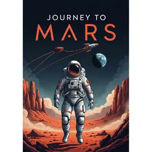
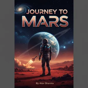
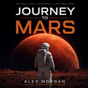
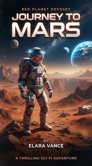
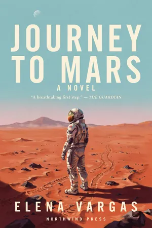
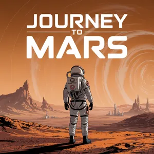
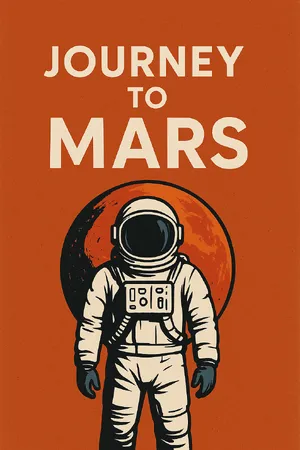
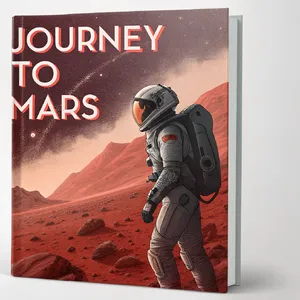
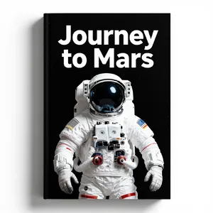
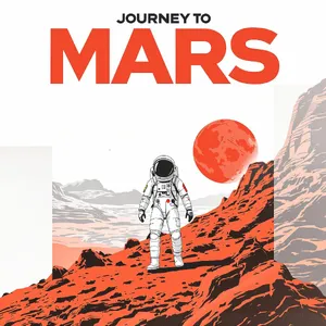
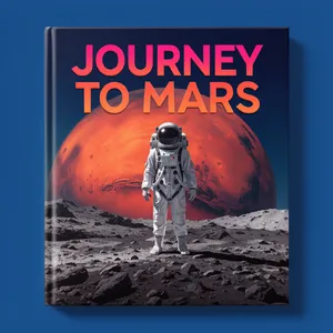
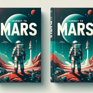
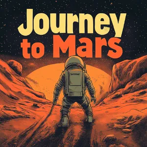
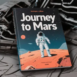
If you need clean, flat vector-style posters, book covers, or minimalist magazines...