Summary for Text in Images
When it comes to generating readable, perfectly integrated text, the landscape of AI models is highly polarized. Some models excel at typography, while others still struggle with basic spelling. 📝
🏆 Top-Performing Models Overall:
📈 Major Trends in the Data:
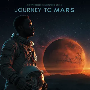
- The "Gibberish" Problem: Many models successfully render the primary text (like a headline) but automatically fill secondary text (like author names or poster credits) with alien-like gibberish.
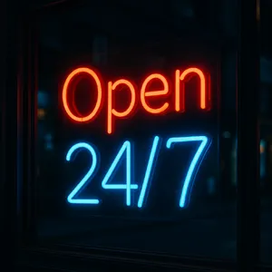
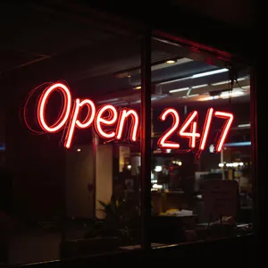
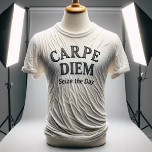
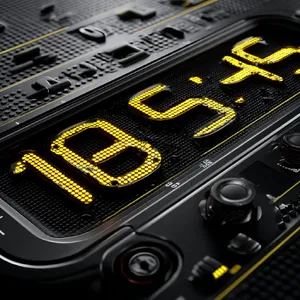
- Material Interaction is Key: The best models don't just paste text onto an image; they understand materiality. They deform text along the wrinkles of a shirt or give neon tubes realistic glass reflections.
😲 Surprising Discoveries:
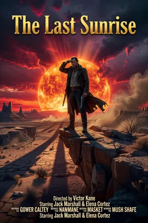
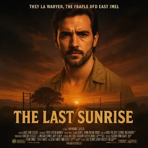
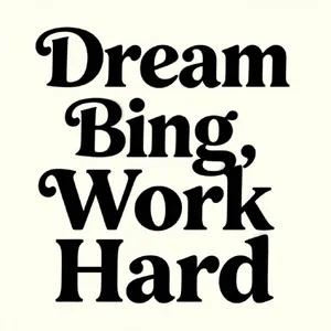
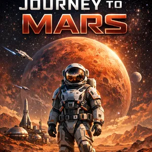
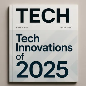
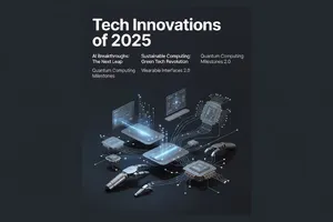
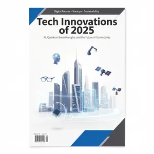
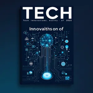
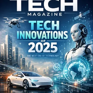
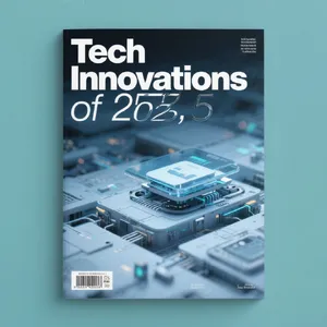
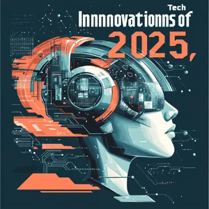
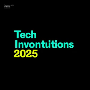
- Despite their dominance in artistic styling, Midjourney V6.1 and Midjourney v7 severely struggled with multi-word typography. They frequently introduced severe typos, such as spelling "Innovations" as "Innnnovatiionns" on the Magazine Cover.
General Analysis & Useful Insights
Generating text is one of the ultimate stress tests for modern AI image models. Our deep dive reveals fascinating insights into how different architectures handle this challenge. 🔍
⚖️ Comparative Strengths Across Models
The Typographical Titans:
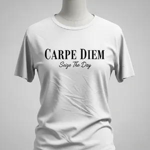
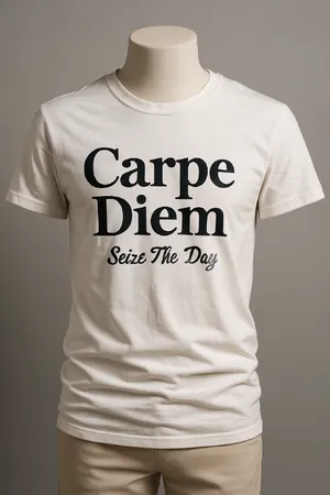
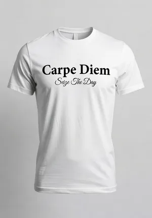
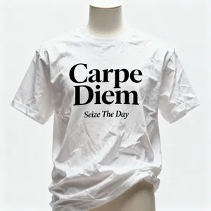
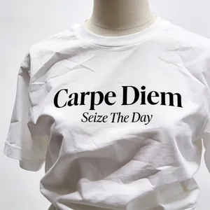
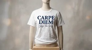
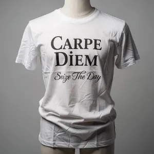
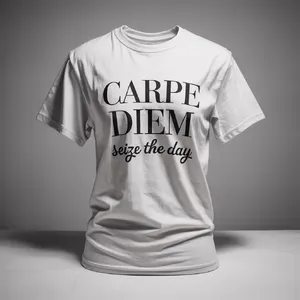
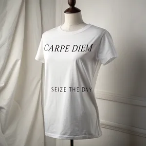
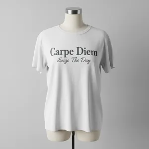
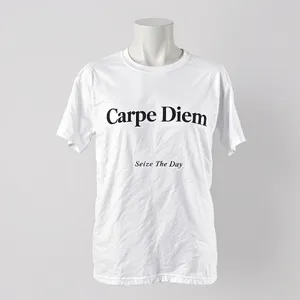
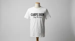
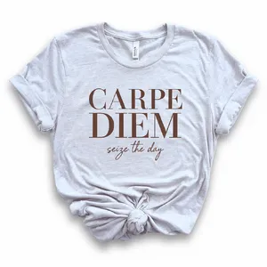
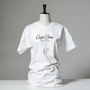
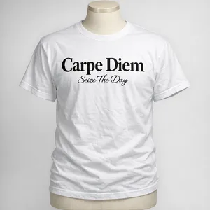
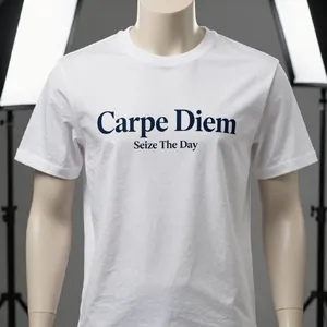
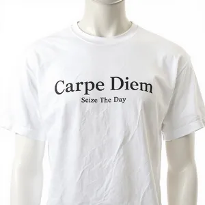
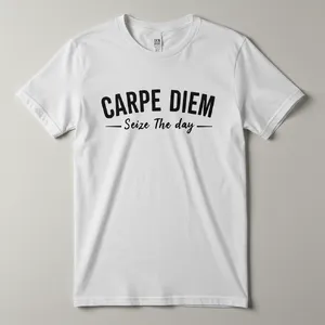
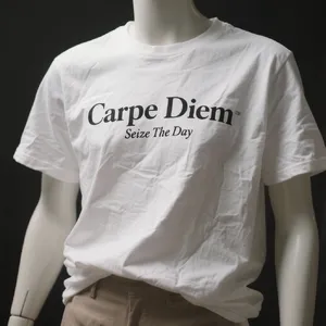
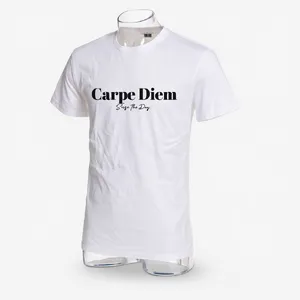
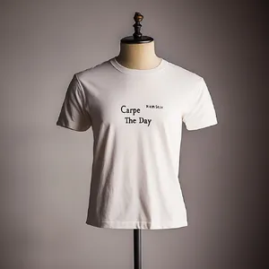
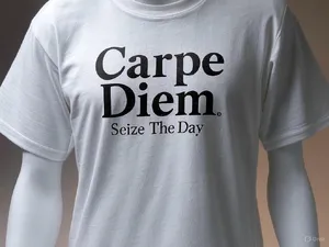
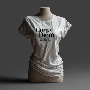
Models like Ideogram 3.0 (Quality) and Nano Banana Pro exhibit a profound understanding of typography. They don't just spell words correctly; they understand font hierarchy, pairing serif and script fonts seamlessly, as seen in the Carpe Diem T-Shirt challenge.
The Artistic Challengers:
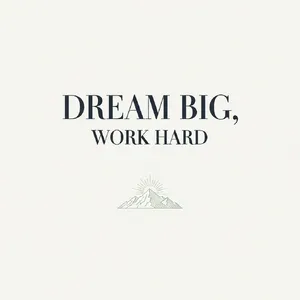
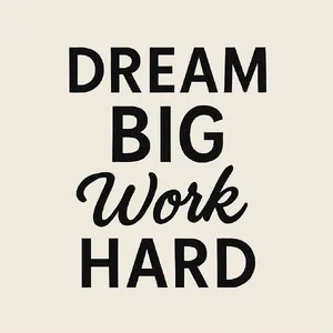
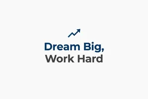
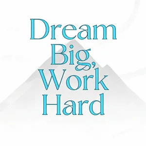
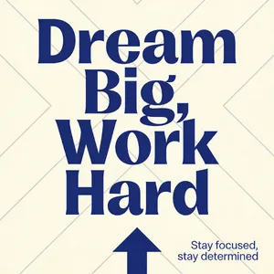
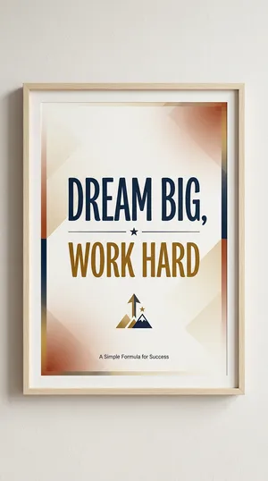
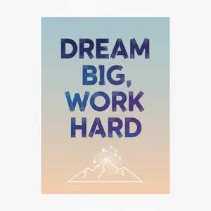
Flux 1.1 Pro Ultra and Recraft V3 offer an incredible blend of aesthetic beauty and text accuracy. Their vector-style rendering on prompts like the Motivational Poster is near perfection.
⭐ Quality Factors Distinguishing Top Performers
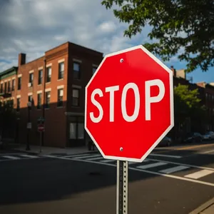
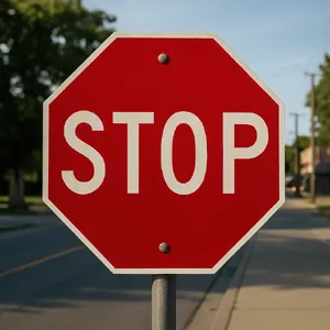
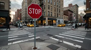
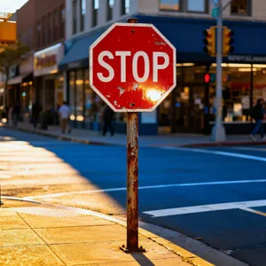
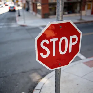
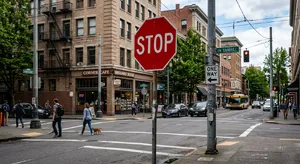
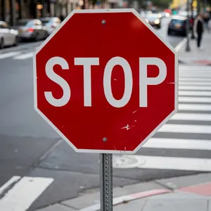
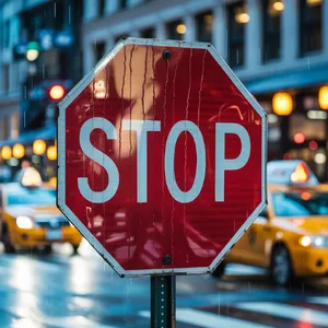
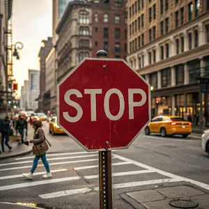
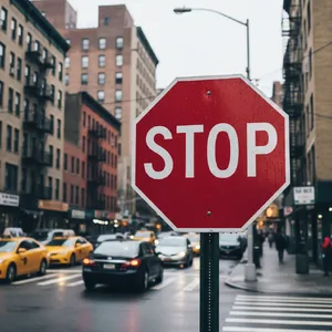
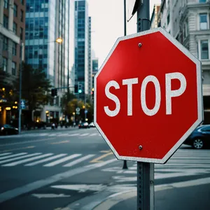
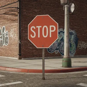
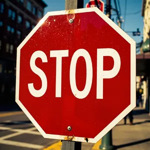
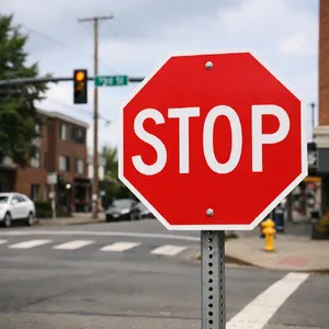
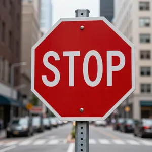
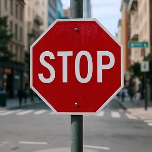
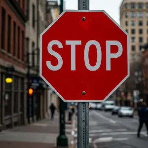
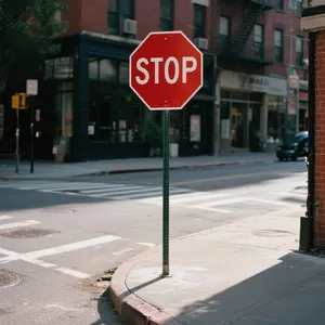
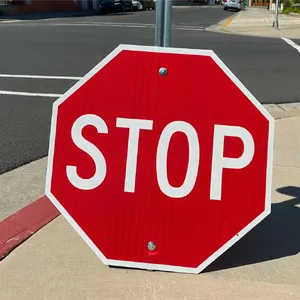
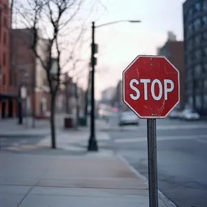
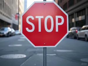
- Contextual Awareness: Top models recognize where text lives. If text is on a Stop Sign, models like Flux 1.1 Pro Ultra add retro-reflective honeycomb textures to the letters.
- Absence of Hallucinations: The biggest divider between a 6/10 and a 10/10 is background text. Superior models use plausible filler words for credits or small print, rather than nonsensical AI symbols.
📉 Common Failure Modes
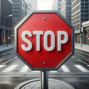
- The 3D Extrusion Error: When asked for photorealism, some models overcompensate by turning flat text into chunky 3D blocks. For example, DALL-E 3 created impossibly thick plastic letters for the Stop Sign.
- Punctuation Panic: Models frequently add unnecessary commas or hyphens, completely altering the intended phrase layout.
Best Model Analysis by Use Case
Different projects require different text rendering capabilities. Here is a breakdown of the best models based on specific graphic design and photography needs: 🎨
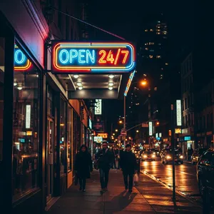
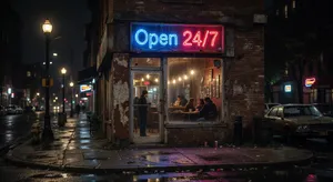
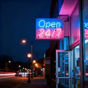
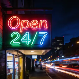
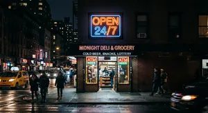
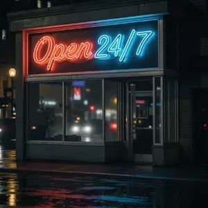
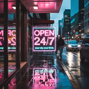
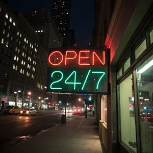
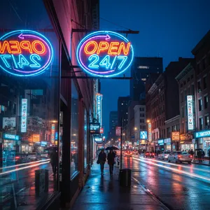
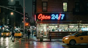
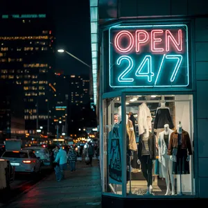
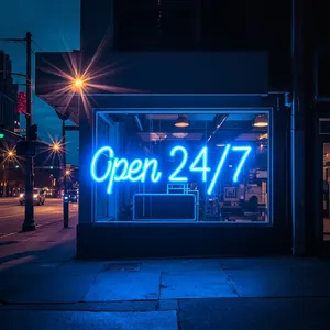
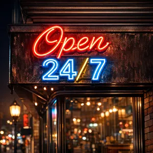
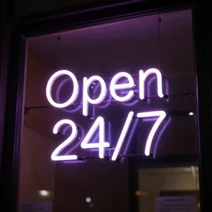
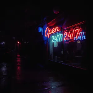
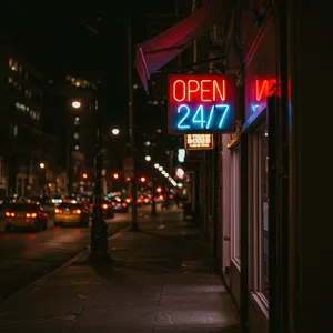
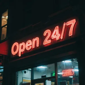
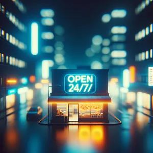
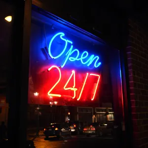
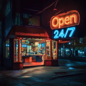
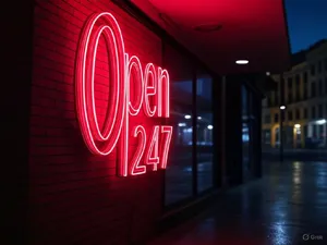
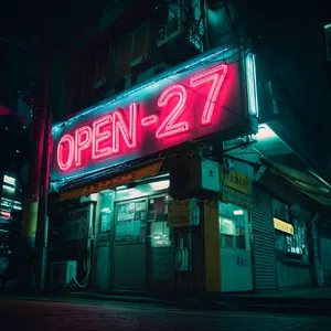
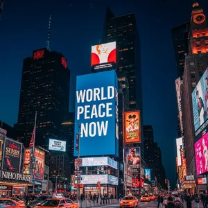
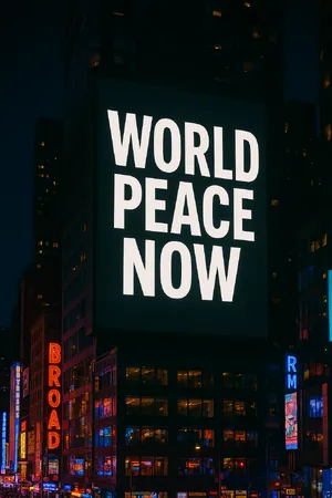
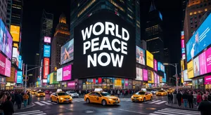
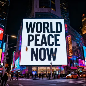
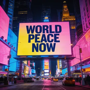
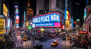
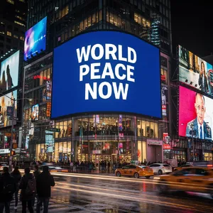
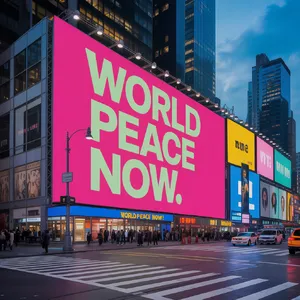
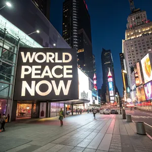
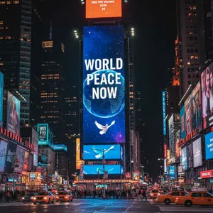
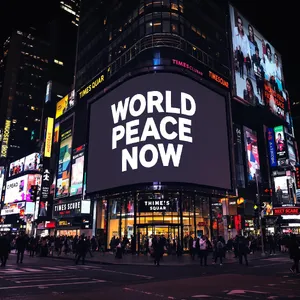
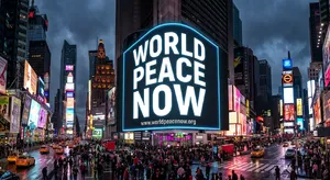
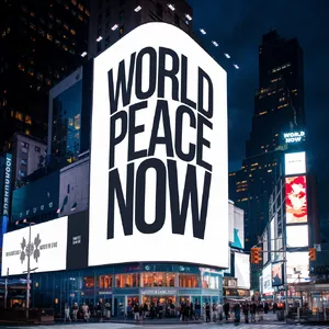
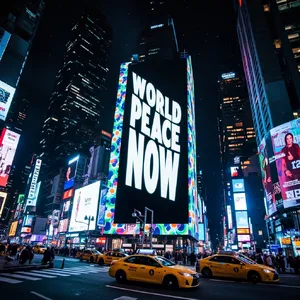
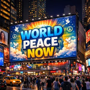
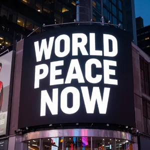
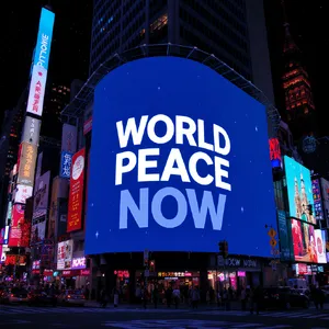
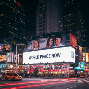
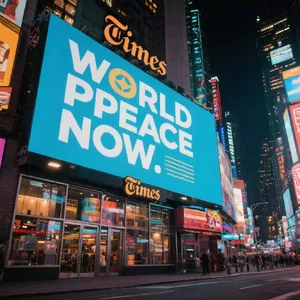
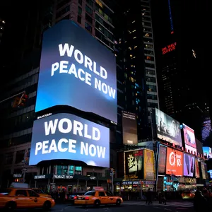
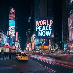
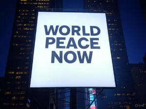
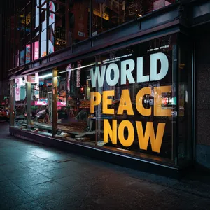
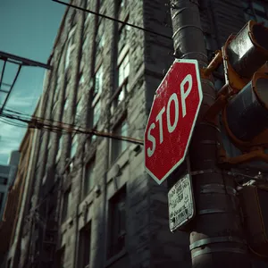
📸 1. Photorealistic Urban Signage
If you need neon signs, billboards, or street signs integrated into real-world environments.
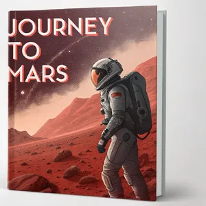
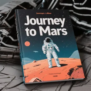
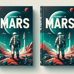
👕 2. Product Mockups & Apparel
If you are designing t-shirts, physical book covers, or staging products.
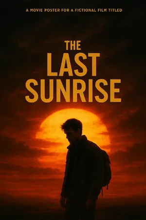
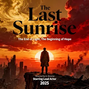
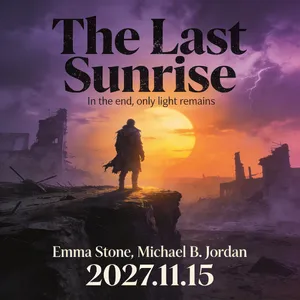
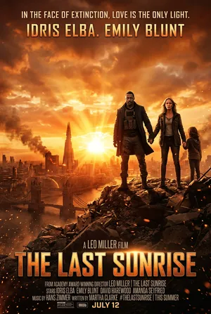
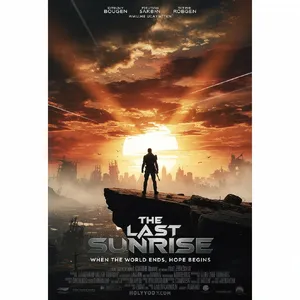
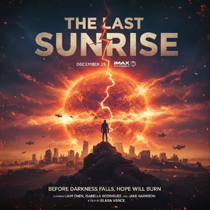
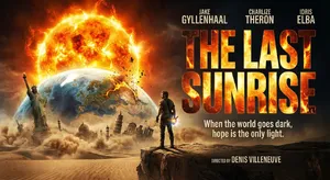
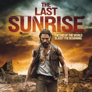
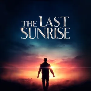
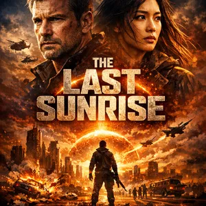
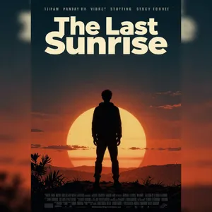
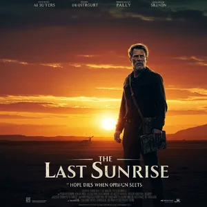
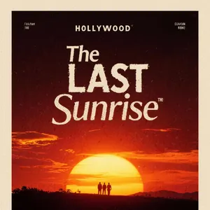
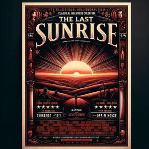
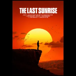
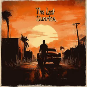
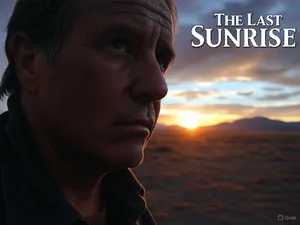
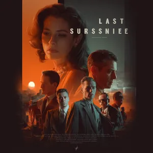
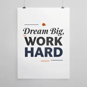
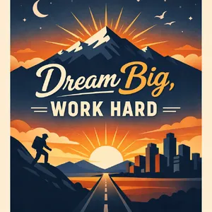
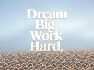
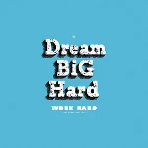
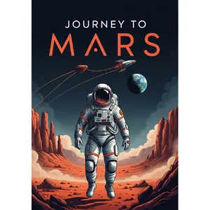
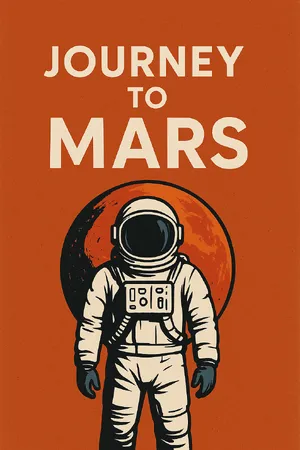
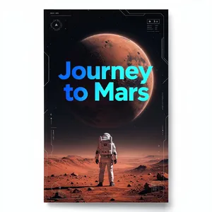
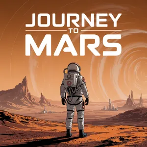
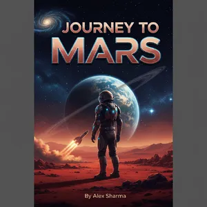
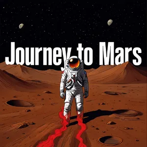
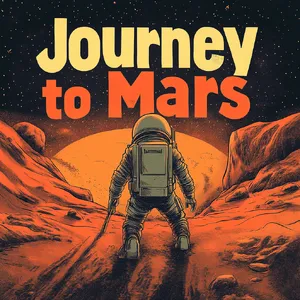
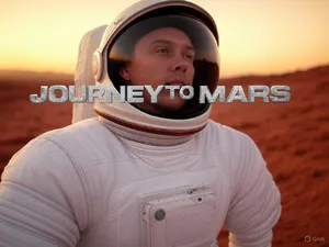
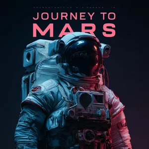
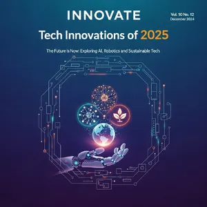
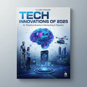
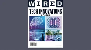
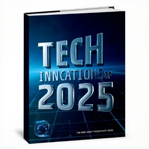
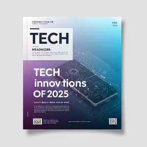
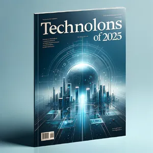
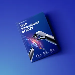
🎬 3. Complex Layouts (Posters & Magazines)
If you need multi-line typography, title headers, and specific layout designs.
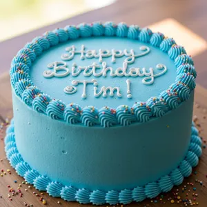
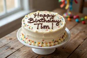
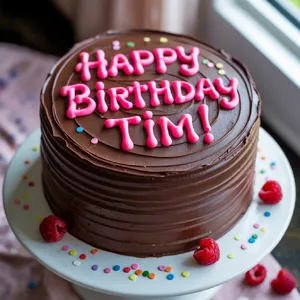
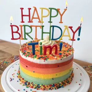
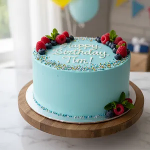
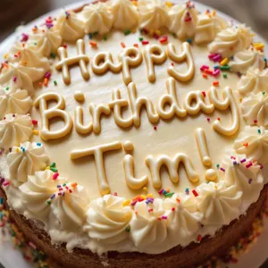
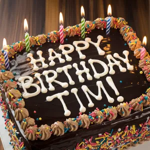
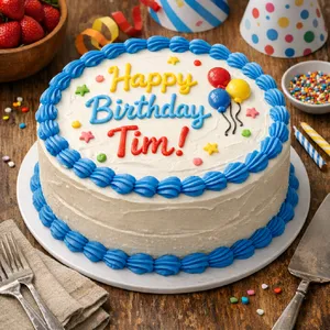
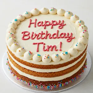
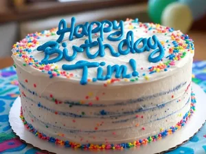
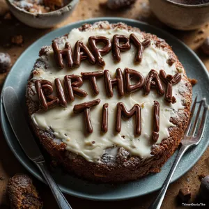
🍰 4. Edible & Organic Text
If you need text made out of icing, frosting, or other non-traditional materials.
- Top Picks: Midjourney v7, Z-Image Turbo.
- Why? While Midjourney struggles with long sentences, it absolutely dominates material realism. Its execution of the Birthday Cake prompt perfectly mimics the viscosity, sheen, and volume of real piped chocolate or gel icing.
- Highlight: This incredibly appetizing Rustic Carrot Cake by Midjourney v7 is visually flawless.